
|
|
|
|
by Editor Lourens Durand
Edited and published by Yvette Depaepe, the 17th of July 2026
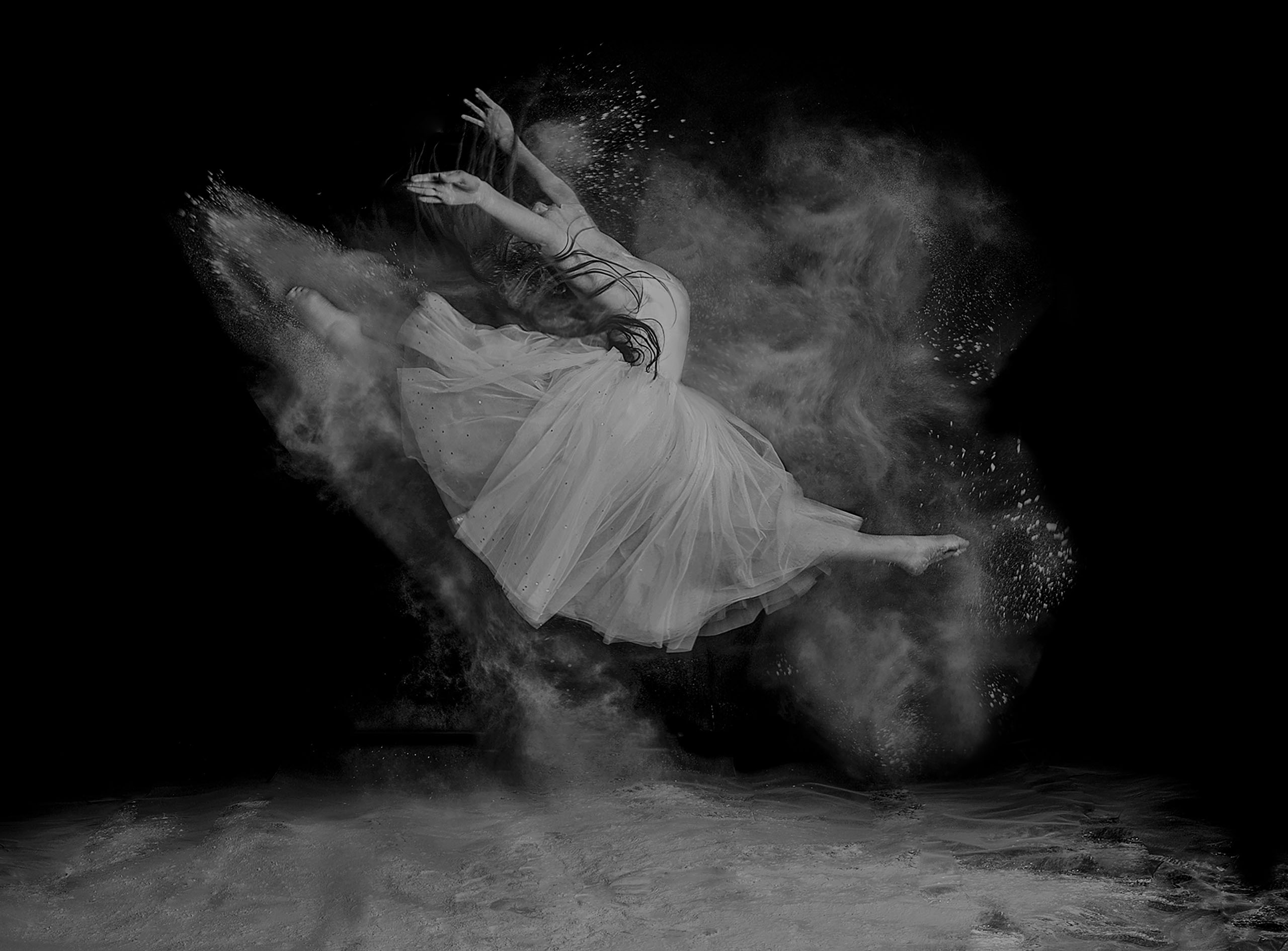
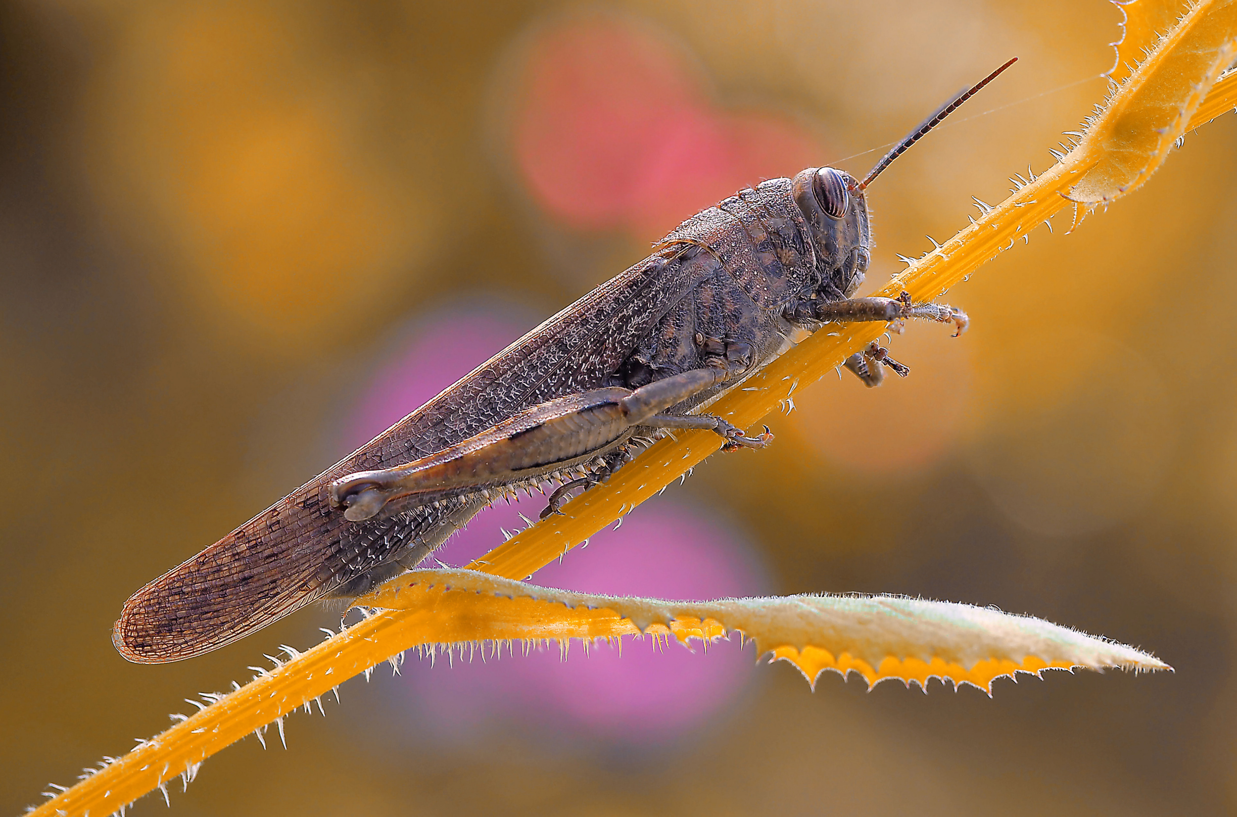
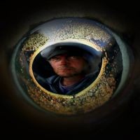
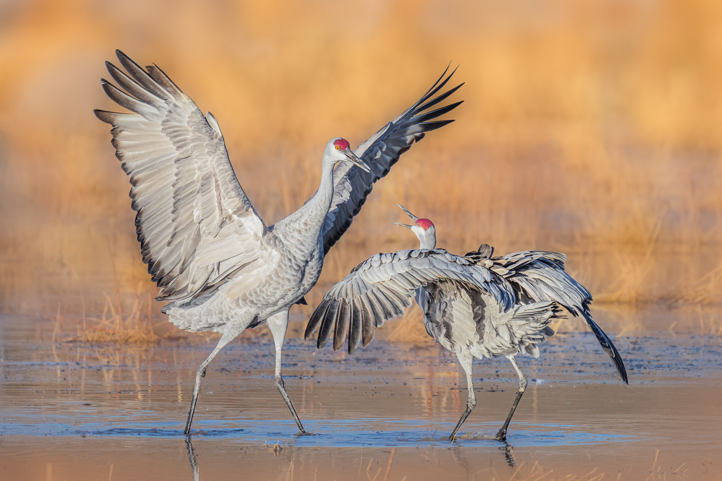
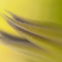
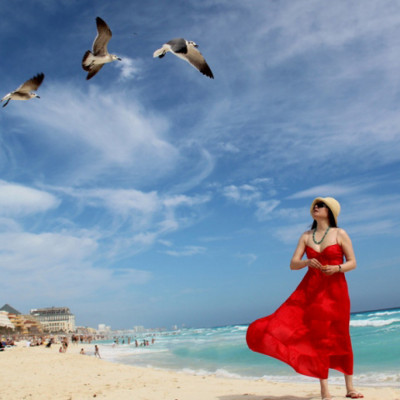
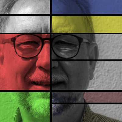
“Show Time’ by Hasan Baglar
One could argue whether an interest in nature engenders an interest in macro photography, or vice versa.
Either way, it provides a fascinating insight into both.
Macro photography in the insect world requires an understanding of not only the equipment and techniques used, but also of where and when to find your subjects. There are very few lucky shots! Most successful photographs are the result of a careful assessment of camera settings, necessary equipment, lighting setups, and post-processing.
Then there is the question of ethics. Nowadays, it is widely accepted that you should shoot your subject in situ. There is no longer any justification for catching a butterfly and putting it in the refrigerator, rendering it immobile for a few minutes, or freezing it to death. Of course, all insects die a natural death, whether by the hands of a flying assassin or a sniffing one, but the consensus is to let nature take its course. If an insect has died naturally, it is OK to use it as a macro subject!
Nevertheless, the live opportunities are manifold and better in the cooler mornings and evenings when insects are more sluggish.
The quality of the equipment is crucial. It can make or break a great photo. This applies to photos of nature subjects. It also applies to photos of other small things taken in a studio.
Although mobile phone technology has advanced to the point where it can successfully perform macro photography, it is clear that conventional cameras with their larger sensors and plethora of settings, together with macro lenses and their advanced optical properties, are superior.
The settings required for excellent macro photography would fall within the following ranges:
o Iso: as low as possible without generating excessive noise – max 1600 in handheld situations, but 120 would be OK with a tripod
o Shutter speed needs to be at 1/120 second if handheld. With a tripod, a slower shutter speed is possible provided the subject is static
o F-stop of 1/11 or 1/16 is generally used.
o Ideally, the subject should be sharply in focus, with the background blurred.
To achieve front-to-back sharpness in larger specimens, photo stacking is used – a process involving taking a number of shots focused at different distances from the camera, from closest to farthest, typically at an f-stop of around 1/5.6. This can be achieved by using a set of movable bellows between the camera and lens, or by using a focusing rail, and then blending the photos using software such as Zerene Stacker or Helicon Focus.
Although many newer cameras have built-in focus stacking capabilities, you will still need stacker software.
As is often the case in photography, lighting is of prime importance. This applies to both quantity and quality. Natural light is ideal, but it often creates shadows in the wrong places. This can be overcome by using an on-camera flash, but this can cause glare and uneven lighting. This can easily be overcome by adding a diffuser to the flash unit. The one I use is a mini 16 x 16 cm soft box that is fixed to the flash unit with elastics.
In conclusion, as with any other photographic endeavour, mistakes will be made and lessons will be learned along the way. The four key things to remember on your journey are Patience, Persistence, Precision and Preparation.
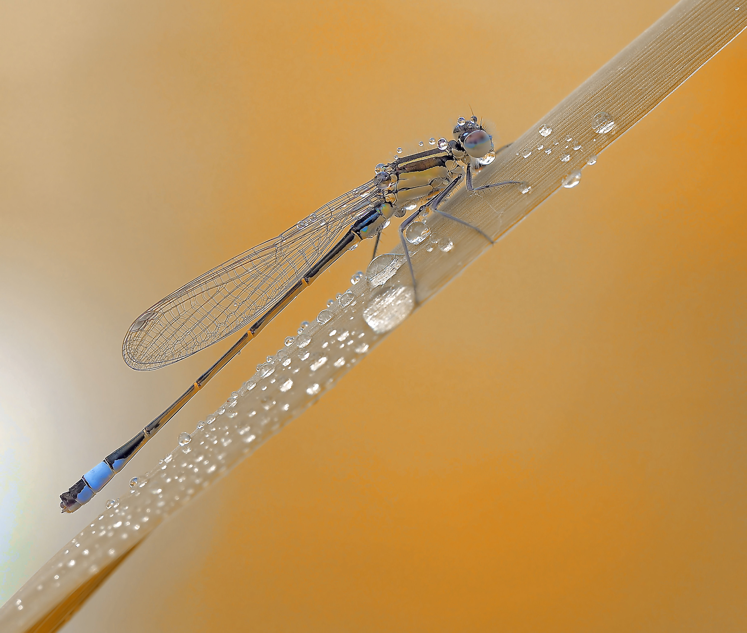
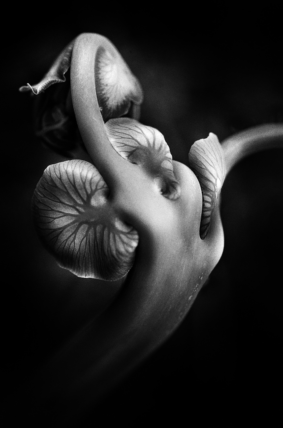
Here are some stunning macro photographs from the 1x archives.
Happy shooting!
"The smell of you" by Atul Saluja
“The Duel on the Vine’ by Atul Saluja
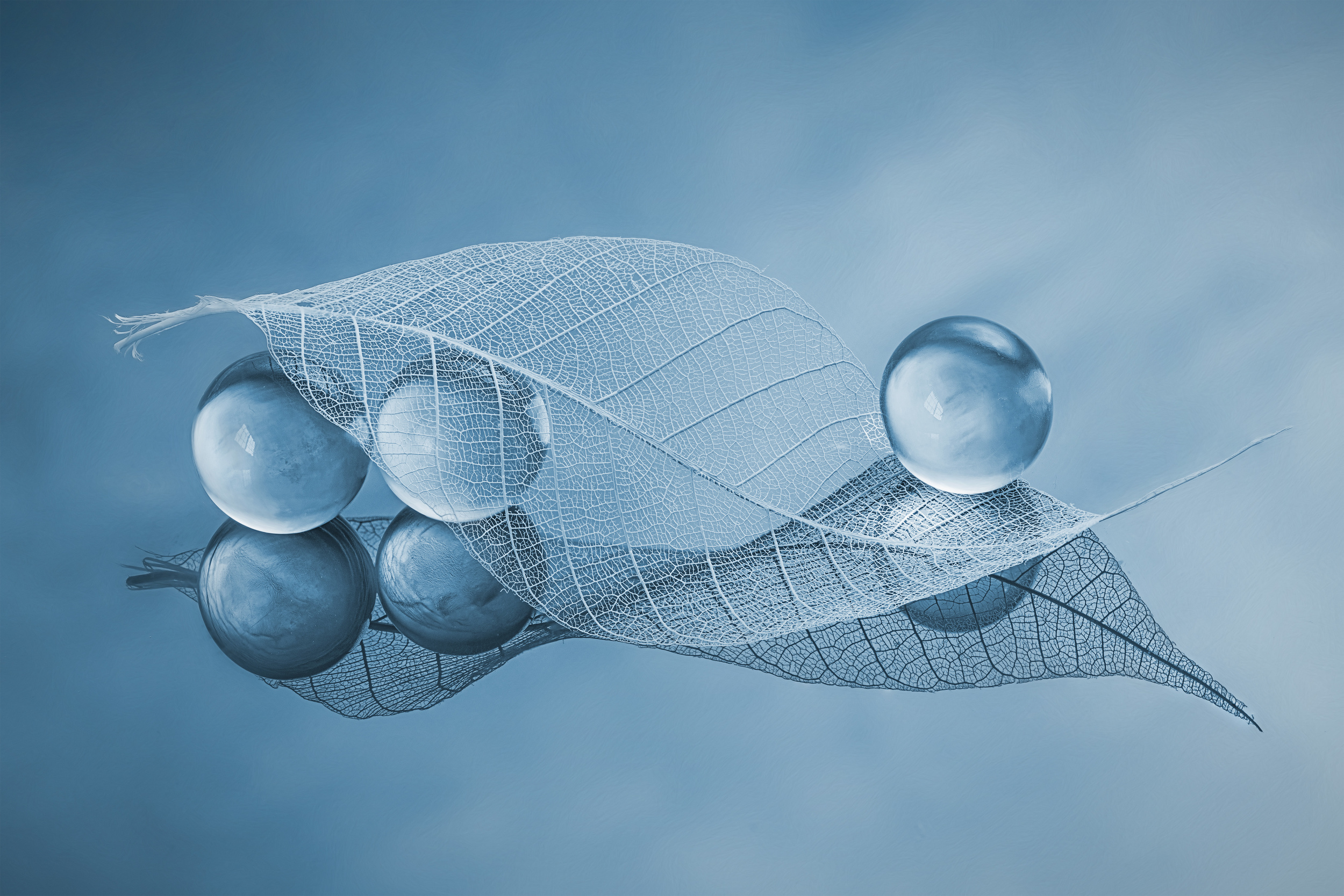
‘Dry leaf and Bubbles’ by Lydia Jacobs
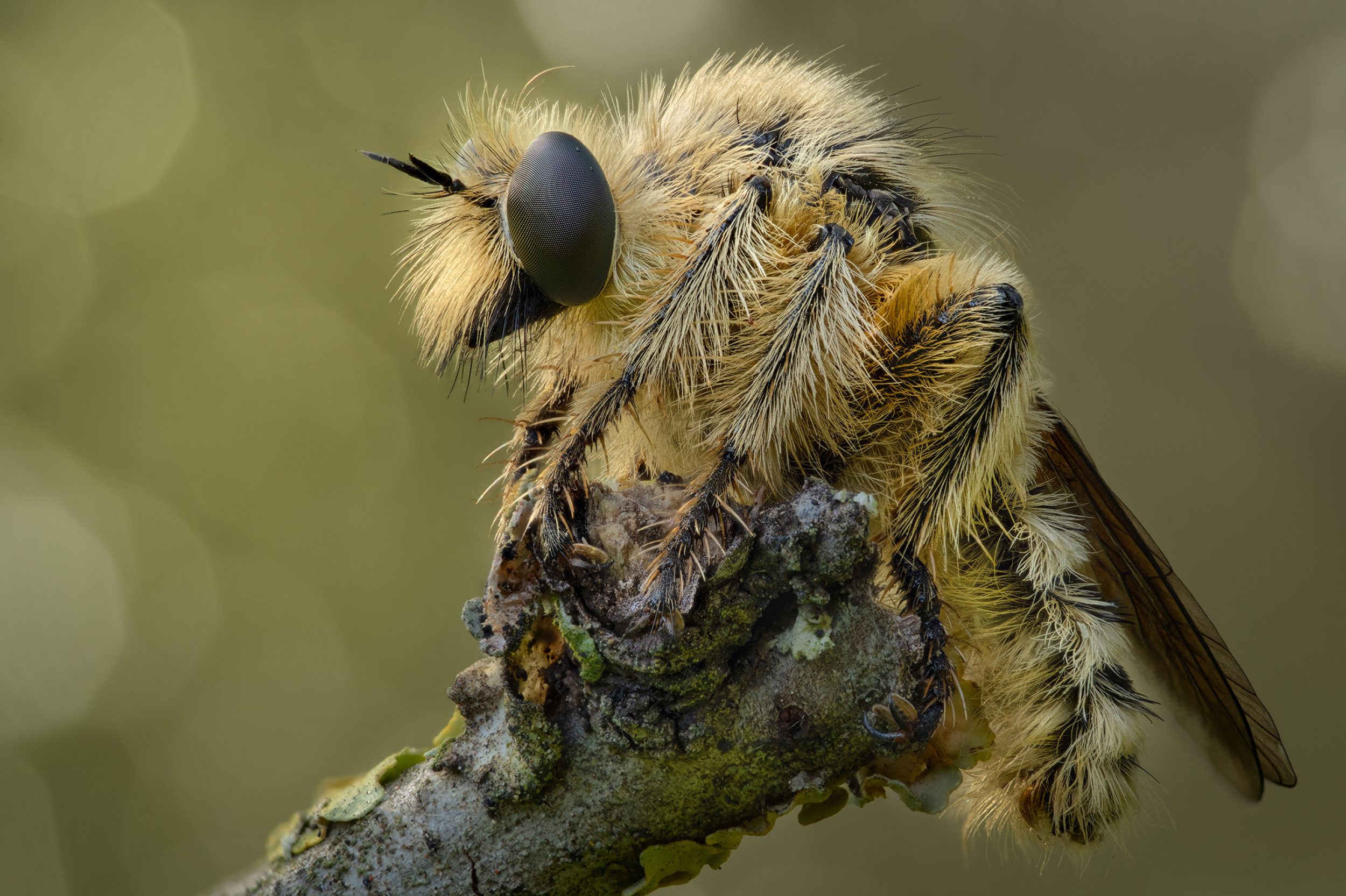
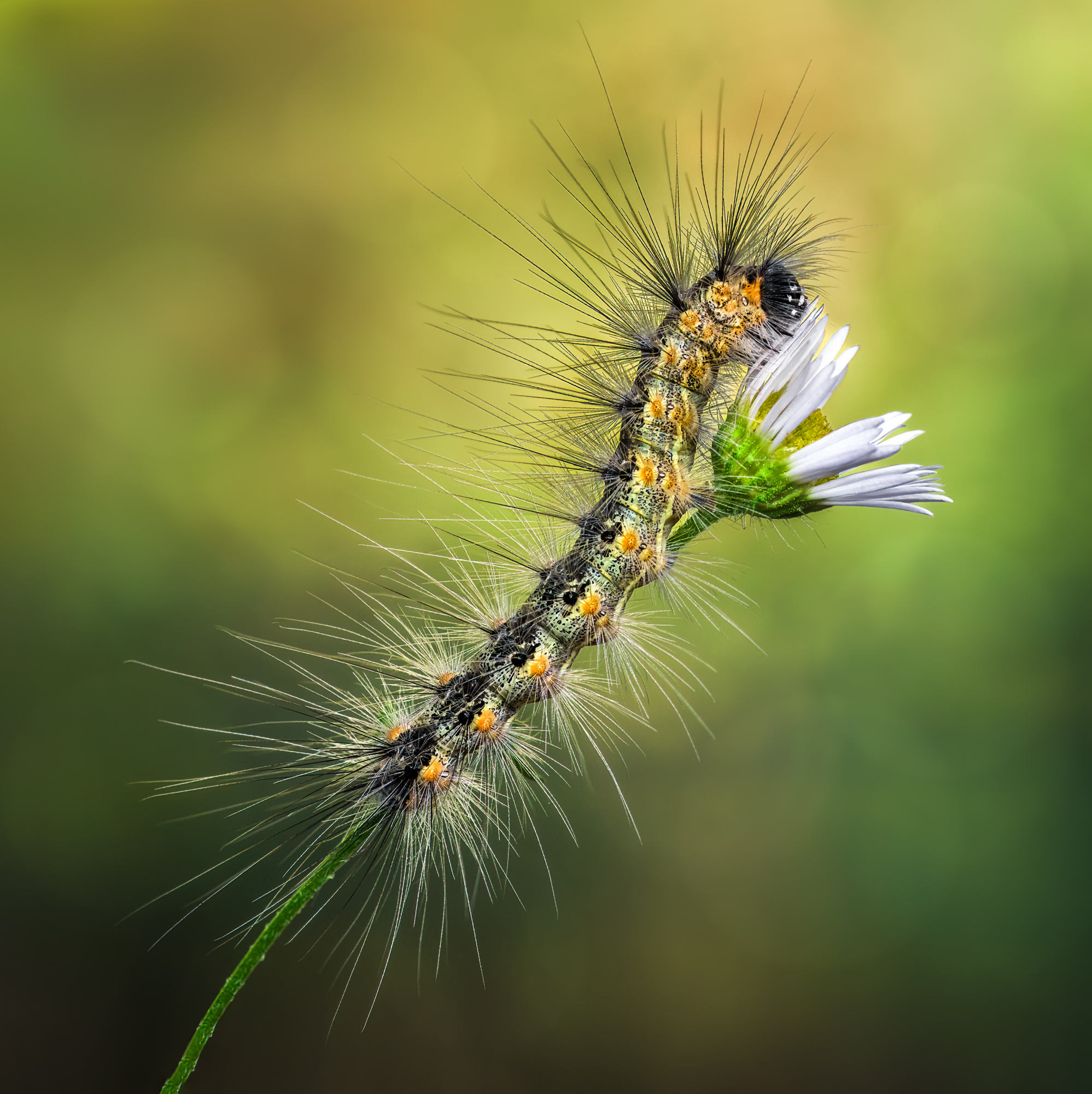
“Robber Fly” by Miron Karlinsky
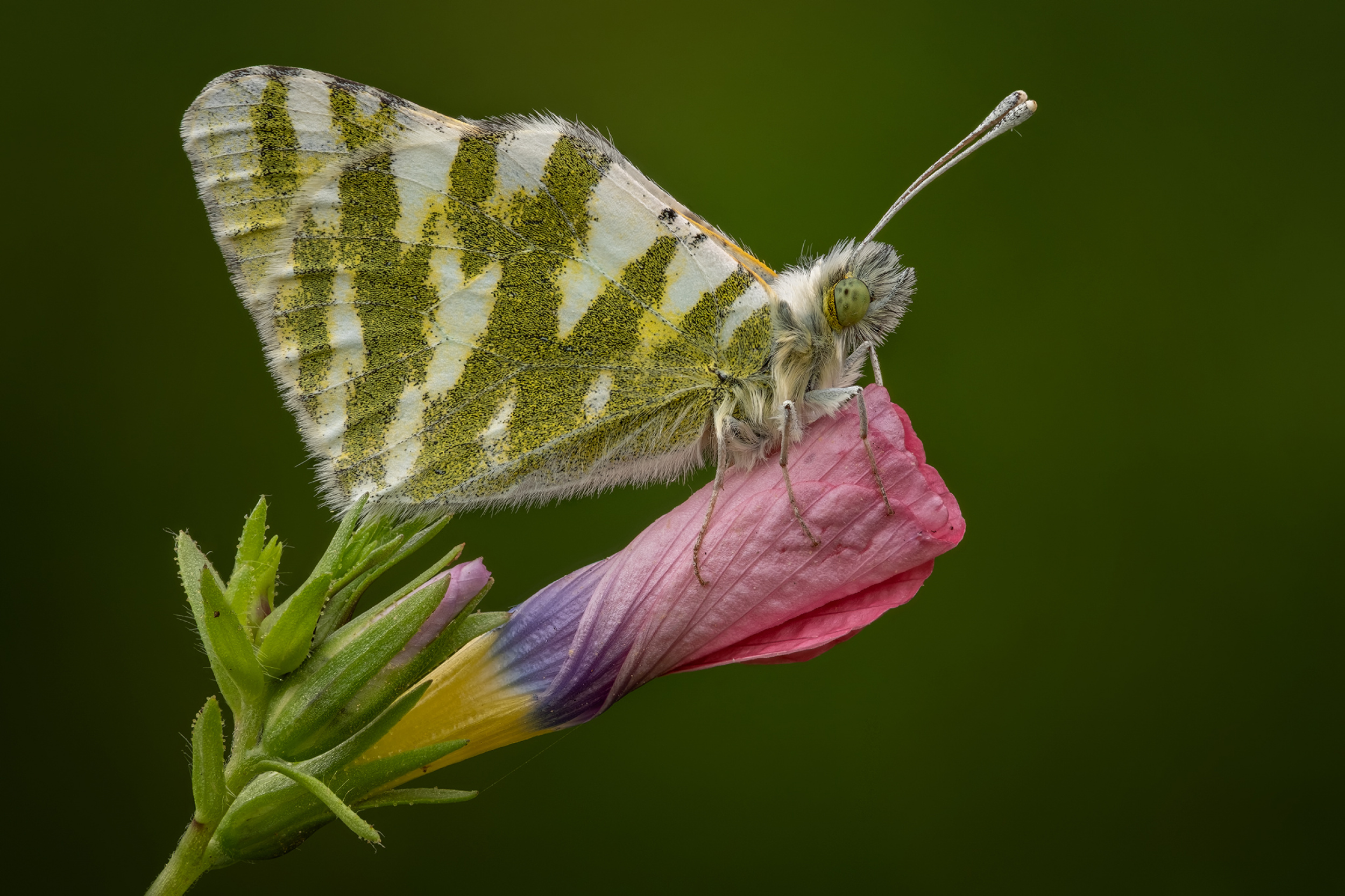
“Euchloe belemia” by Miron Karlinsky
“Starless” by El Filósofo
“The winner of the summit…” by Thierry Dufour
“Relax break” by Thierry Dufour
“Autumn rain” by Thierry Dufour
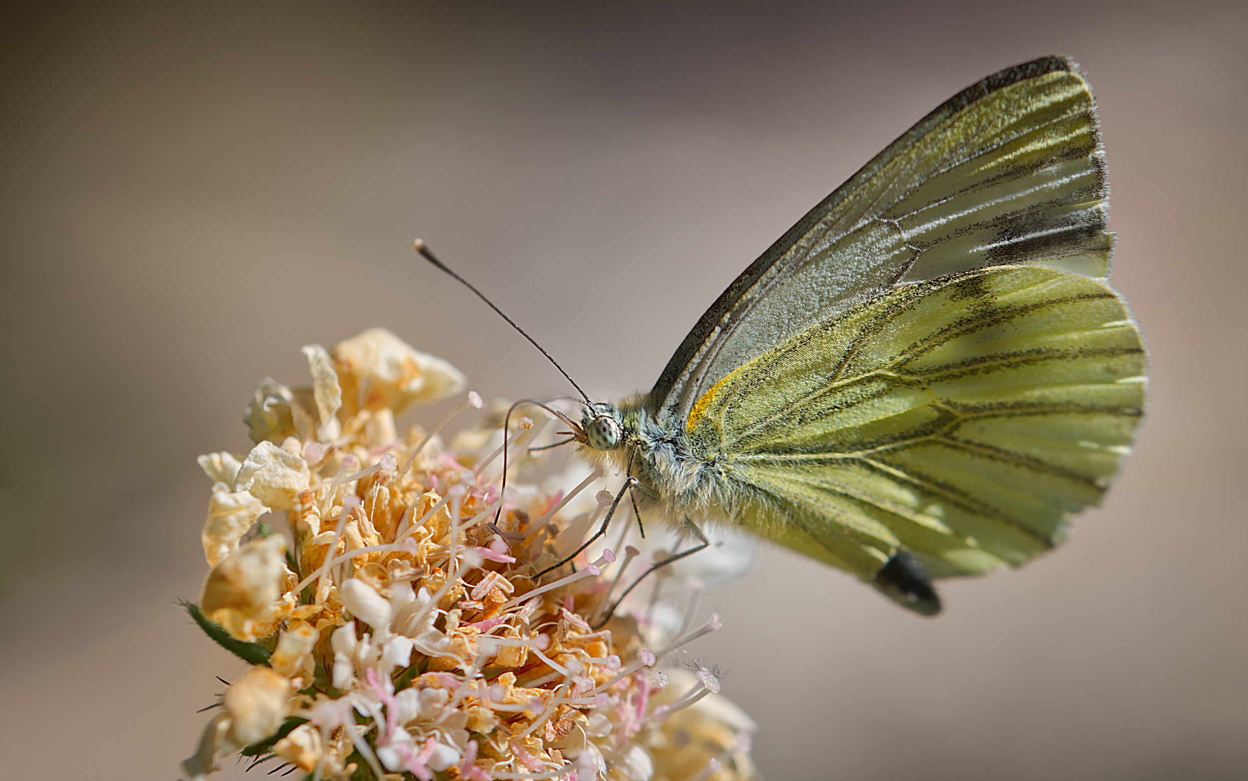
“Green Veined White” by Peter Davidson
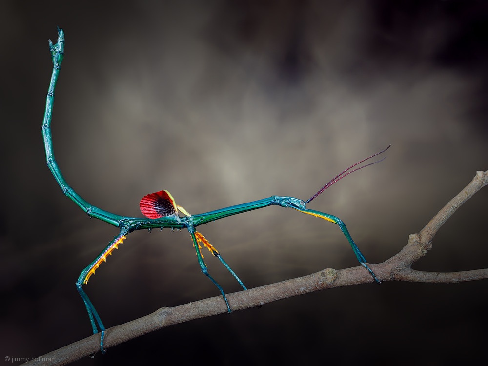
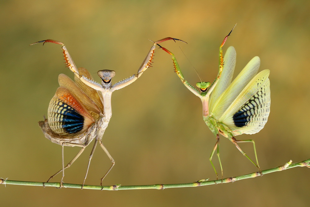
“Threat display” by Jimmy Hoffman

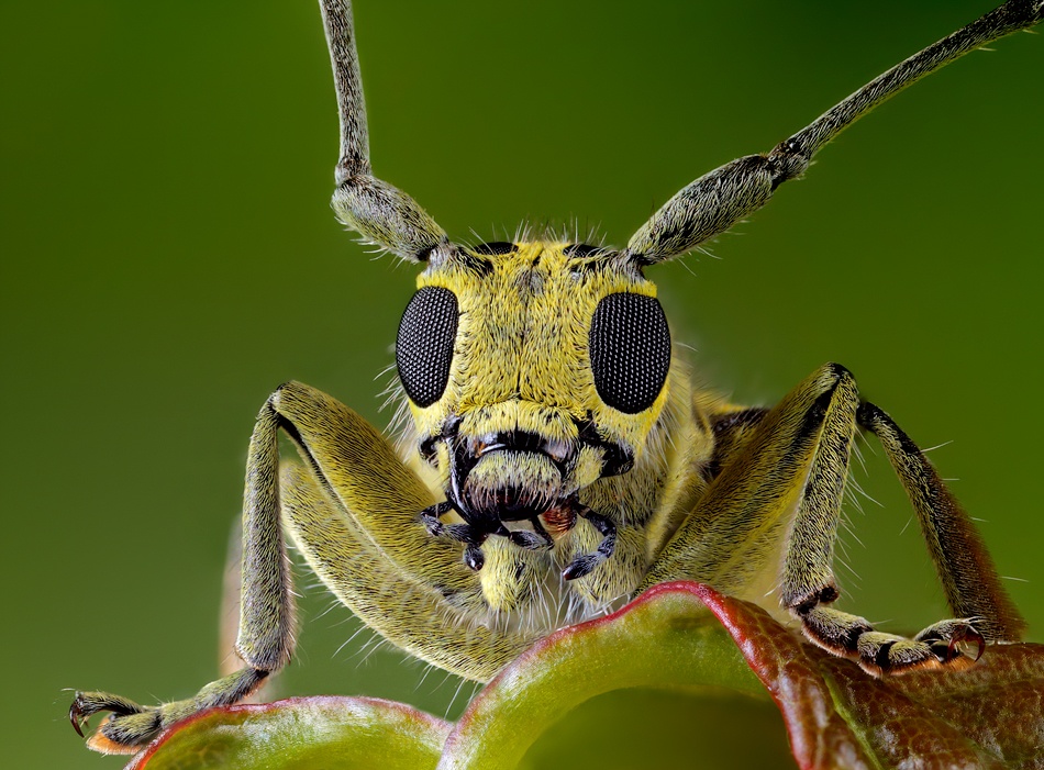
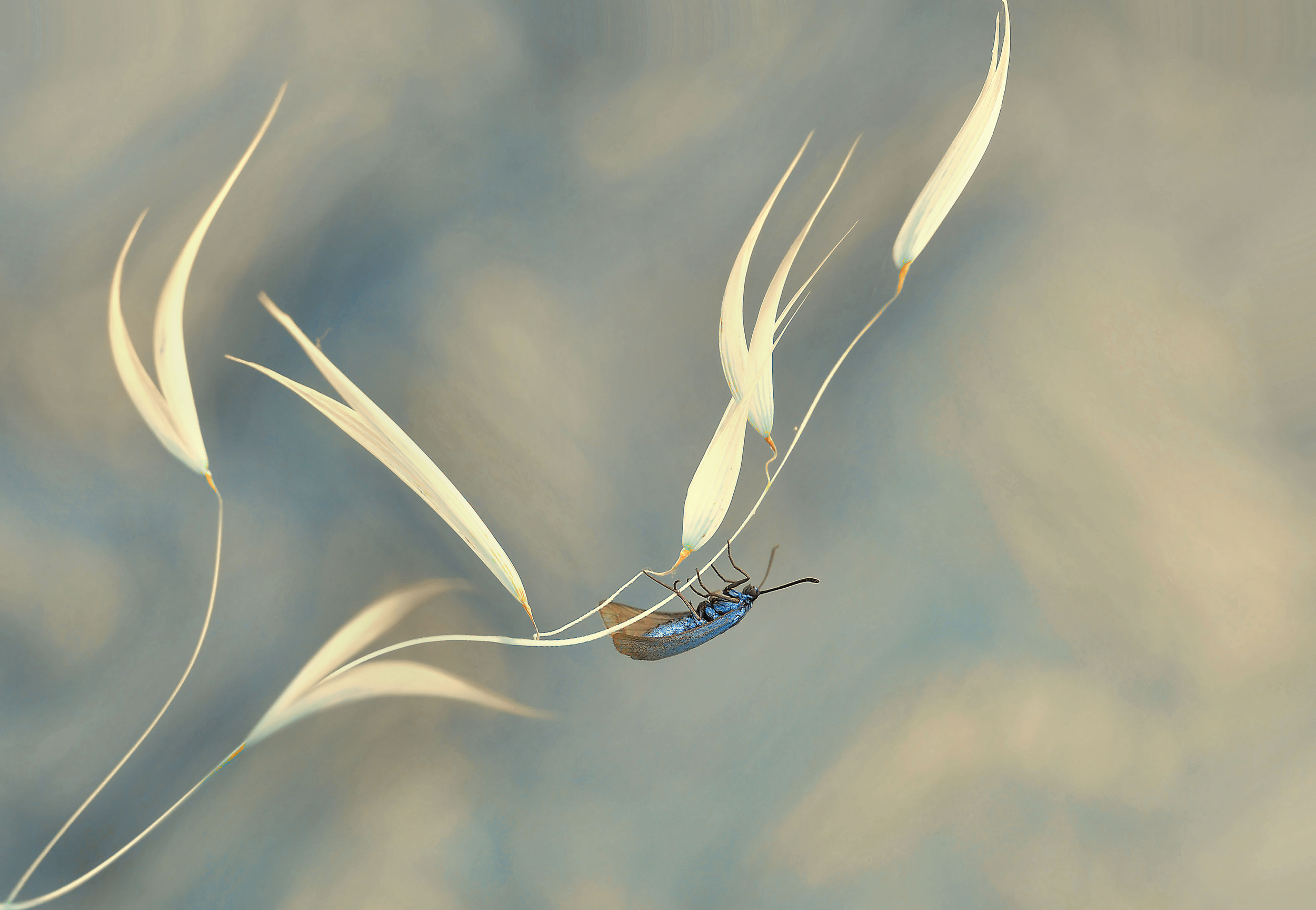
“Robber Fly” by Lourens Durand
“Curious Yellow Car” by Alexander Zubrickij
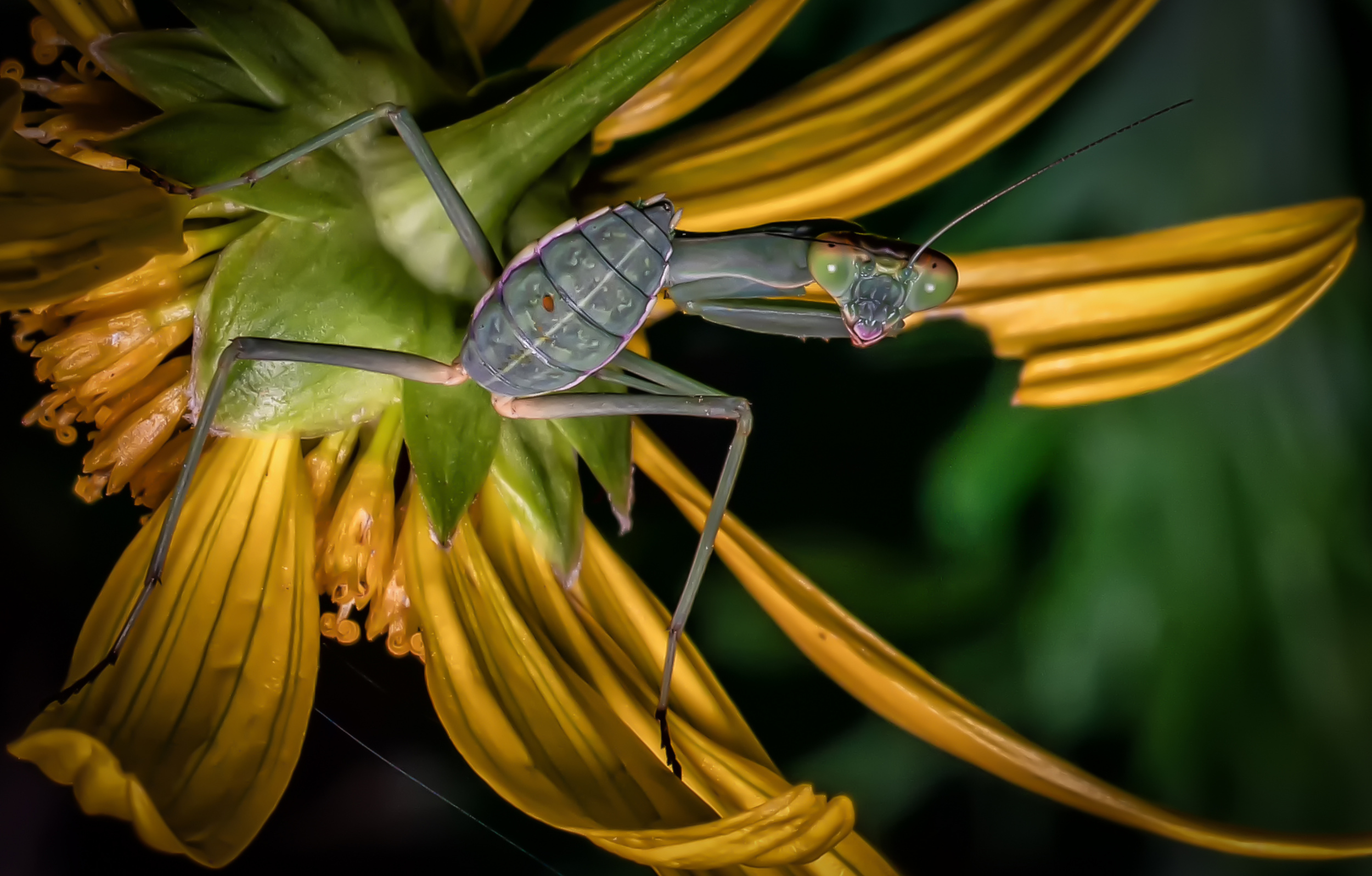
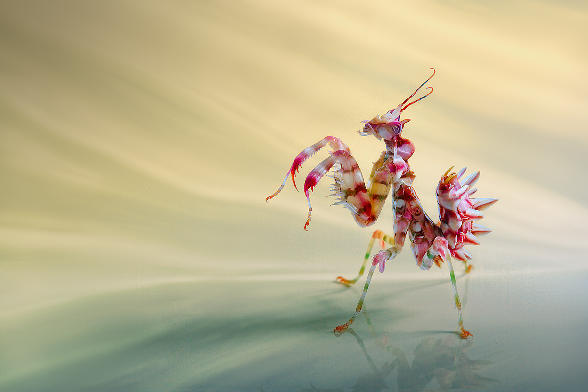
“Mantis” by Lourens Durand
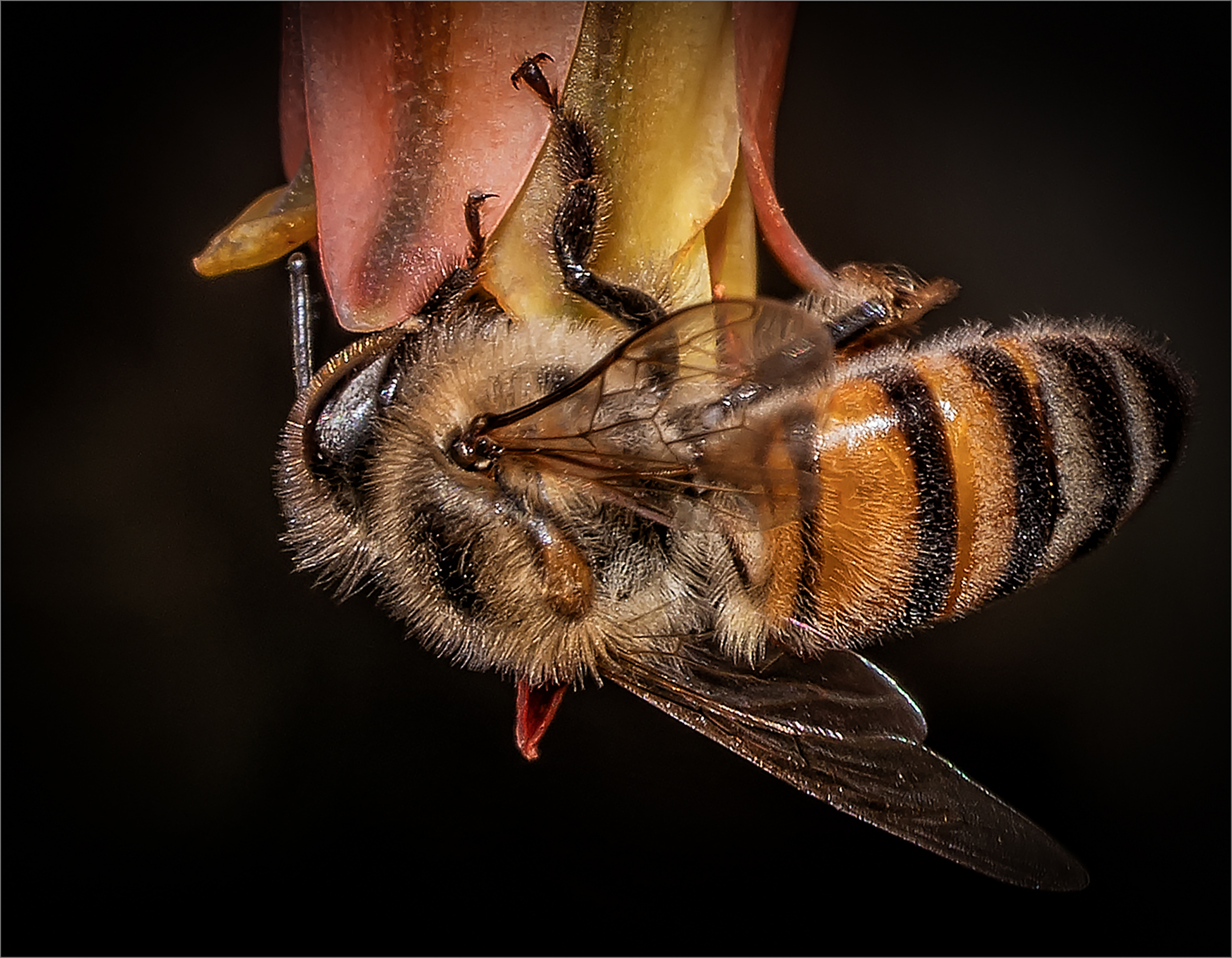
“Bee on Aloe HR” by Lourens Durand
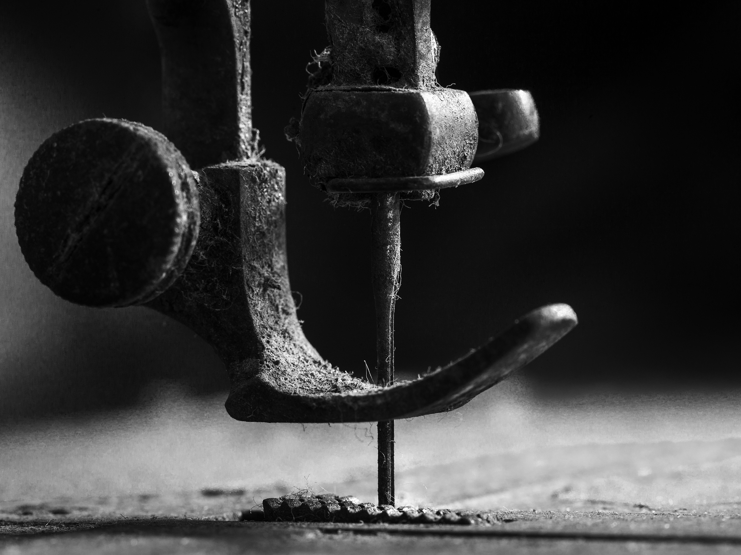
“…..Element on sewing machine…..” by Johanes Januar
"ABw048” by Johanes Januar
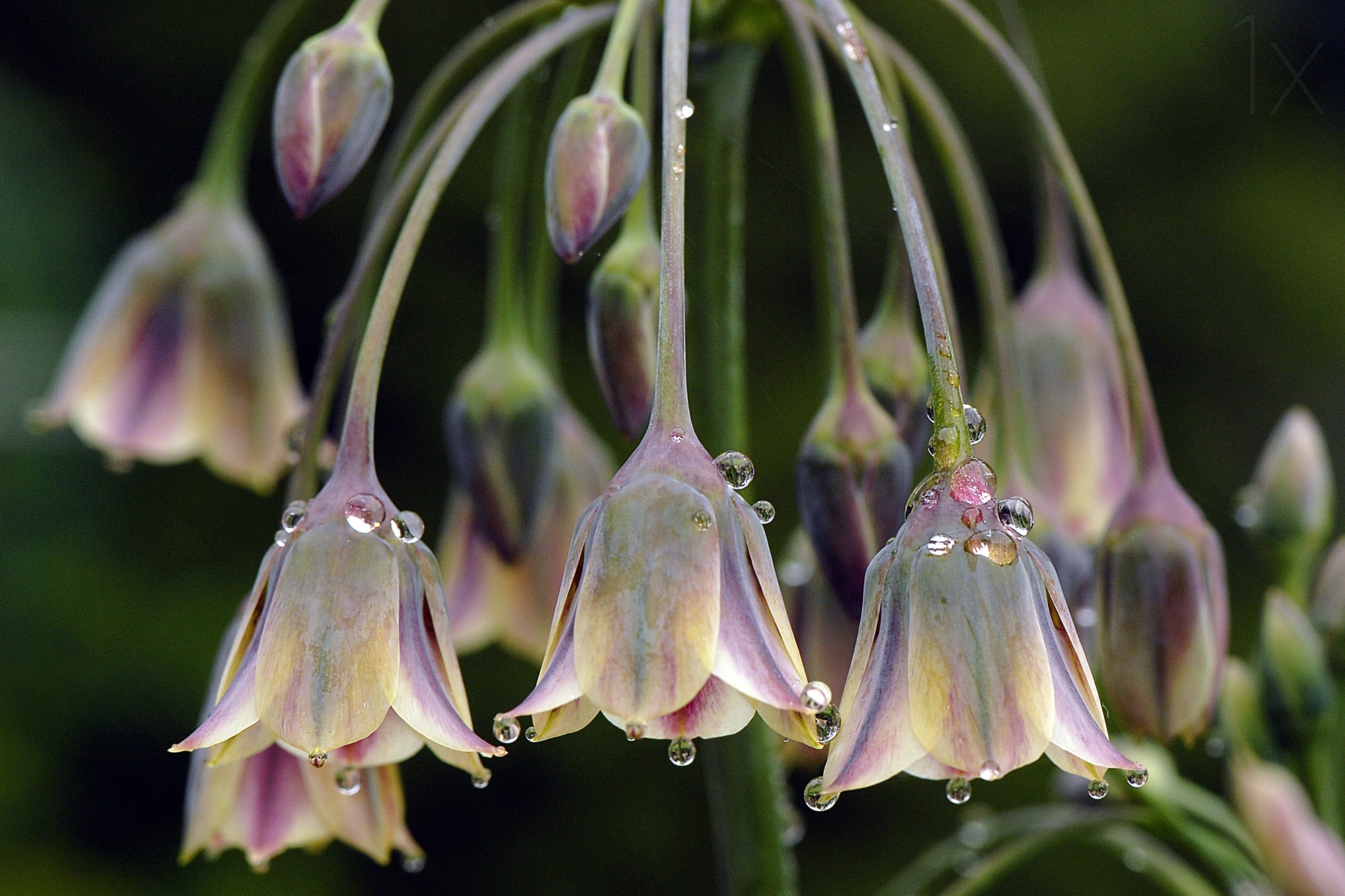
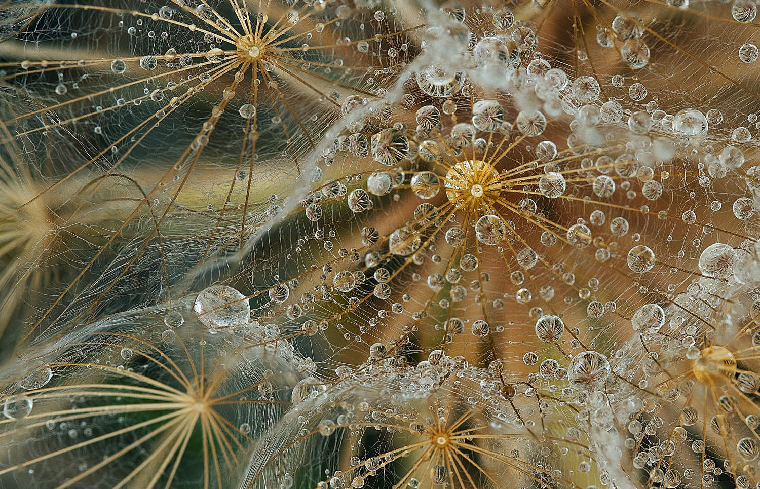
“Dew Bells” by Jacky Parker
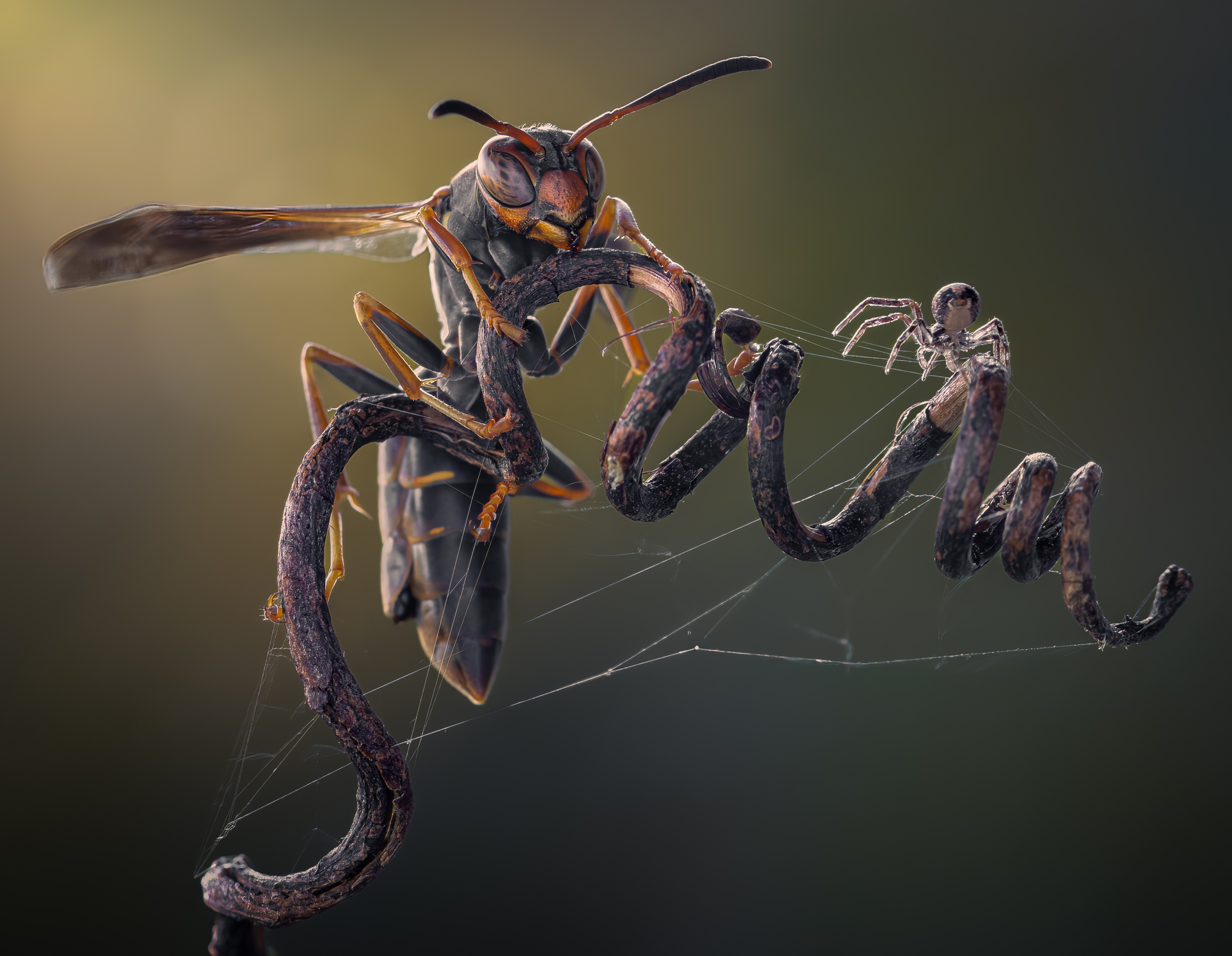
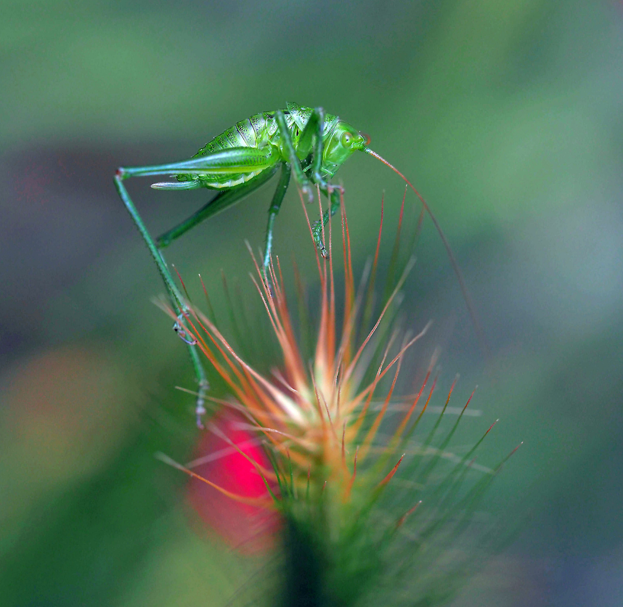
“Delicate Insect Balance” by Thierry Dufour
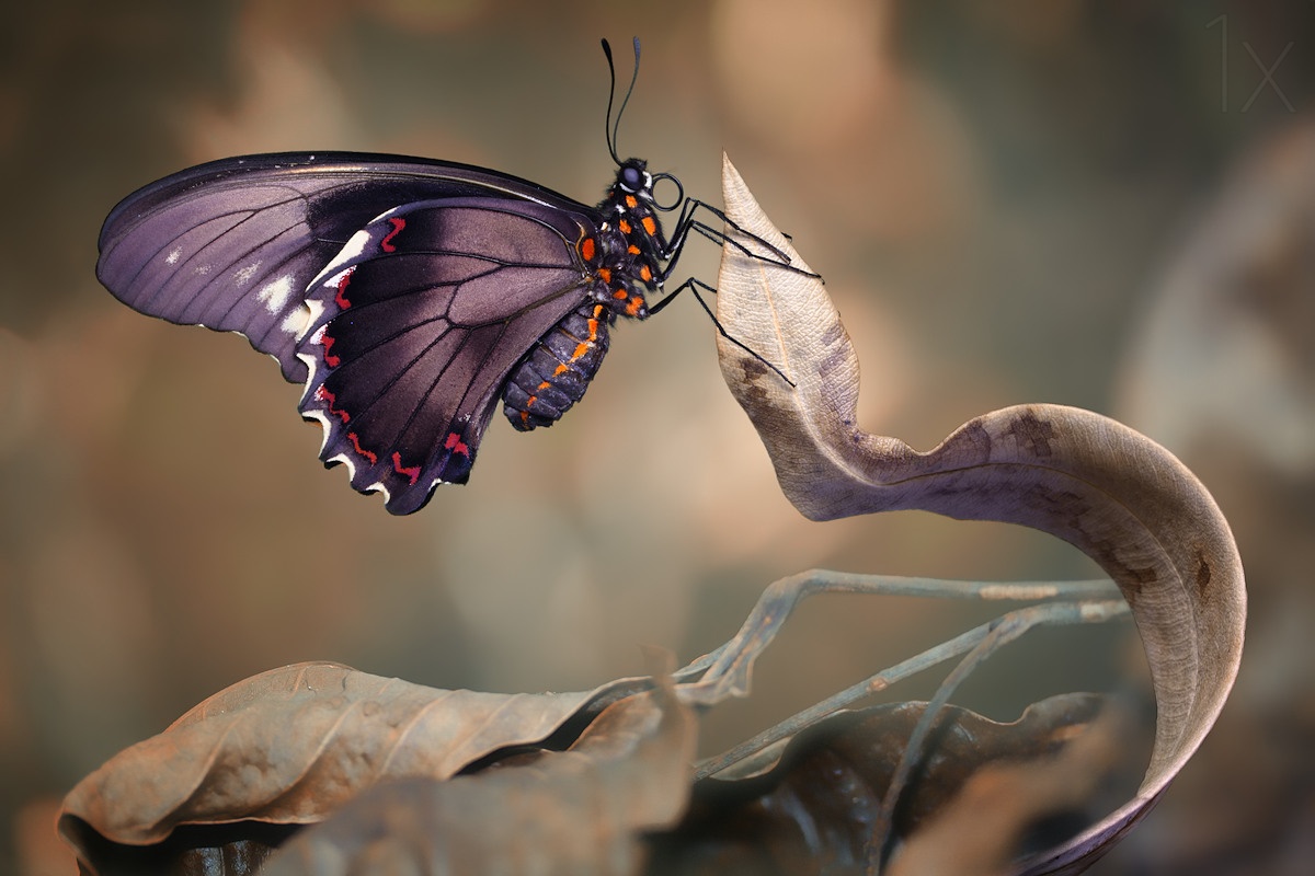
“Swallowtail” by Jimmy Hoffman
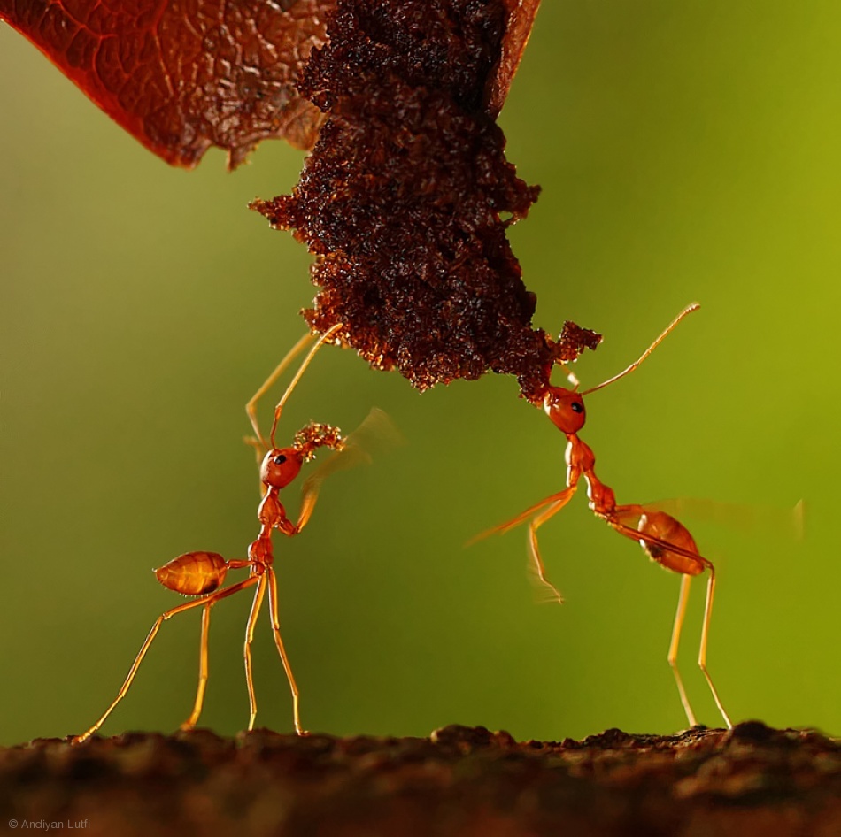
“Ration” by Andyan Lutfi
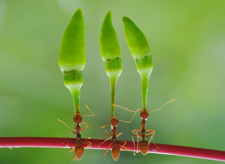
“chili cilider team” by Yahia Taufikurrahman
“Lost” by Jimmy Hoffman
“Dewdrops are the GEMS of morning” by Yvette Depaepe
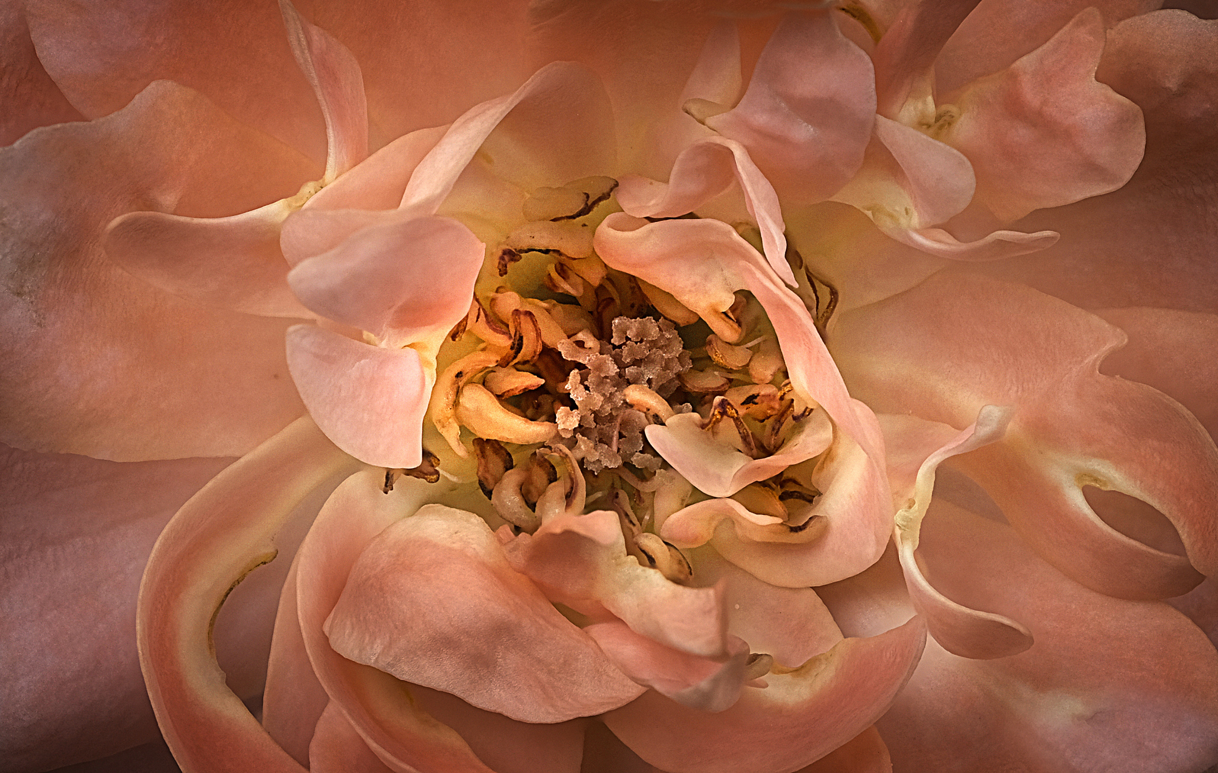
"Heart of a Rose" by Peter Davidson
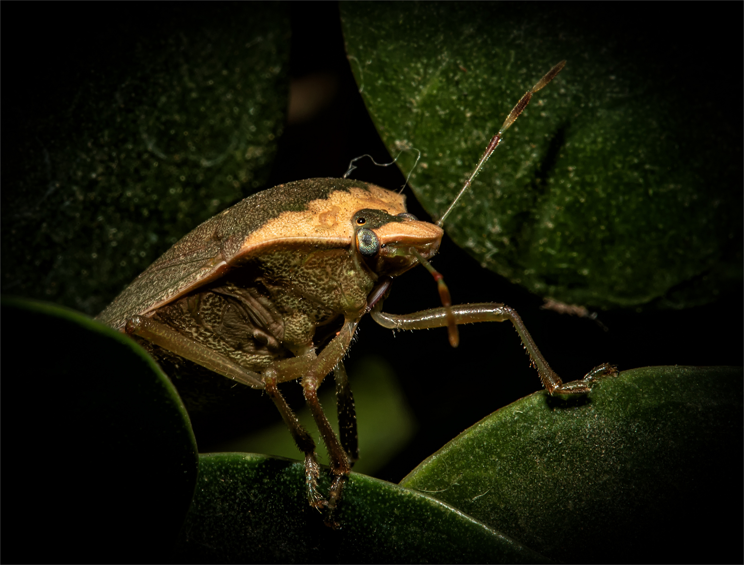
“Stinkbug HR” by Lourens Durand
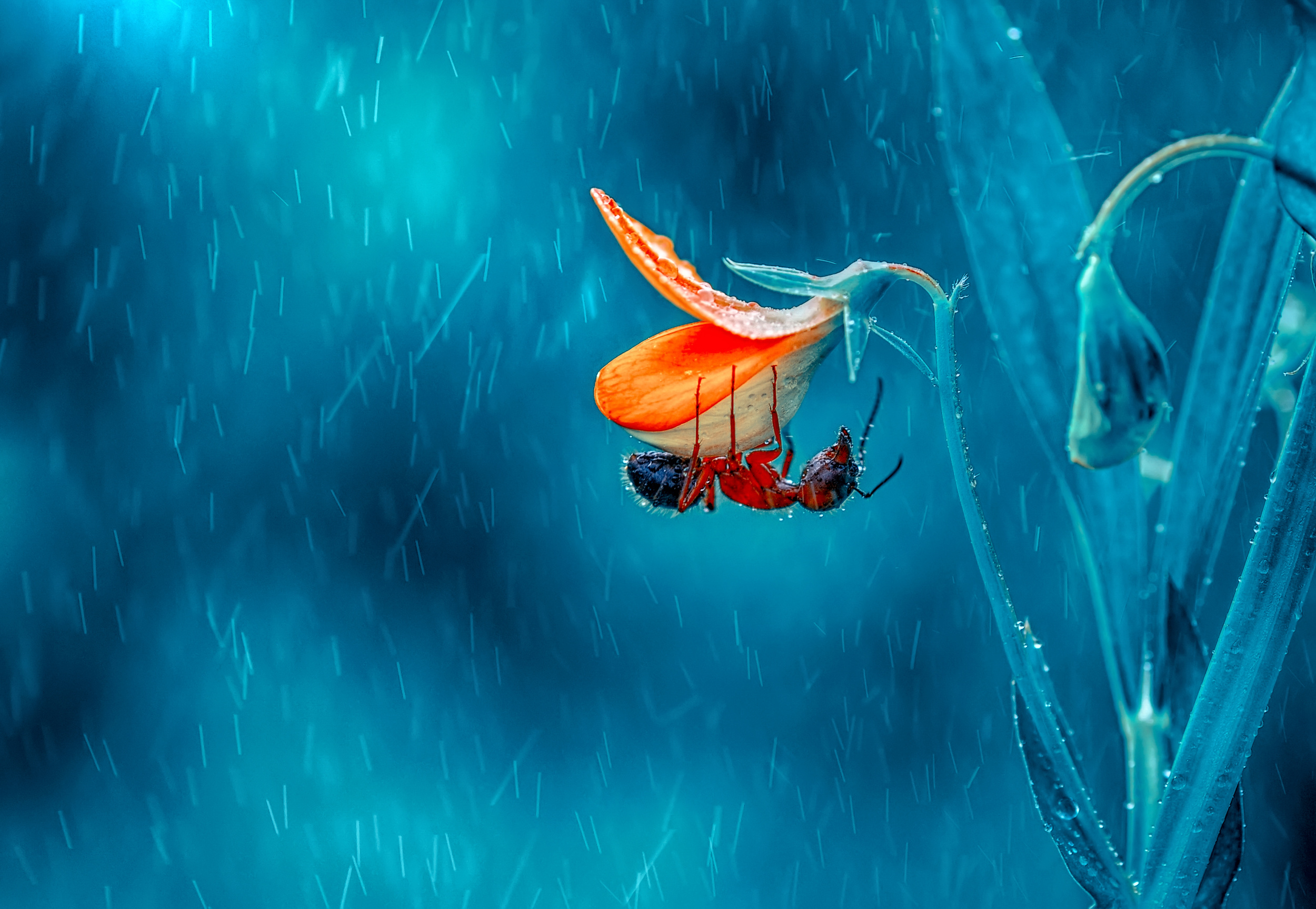
“Rain” by Mustafa öztürk
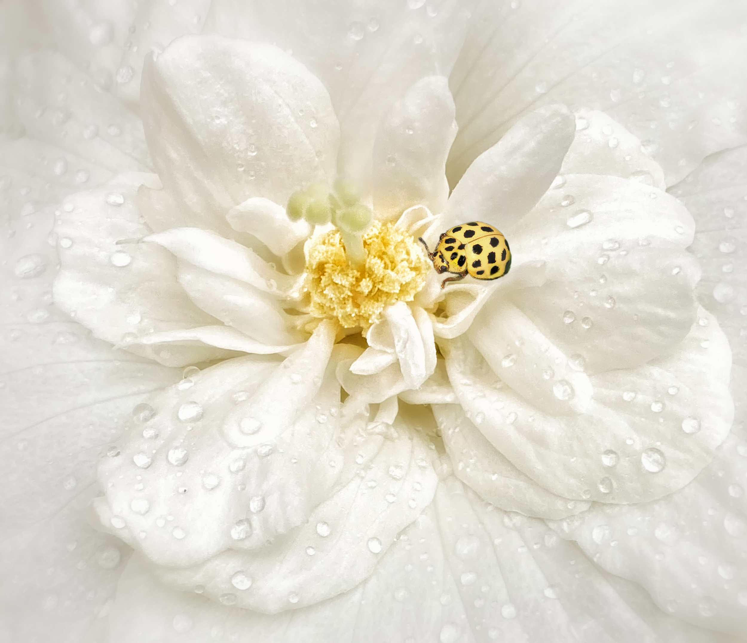
“Little Secret” by Wil Mijer
 | Write |
 | Giampiero Maffulli PRO Great article |
 | Miro Susta CREW wonderful collection of beautiful macro pictures, thank you Laurens and Yvette for creating, editing and publishing it. |
 | Yvette Depaepe CREW Thanks a lot, Miro !!! |
 | Emel Sefer PRO Congratulations |
 | Carolina Garcia-Paris PRO Wonderful article, full of impressive and inspiring macro images... A real feast to the eyes. Congratulations to the featured photographers, and to Lourens and Yvette for creating this insightful magazine article. 👏👏 |
| Yvette Depaepe CREW Thanks for your appreciation, dear Carolina !!! |
 | Jimmy Hoffman PRO Very nice article. Thanks for choosing a couple of my shots!
have a great weekend. |
| Yvette Depaepe CREW Your work couldn't be missed here, Jimmy ;-) |
 | Sokol Priftaj PRO Really enjoyed reading this article. Thanks for sharing |
| | Sokol Priftaj PRO Really anjoyed reading this article. Thanks for sharing |
 | Peter Davidson CREW Excellent piece and thank you for choosing a couple of my shots! |
| Yvette Depaepe CREW Our pleasure, Peter! |
 | Hasan Baglar many thanks to editors, great collection !!! |
 | Thierry Dufour PRO Thank very much dear Yvette and Lourens for selecting my images. A magnificent series of macro shots. |
| Yvette Depaepe CREW Thanks for your appreciation, Thierry ... well deserved selection! |
 | Hai Lin 雪原 PRO Great collection of macro works, thanks very much to editors!! |
| | Robert Žumer PRO Excellent article. |
 | Patrick Compagnucci PRO Great article, thanks for the info and wonderful images! |
| Yvette Depaepe CREW Thanks for your appreciation, Patrick ... |
 | Atul Saluja PRO Wonderful article and very well summarized dear Lourens. An excellent series of images shared from 1X. Thank you for highlighting a couple of my images. Many thanks to Yvette as well for facilitating. |
| Yvette Depaepe CREW Thank you dear Atul ;-) |
by Yvette Depaepe
Published the 15th of July 2026
'Eccentric Photography'
For photographers a free spirited pursuit can lead to the most original and memorable photographs. Leaving the comfort of familiar subjects is a challenge, yet an exciting way to grow as an artist.
Stunning and original images were submitted.
The winners with the most votes are:
1st place : Udrea Dan
2nd place: Adolfo Urrutia
3rd place : Hadi Malijani (Malenjani)
Congratulations to the winners and honourable mentions.
Thanks to all the participants in the contest 'Eccentric Photography'
Next theme will exceptionnally start on Monday the 20st of July.
You have a few days extra to think about the new challenge : 'Full Frame Photography'.
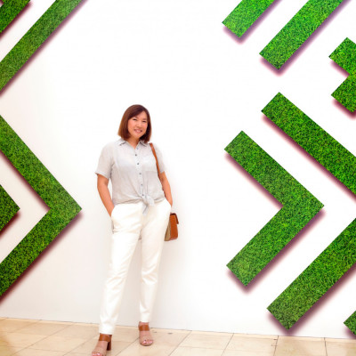
In photographic composition, the 'frame' refers to the rectangular view you see through your camera. When using this technique, you simply fill the frame with more of your subject, thereby reducing the amount of background or negative space shown.
This contest will end on Sunday the 2nd of August at Midnight, like it used to be in the past.
The sooner you upload your submission the more chance you have to gather the most votes.
From Monday morning on you will be able to uploaded your photo here.
 2nd place : by Adolfo Urrutia
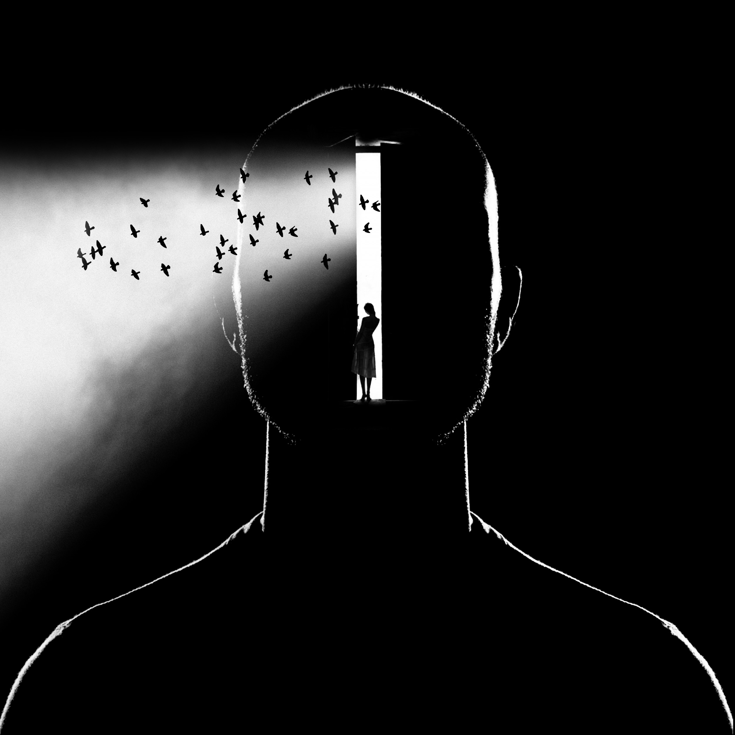 3rd place : by Hadi Malijani (Malenjani)
 Martin Kucera EFIAP AZSF
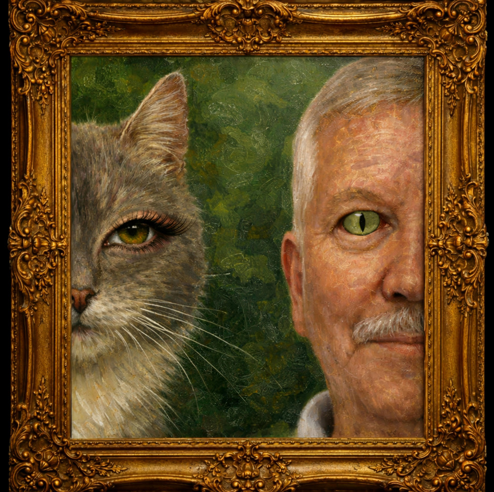 by Olexandr Shpyek
|
 | Yanny Liu PRO Such collection of Creative pictures. Congrations to all the winners! |
| | Creativity at its finest! My sincere congratulations to the winners and honorable mentions. And kudos to Yvette and the 1x management team for running these photo contests. 👏 👏 |
 | Congratulations to all the winners and honorable mentions! Thank you, dear Yvette and the entire 1x team, for your dedication and for making these inspiring contests possible |
| Yvette Depaepe CREW thank you so much for your appreciation, Hadi! |
 | Fiorenzo Carozzi PRO Astonishing images. Congratulations to the authors |
 | Ótima diversão na composição das imagens. Talento quanto baste. |
 | Michel Romaggi CREW Excellent selection! So much creativity and humor. Congratulations to all the participants |
 | Jane Lyons CREW There is so much fabulous humor and creativity here. Congratulations to everyone who entered. |
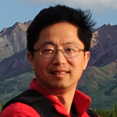
by Yvette Depaepe
Published the 12th of July 2026
James Cai's portfolio is intentionally diverse. Rather than being defined by a single genre, it reflects the people, places, wildlife, architecture, landscapes and moments that have inspired him during his travels. Each image is a photograph that represents an experience and a story from somewhere in the world. Join me on a visual journey through James's amazing body of work.
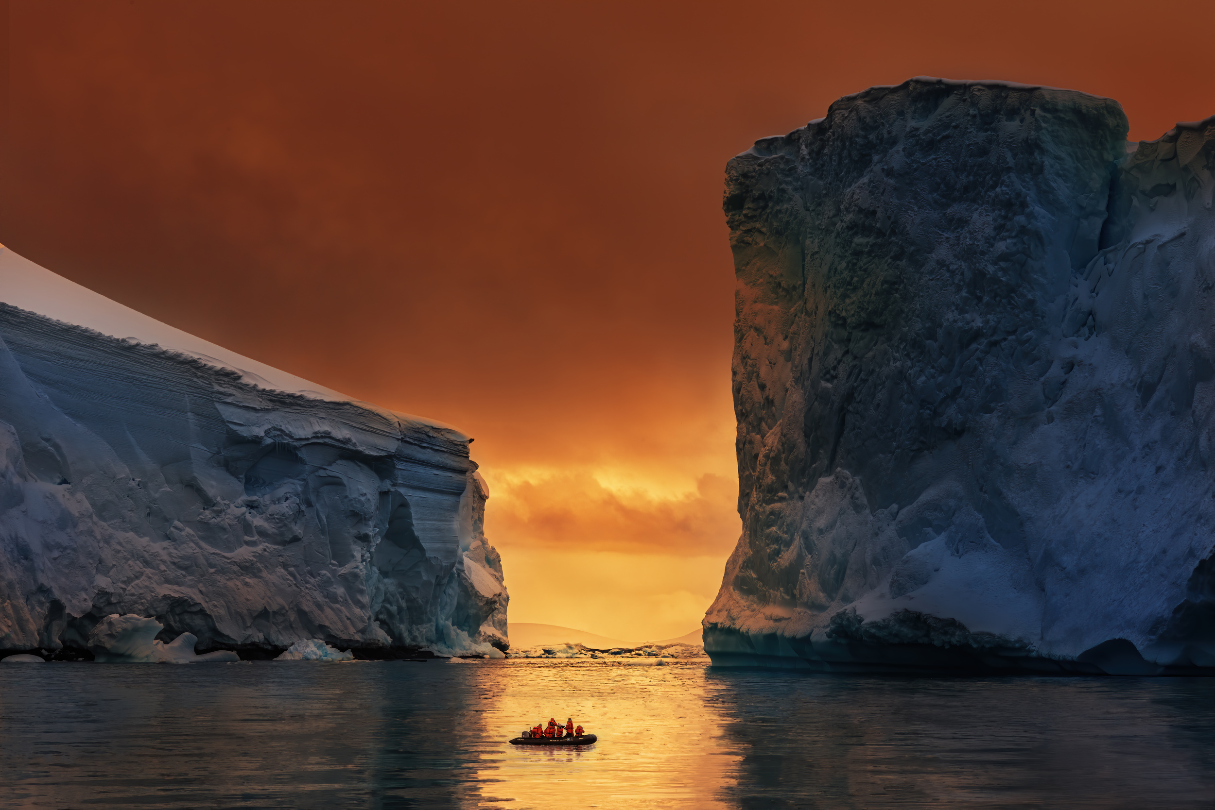
‘Antarctic Fire Gate’
Dear James, firstly, I would like to thank you for taking the time to answer this questionnaire. Could you please start by introducing yourself briefly and telling us about your hobbies and any other projects you are involved in?
Thank you for the invitation, Yvette. It is a great honour to be interviewed by such a renowned art platform as 1x.com. Over the years, I have found endless inspiration and encouragement within the 1X community and learnt a great deal from its diverse and talented pool of photographers.
I have lived and worked in the greater Chicago area for many years. While my professional career is outside the art world, I have been a lifelong admirer of the visual and performing arts. Photography has become a vital extension of this passion, offering me a way to engage with the world more deeply.
To me, light feels like a guiding destiny, and photography is its visual poetry, transforming fleeting moments into lasting expressions of emotion and meaning.
How and when did you start your journey in photography?
My journey in photography began over thirty years ago with a simple point-and-shoot camera. I used it to capture fragments of family life: travel days, children’s laughter and those ordinary moments that fly by. Initially, photography was never about art, only about preserving memory. Yet beneath that simple joy, a creative question slowly emerged: why did these images so often fail to capture the life and emotion I had experienced in those moments?
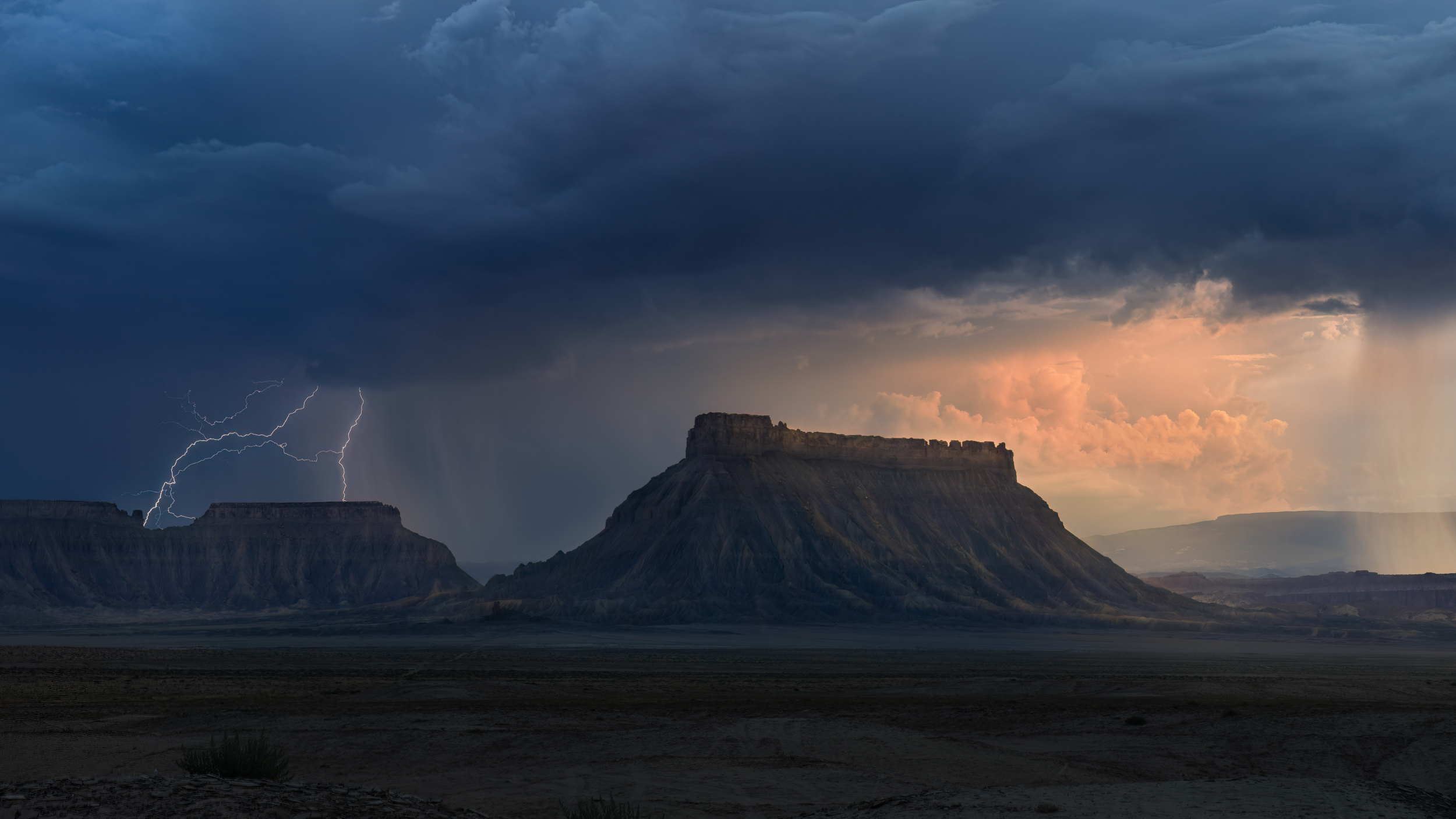
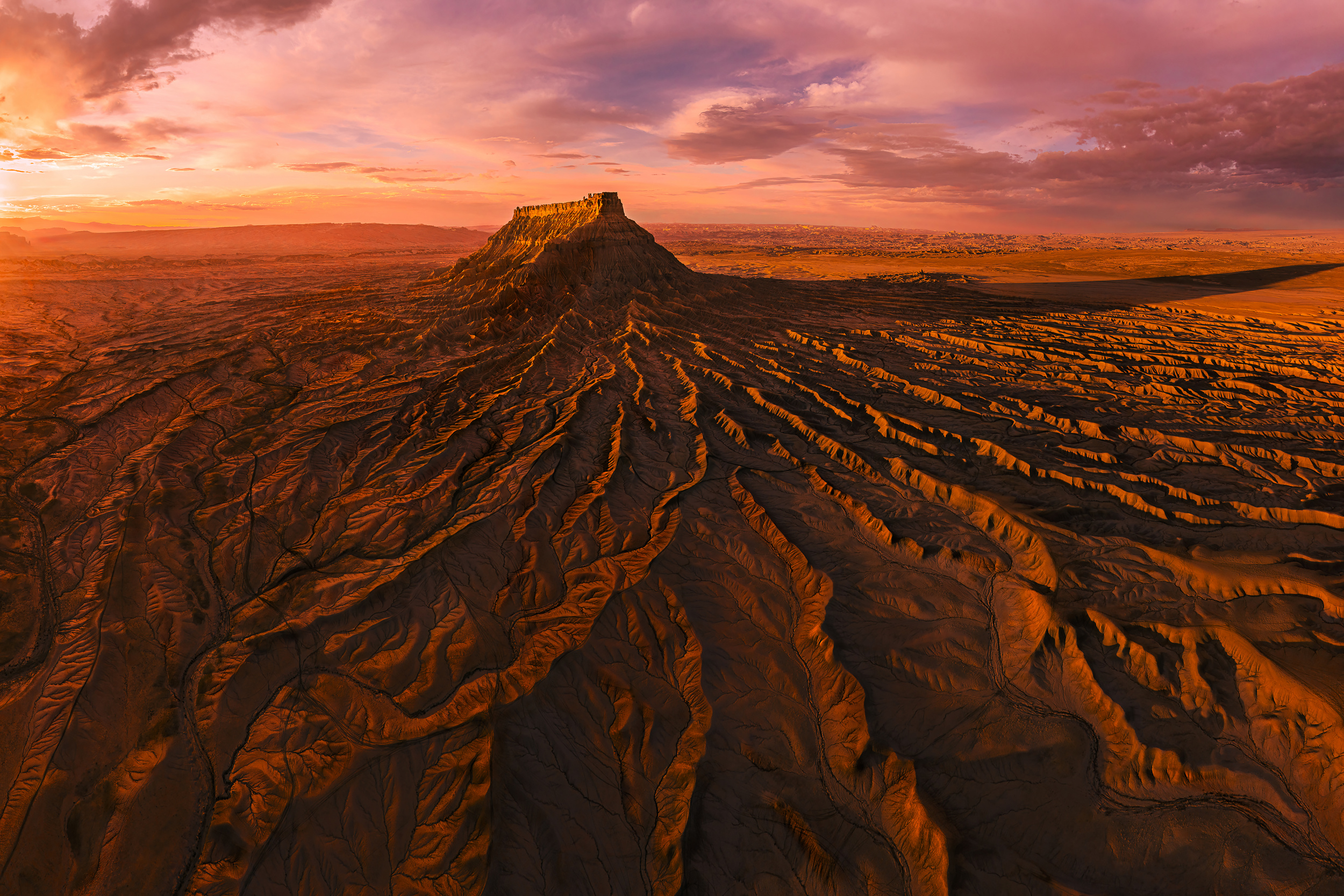
‘A Lightning on the Butte’
In 2016, I attended a photography forum hosted by an international group of celebrated artists. It was there that I stepped into a wider world of vision and intention. It was an awakening. I was introduced to the language of composition, the poetry of light, the rhythm of framing and the subtle craft of pre-visualisation and post-processing. I began to follow the light more deliberately, waiting for the right moment rather than chasing it, and listening to the quiet dialogue between the subject and its shadow. Post-processing became a form of interpretation and expression. Photography became less of a hobby and more of an integral part of my being — a continuous unfolding of attention and emotion.
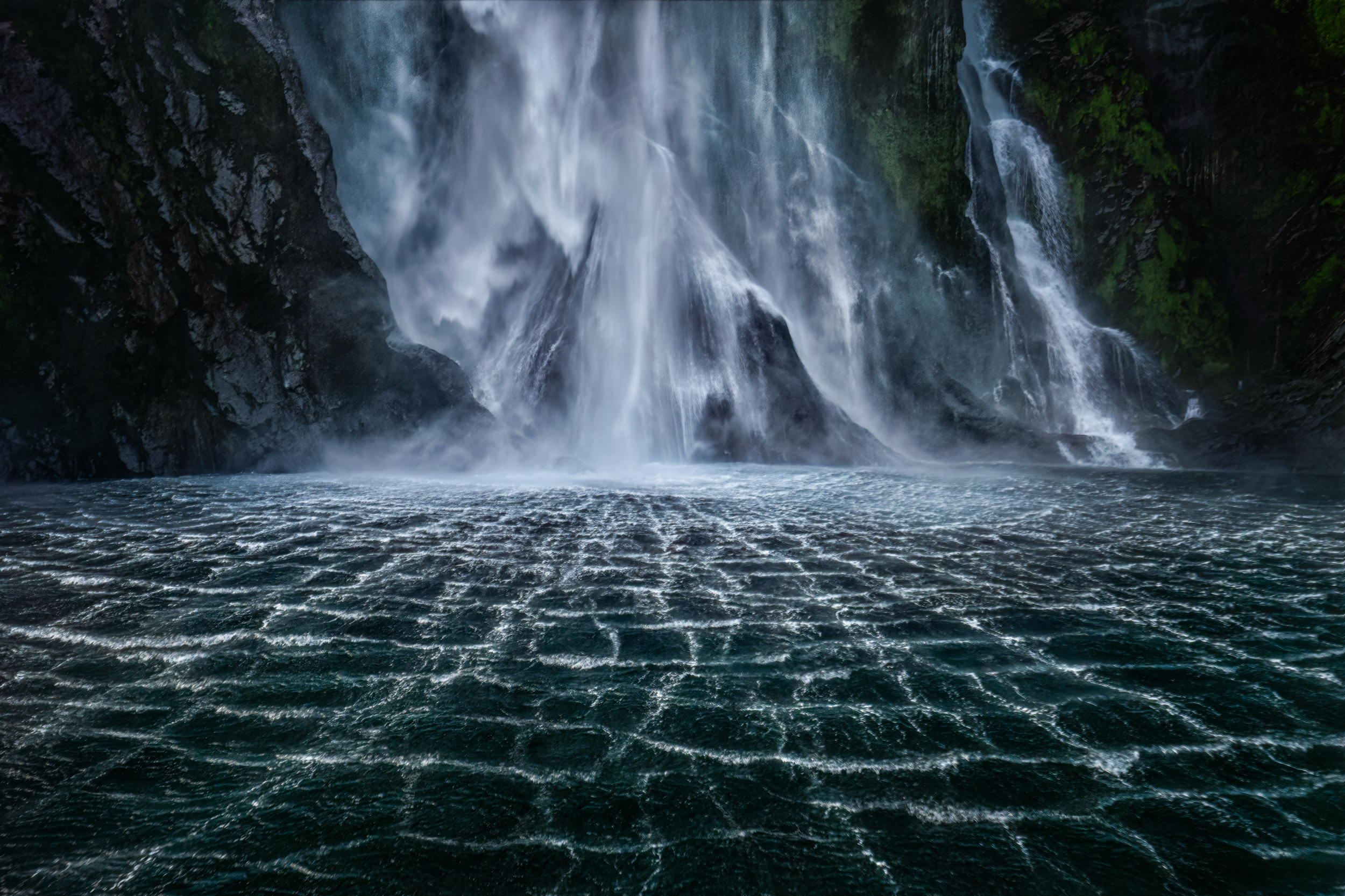
‘Veil of the Waterfall’
Today, I see myself as a humble chaser of light. I am still learning and searching, and I am still moved by the silent poetry hidden in everyday life.
For many of us, photography is a hobby or a way of life. So, how would you describe your relationship with photography?
By immersing myself in the world of photography, I gradually developed a heightened sensitivity to light, shadow, shape and form, almost like a sixth sense. Over time, I began to see the world through the lens of photography, using it to observe living beings and the environment around me.
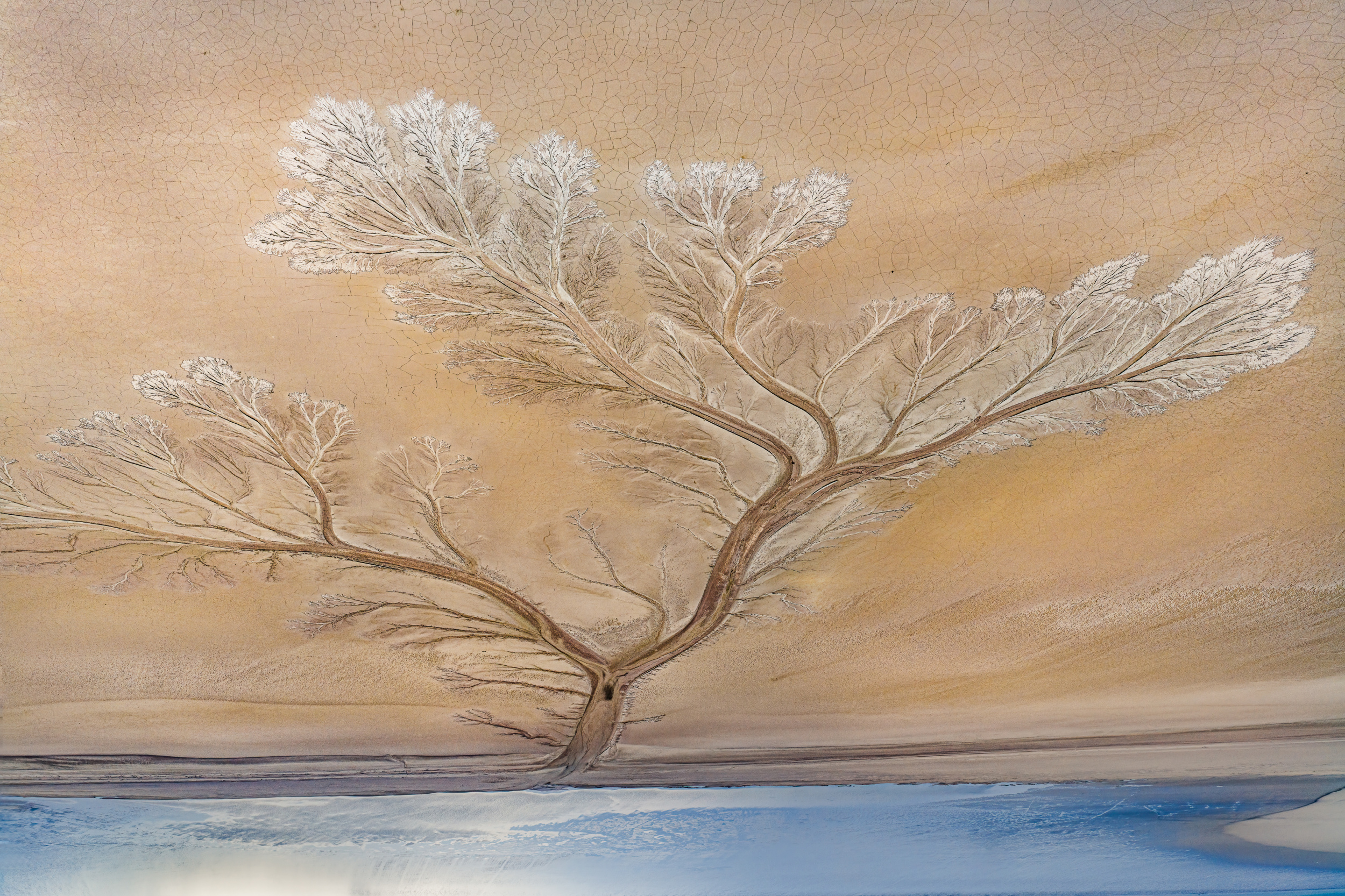
‘A Tree’
This shift brought with it an extraordinary ability: the capacity to sense a place's subtle vibrations and feel a moment's atmosphere before it fully unfolds. Photography became a means of capturing fleeting moments, transforming ordinary, passing instants into concentrated emotional expressions.
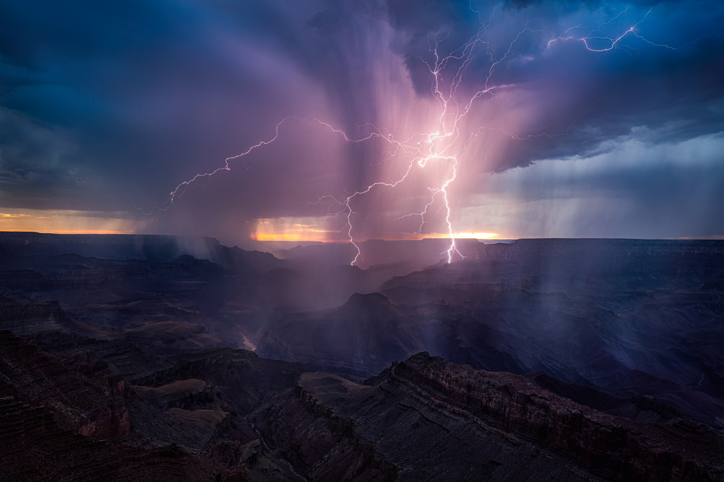
‘Splash of a Lightning’
On this journey, light feels like a guiding destiny: ever-shifting yet always leading the eye and spirit forward. In turn, the camera becomes my pen, a tool that can express what words often cannot and give shape to the silent conversations between perception and feeling.
‘A Sunset Rhapsody’
‘Roots of the Earth’
Which experience has had the greatest influence on your photographic journey so far?
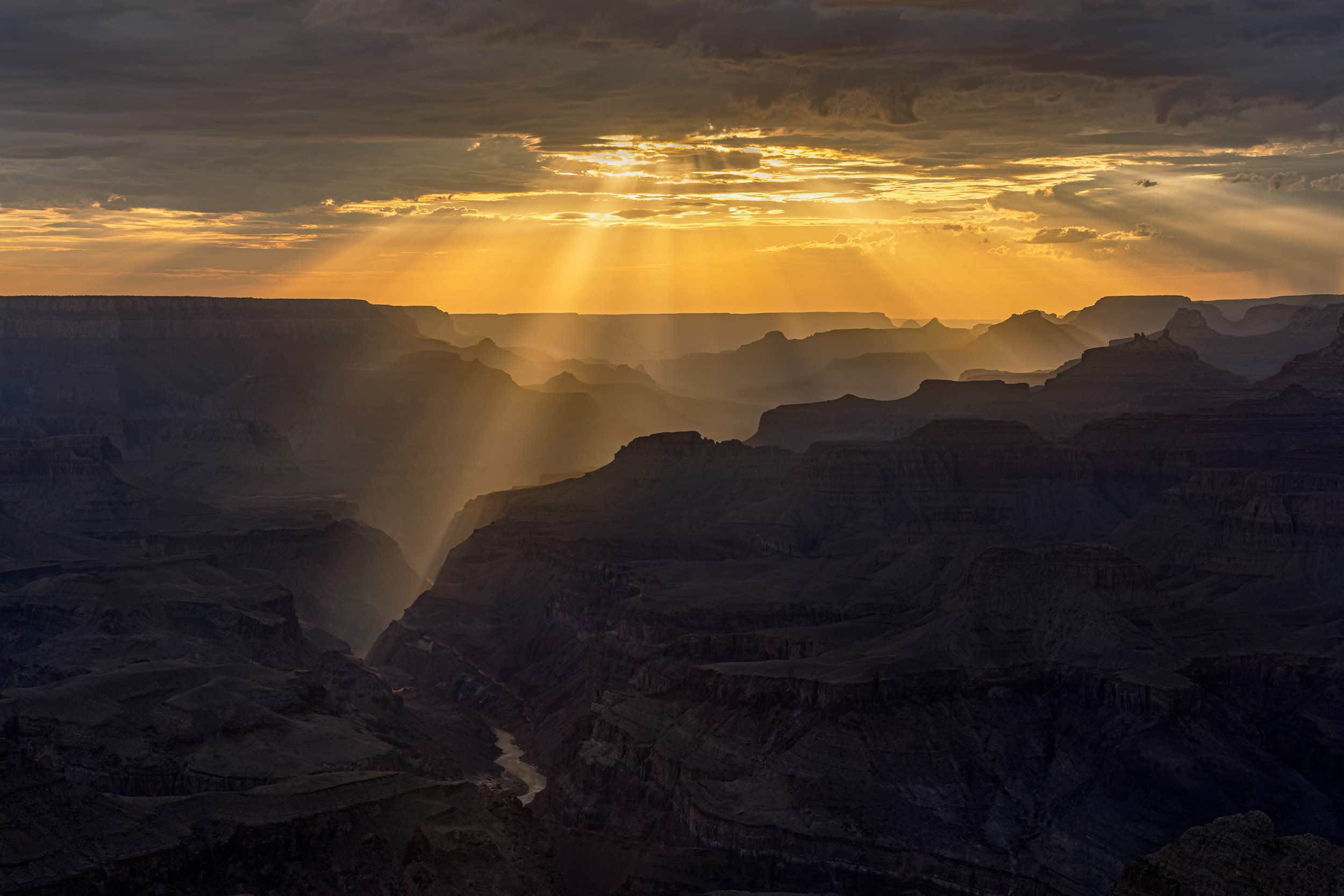
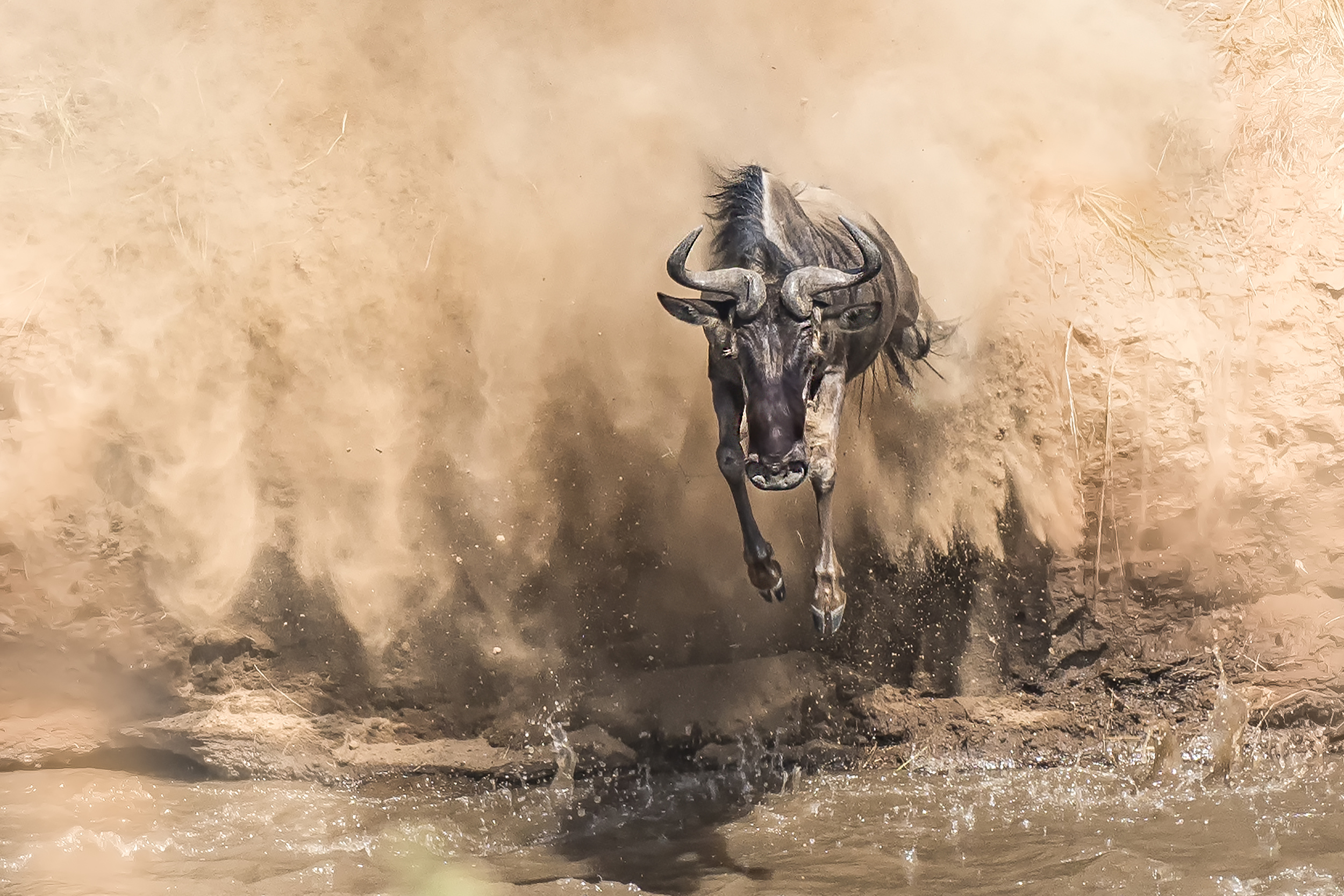
In 2017, I went on my first photography tour, led by Jeffrey Wu. We spent two weeks in Kenya, particularly in the Maasai Mara Conservation Area. This was my first time encountering wild animals in their natural habitat, and it was a truly eye-opening experience. Unlike my previous travels, which had taken me to many parts of the world, this journey was deeply rooted in untamed nature, offering a raw, unfiltered connection with life in the wild.
I took countless photos during the trip, but more importantly, it changed the way I saw and approached photography. One of those photographs was the first image I had featured on 1x.com, and it became the most liked photo in my portfolio.
‘Breakthrough’
That experience was a turning point for me. It strengthened my technical skills, deepened my emotional connection to photography, and confirmed my passion for telling stories through the natural world.
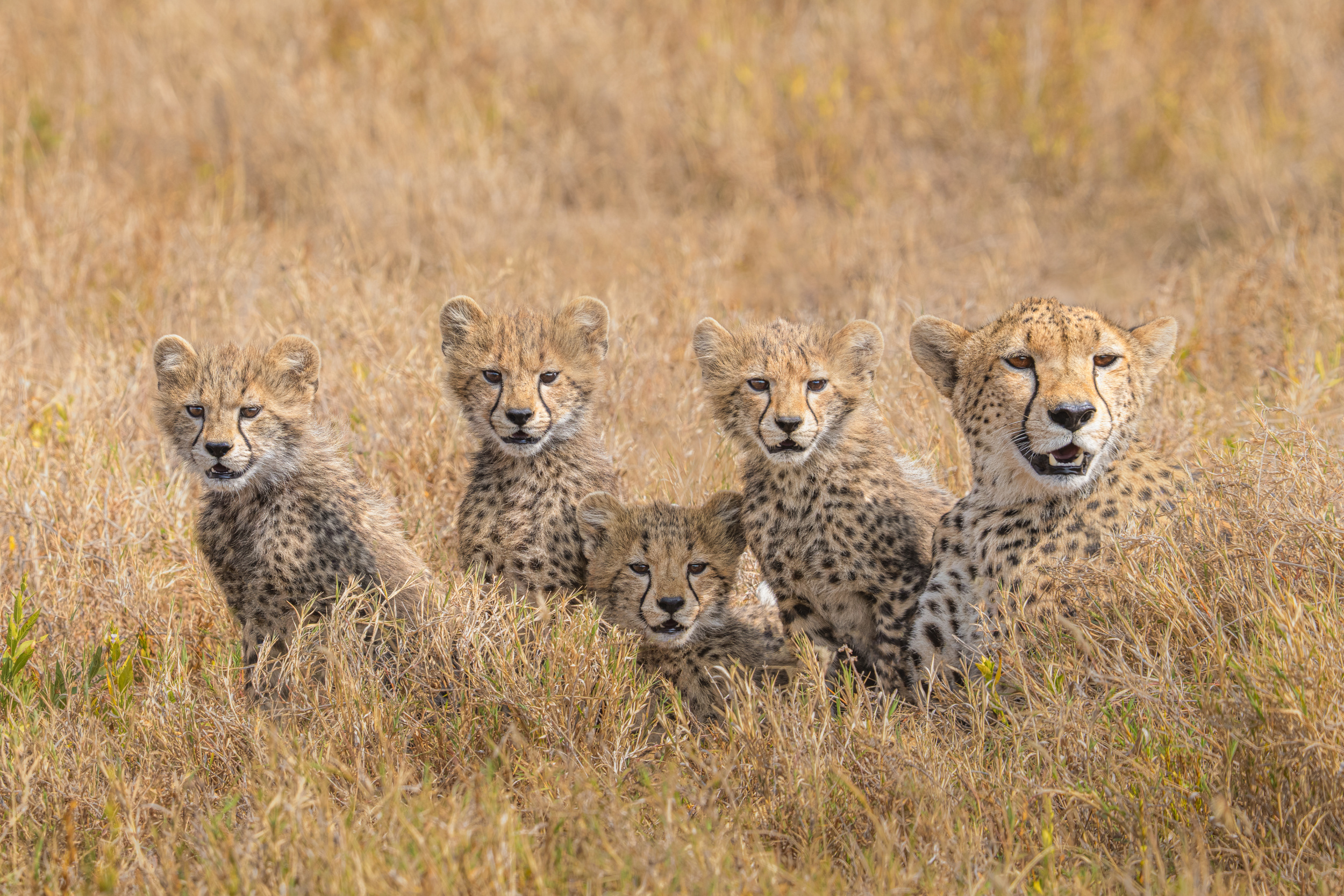
‘Mom and Cubs’
You have a diverse body of work. I see wonderful landscapes, stunning aerial shots, and beautiful wildlife photography. What draws you to these different genres?
Travel is a big part of who I am. I prefer to explore the world and experience different cultures, landscapes and ways of life rather than travelling with a specific photographic subject in mind. Although photography often accompanies our travels, it is not always the main reason for going somewhere.
This approach naturally leads to opportunities to photograph a wide variety of subjects, both within and beyond our comfort zones. Consequently, my portfolio is intentionally diverse. Rather than being defined by a single genre, it reflects the people, places, wildlife, architecture, landscapes and moments that have inspired me on my travels. Each image represents an experience and a story from somewhere in the world, as well as being a photograph.
‘A Playing Scene’
Which is more important to you: the mood or story behind your images, or technical perfection?
Although both are important in the creative process, I would prioritise story or mood over technical perfection. To me, photography is primarily about conveying emotion and/or meaning rather than achieving flawless technical execution.
‘My meal too!’
I often think of it in terms of music. The composer writes the musical score, which sets out the structure, story and emotional foundation of the piece. However, it is the conductor and musicians who breathe life into it, interpreting it with technical skill and personal expression.
Similarly, an image may rely on technique, but it is the underlying story that gives it soul. The story forms the invisible foundation that carries emotion and energy, while technical elements simply serve to support and express it. Without an emotional core, even the most technically perfect image can feel empty.
Do you carefully select the locations at which you intend to take photographs?
I value spontaneity and action when it comes to capturing the moment as it unfolds. Before a project, I usually scout the landscape using Google Maps, or research potential subjects online. This preparation helps me to understand the environment better while still allowing room for intuition and the unexpected in the field.
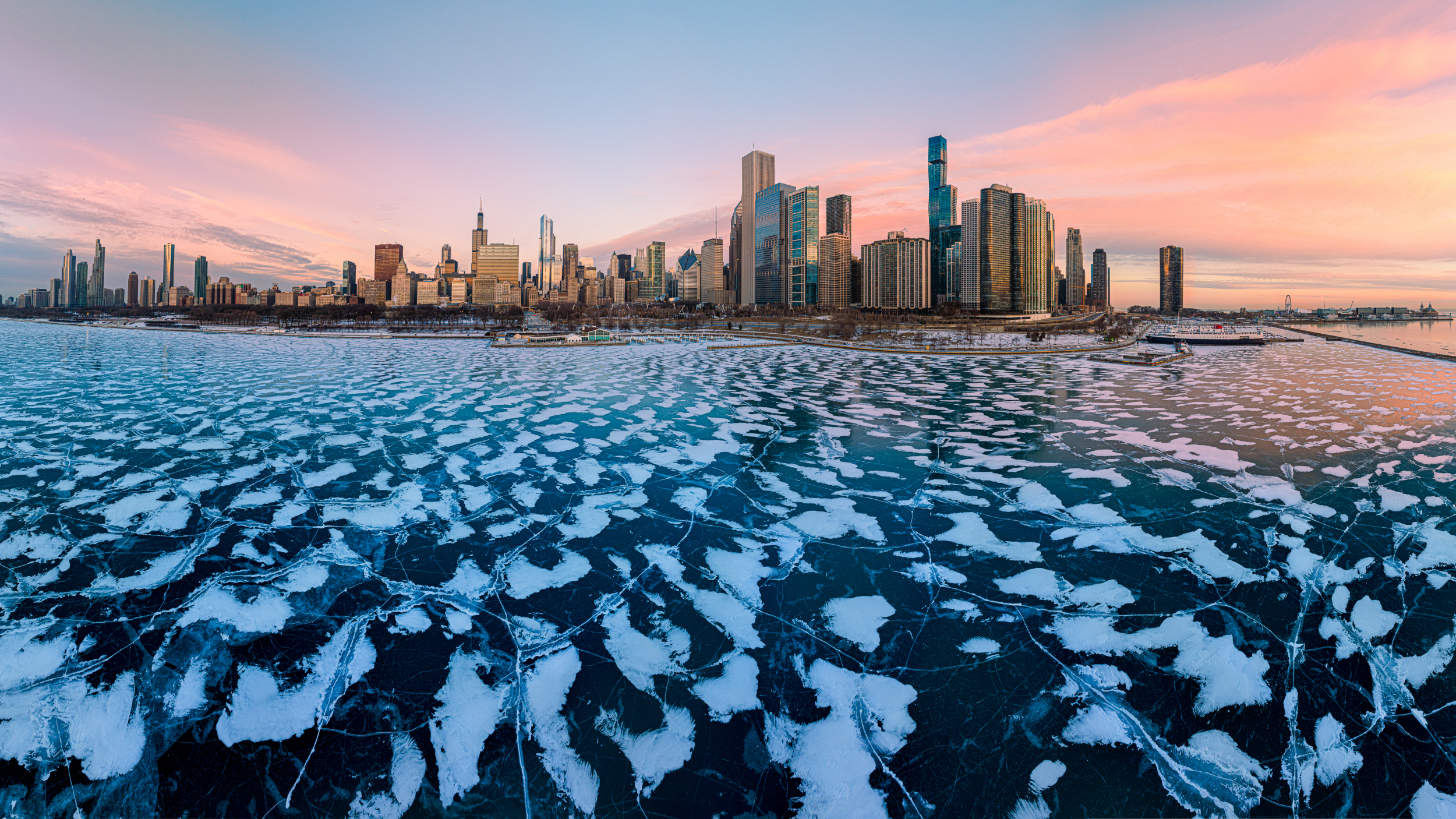
‘Chicago Shoreline and Frozen Lake’
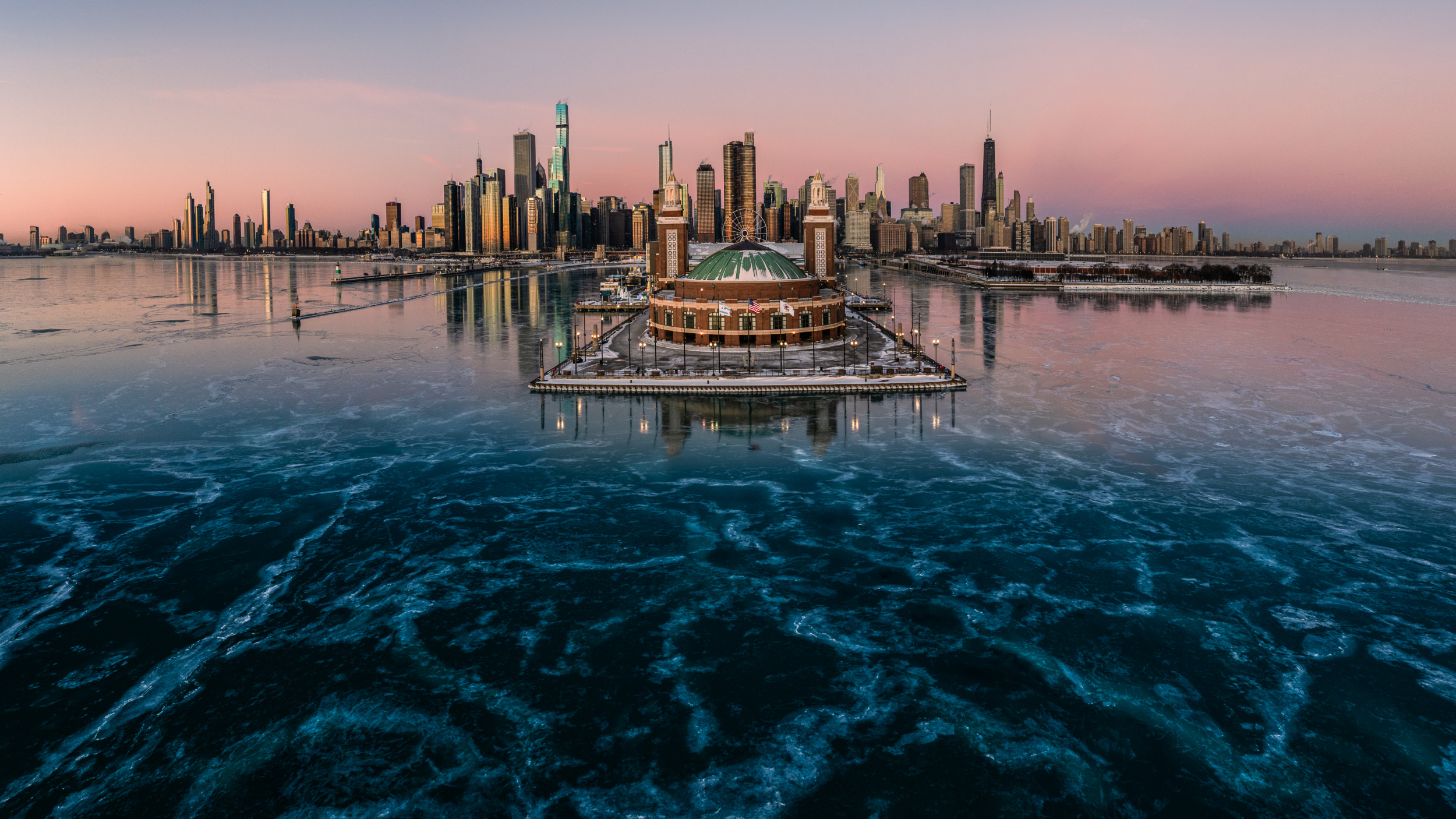
‘Frozen Lake Michigan’
What is your relationship with your subject matter, aside from being an observer?
Photography is not just about observing the subject; it's also about sensing the relationship between the subject, its surroundings, and the frame. The photographer brings these elements together to express his personal view of the scene.
In photography, therefore, I see myself not only as an observer, but also as an emotional interpreter — someone who feels as well as sees, and who translates those feelings into a visual form.
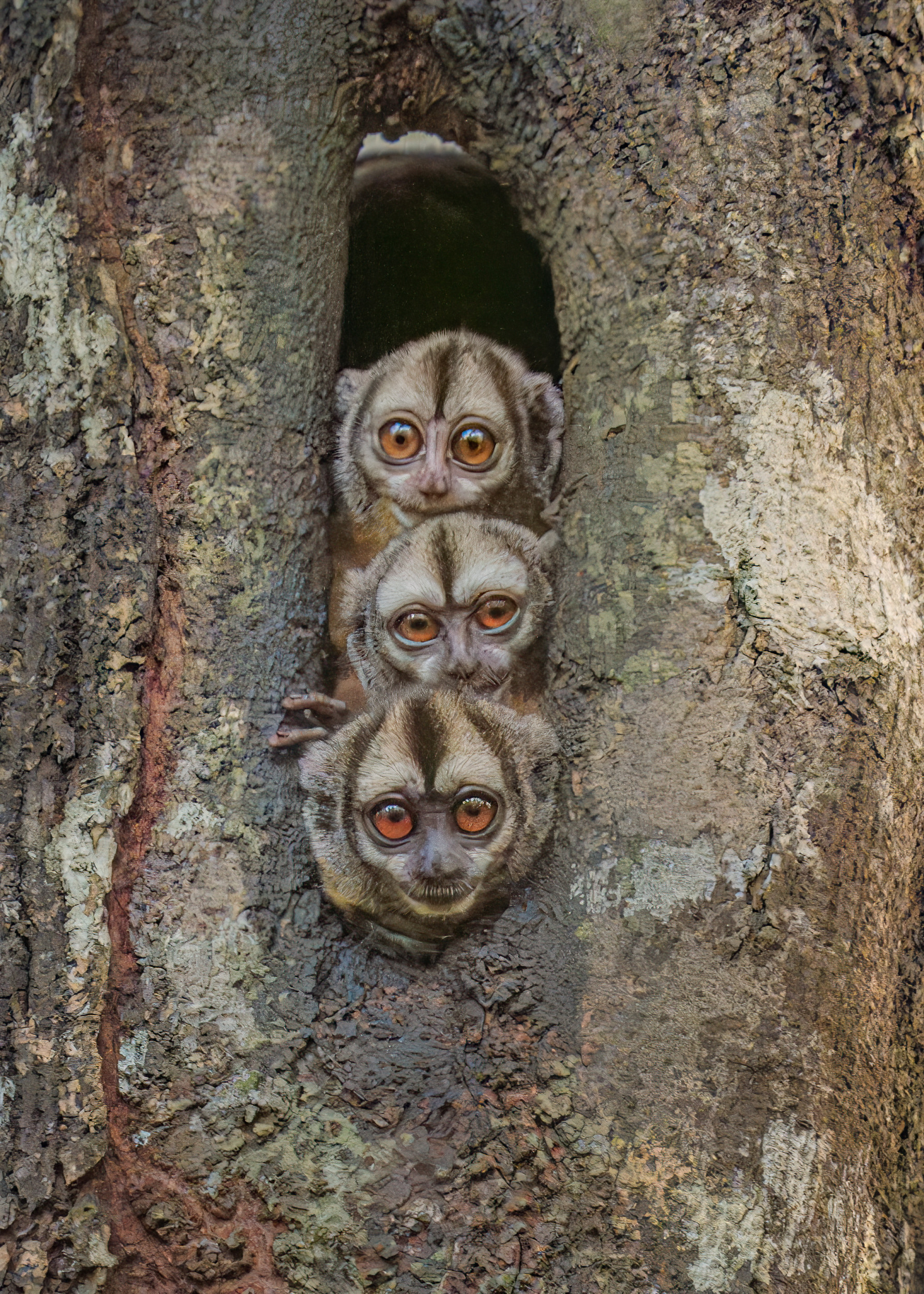
'Night Owl Monkeys’
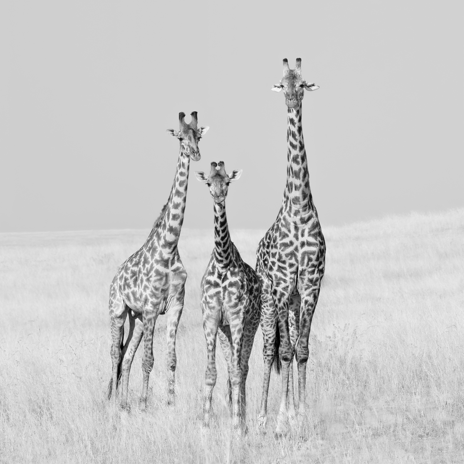
‘Curiosity’
Describe your vision for your photography.
A good photograph can capture the viewer’s attention, evoke a tangible emotion and convey a touching narrative. A meaningful image can also encourage people to think, imagine and reinterpret what they see. As an observer, I have come to see photography as a constantly evolving art form that is no longer limited to the faithful recording of reality, but is opening itself up to more experimental and expressive possibilities. Through mixed media and other as yet undefined possibilities, photography continues to expand the language of visual storytelling.
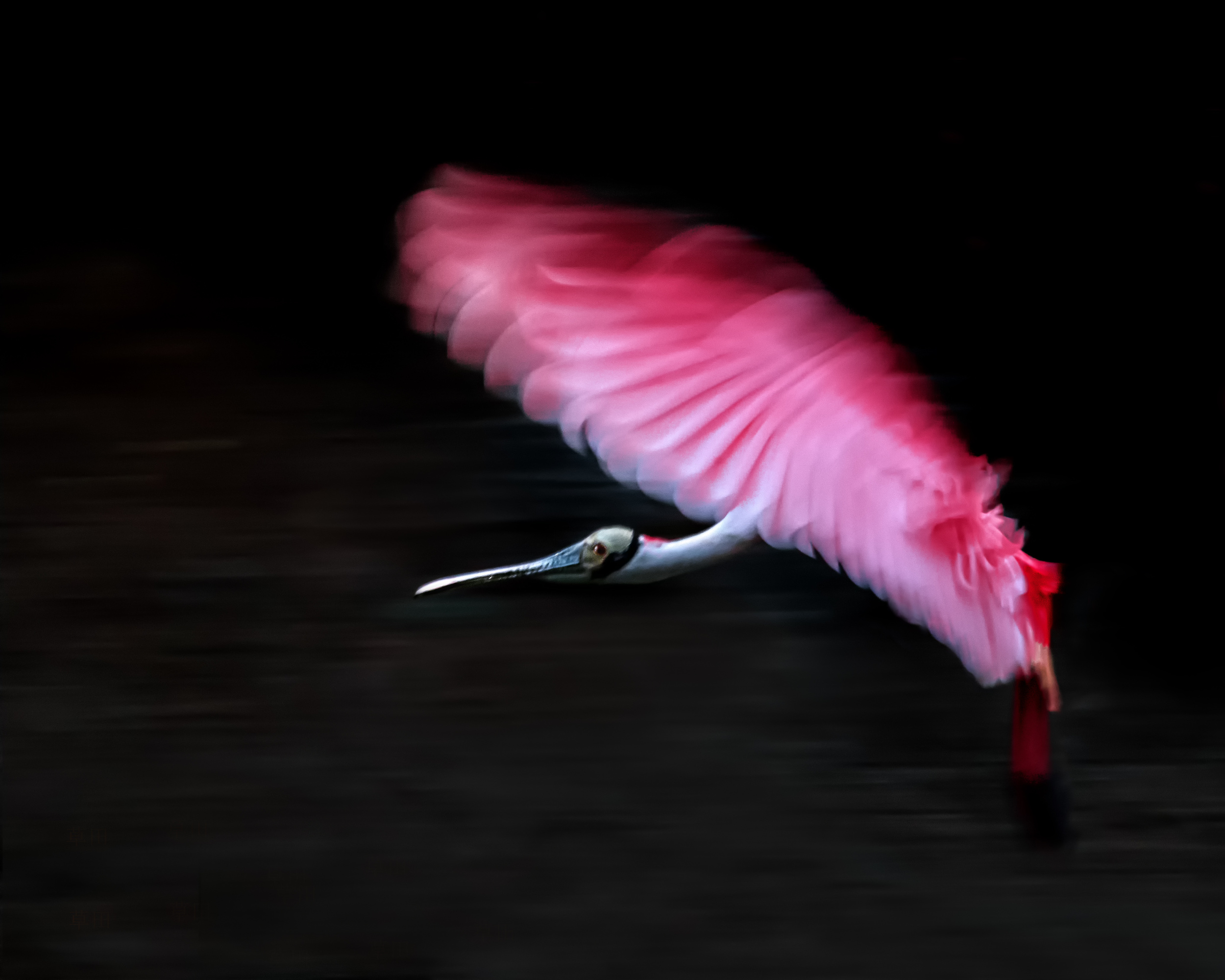
‘Flying Rose’
Where do you find inspiration, and what inspires you most?
I do not see art as an isolated form. Instead, I believe that different art forms are closely connected and can influence one another. As well as photography, I have joined a community choir and played musical instruments, which has helped me to develop a better understanding of rhythm, emotion and expression.
I have also helped to set up a small theatre for a drama group and often attended theatre performances, which provided valuable experience in stage lighting, storytelling and performance space. I also often visit classical and contemporary museums to find inspiration and observe different forms of artistic expression.
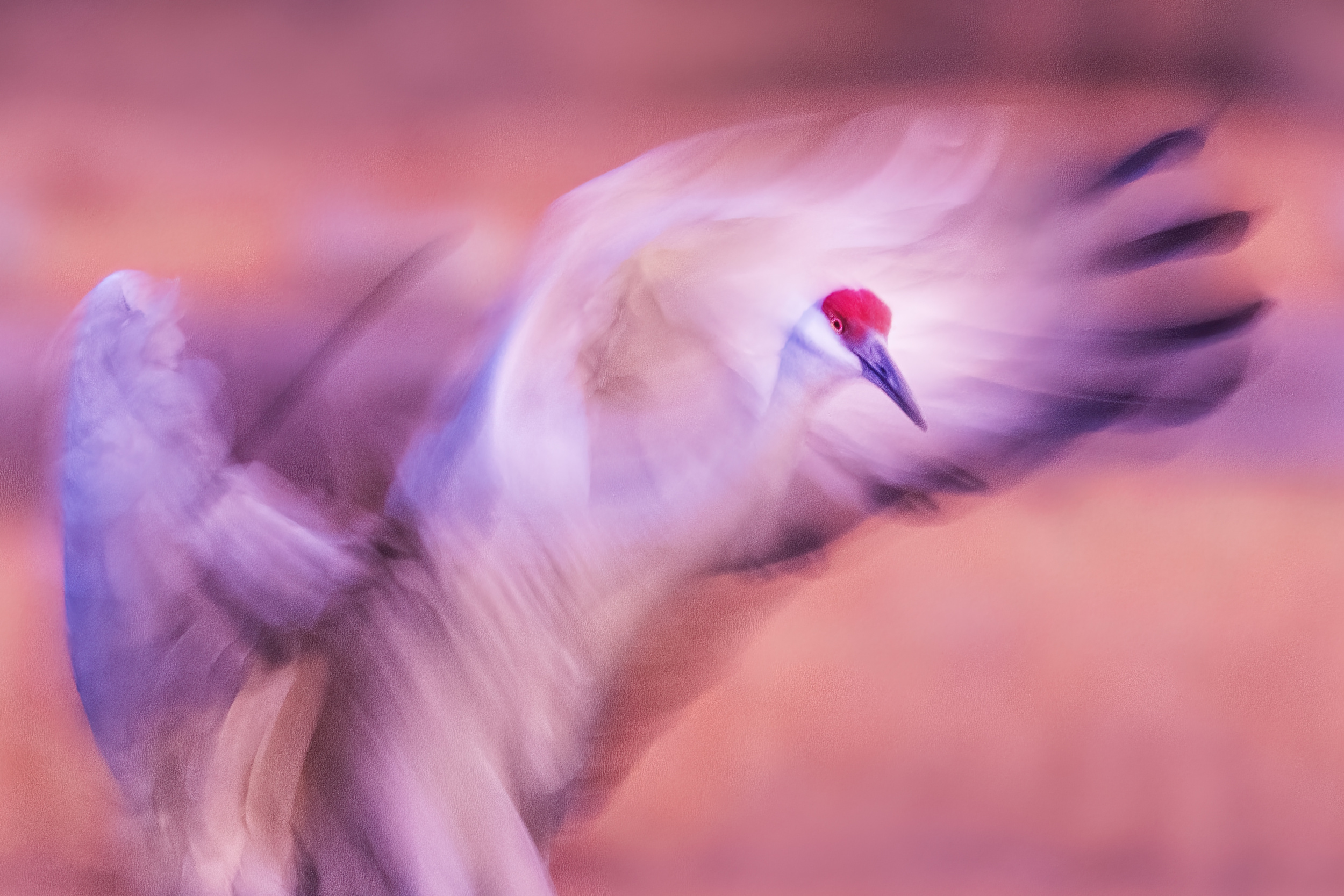
‘The Dance’
Through these experiences, I have come to see art as a shared language. Music, performance and visual art all express human emotion differently and continually enrich each other.
Many people believe that the right gear is unimportant if you're passionate about photography. Could you tell us what equipment you use? For example, what camera and lenses do you use, and what lighting and tripod?
I use the Sony A1 and Sony A7R IV for wildlife and landscape photography. For video projects, I work with the Sony A7SIII series. In addition, I have built a range of Sony lenses that support different creative needs, from wide-angle landscapes to telephoto wildlife work. For aerial perspectives, I use the DJI Mavic 4 Pro, which adds another dimension to my visual storytelling and allows me to explore scenes from a unique and elevated viewpoint. I have a full studio setup with an array of photo lighting equipment.
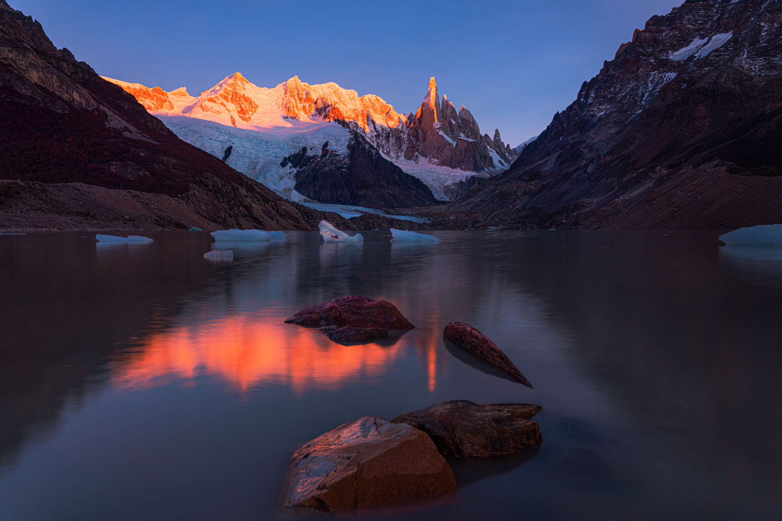
‘Sunshine glazed Cerro Torre’
Which is your favourite photo, and what is the story behind it?
My wife and I recently travelled to Australia and New Zealand, visiting many locations that are well known in the world of photography. Because of this, I did not expect to take any truly exceptional photos.
One evening, however, I found myself at the Church of the Good Shepherd, photographing a night scene. This place has been photographed countless times and widely shared across the internet. It had rained all day, and by sunset the sky was still covered in clouds and there was a strong wind, so conditions were far from ideal. However, at around 7.30pm, the wind began to clear the clouds, revealing a vast, open sky above us. The Milky Way emerged in all its glory. There was also unusually strong geomagnetic activity at that time, and aurora lights began to appear. Amazingly, the Milky Way and the aurora were visible in the same shot, arcing above the quiet silhouette of the old church.
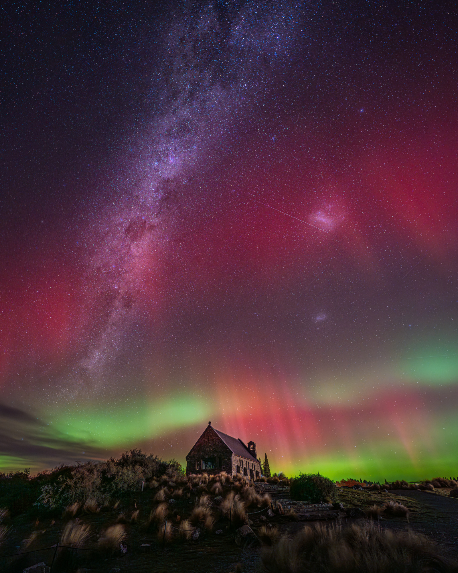
‘Southern Rhapsody’
The rare convergence of two natural elements transformed a familiar scene into something extraordinary and deeply personal. It reminded me that, as in travel, the most memorable moments in photography often arrive unexpectedly, as if nature itself were offering a brief, generous reward for patience and presence.
Which photographers or mentors have influenced you the most?
I was fortunate to meet my mentor, John Fan, who has lived close to me for the past decade. He has had a deep influence on me in all aspects of photography, from observing a scene to understanding the essence of a good image.
I also participated in several photography tours with Yiming Hu and Marc Adamus, which provided me with valuable insights into landscape photography and helped me to further refine my technical and creative approach.
On a personal level, I greatly admire Sebastião Salgado and his work.
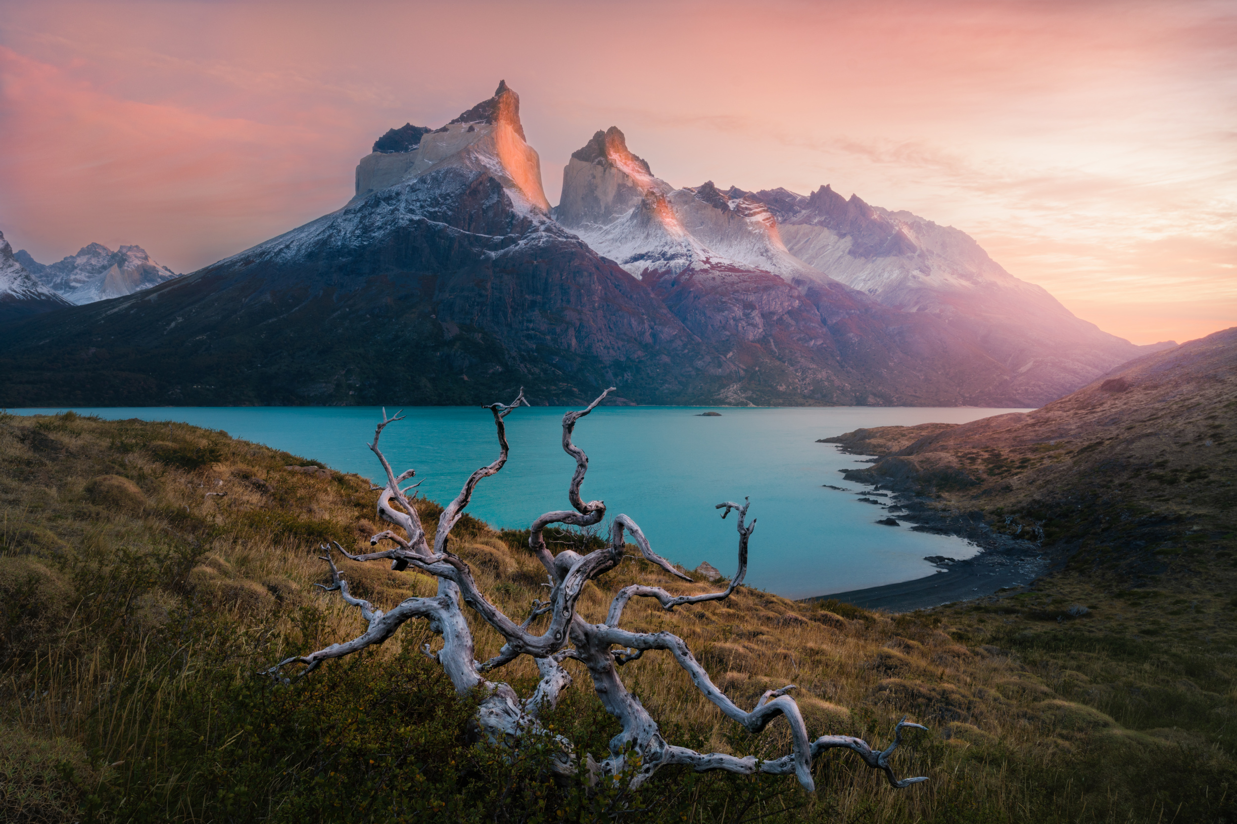
‘Morning in Torres del Paine’
|
 | Vasil Nanev PRO Fantastic work, thank you ! |
 | Kathryn King PRO Truly amazing work. I love the tidal tree and all the images, just wonderful. |
 | James Zhen Yu PRO 恭喜 恭喜 |
 | Lucie Gagnon CREW Wow! Such an impressive and diverse body of work! Magnificent images! Congratulations! 👏👏👏 |
 | Jun Zuo PRO Congratulations, my friend! Great works! |
 | UstinaGreen PRO Super artistic works! The diversity of m and the power of nature in the best execution! Many best compliments and congrats! |
 | Adrian Donoghue PRO great work! |
 | Louise Xie PRO Congratulations brother 🎉 You really deserved👍 |
 | Zhang Dong PRO Congratulations! Amazing artwork! |
 | Chong Q. Wu PRO Best of the best - An exhibition representing the top of 1X 👍 |
 | Leah Xu PRO A truly gifted photographer with an exceptional artistic eye. Congratulations! |
 | Chao Feng 天馬 PRO Impressive body of work. Well deserved, congratulations 🎉 |
| | Yanny Liu PRO Love your pictures. Such grand, majestic feel while beautifully capturing of the landscapes. And spirit and vitality of the animals. Congratulations on your wonderful work! |
| | Yanny Liu PRO Love your pictures. Such grand, majestic feel while beautifully capturing of the landscapes. And spirit and vitality of the animals. Congratulations on your wonderful work! |
 | Hanping Xiao PRO Congratulations my friend. you are well deserved! |
 | Ruiqing P. PRO Congratulations, my friend! This recognition is truly well deserved. Your outstanding landscapes and wildlife images speak for themselves, reflecting years of dedication, patience, and artistic vision. Wishing you many more unforgettable moments behind the camera! |
| | Sublimes photos, congrats |
by Editor Jane Lyons
Edited and published by Yvette Depaepe, the 10th of July 2026
"If you don't have any shadows you're not in the light”
~ Lady Gaga ~
“Dreams” by Igor Baranyuk
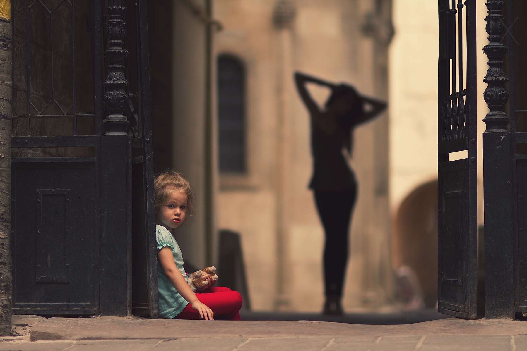
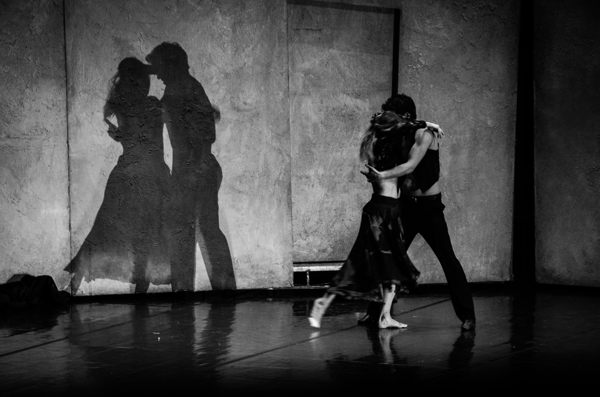
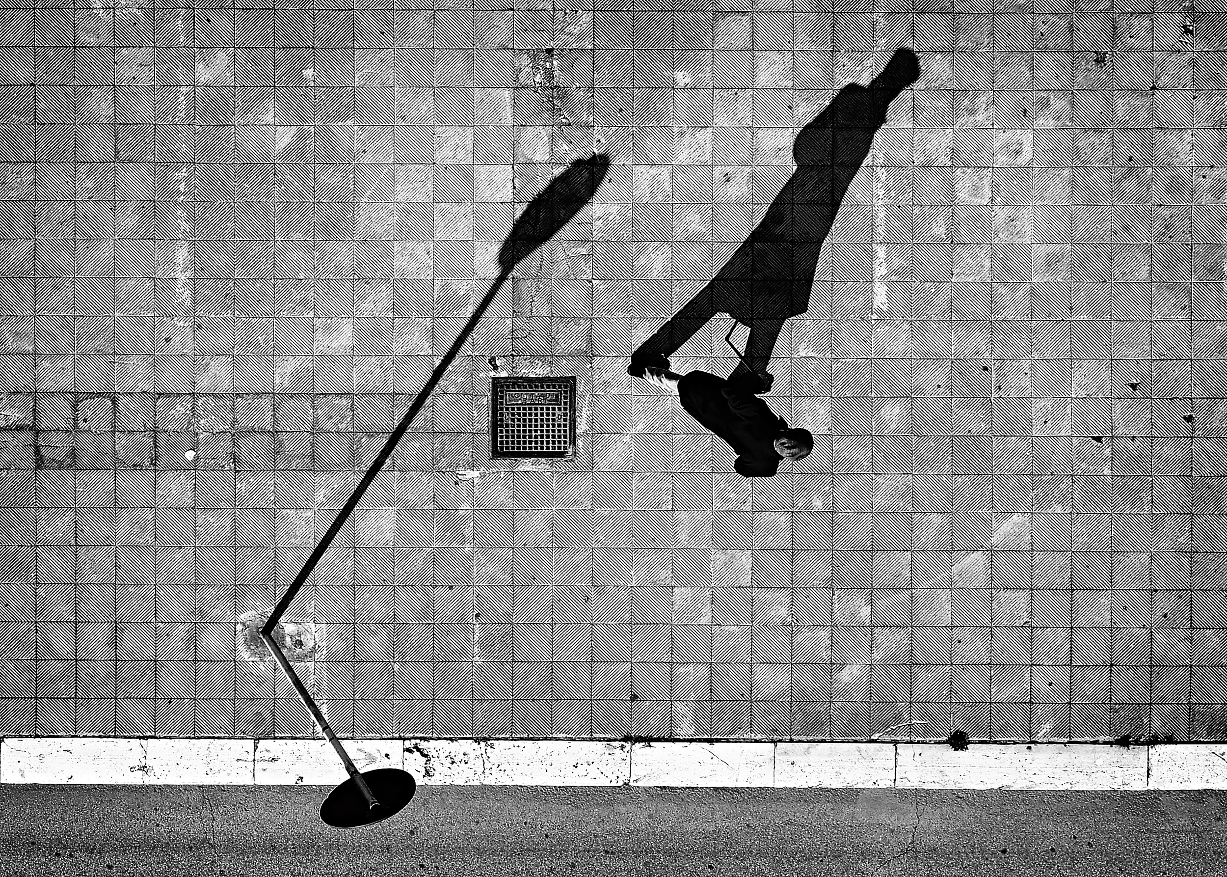
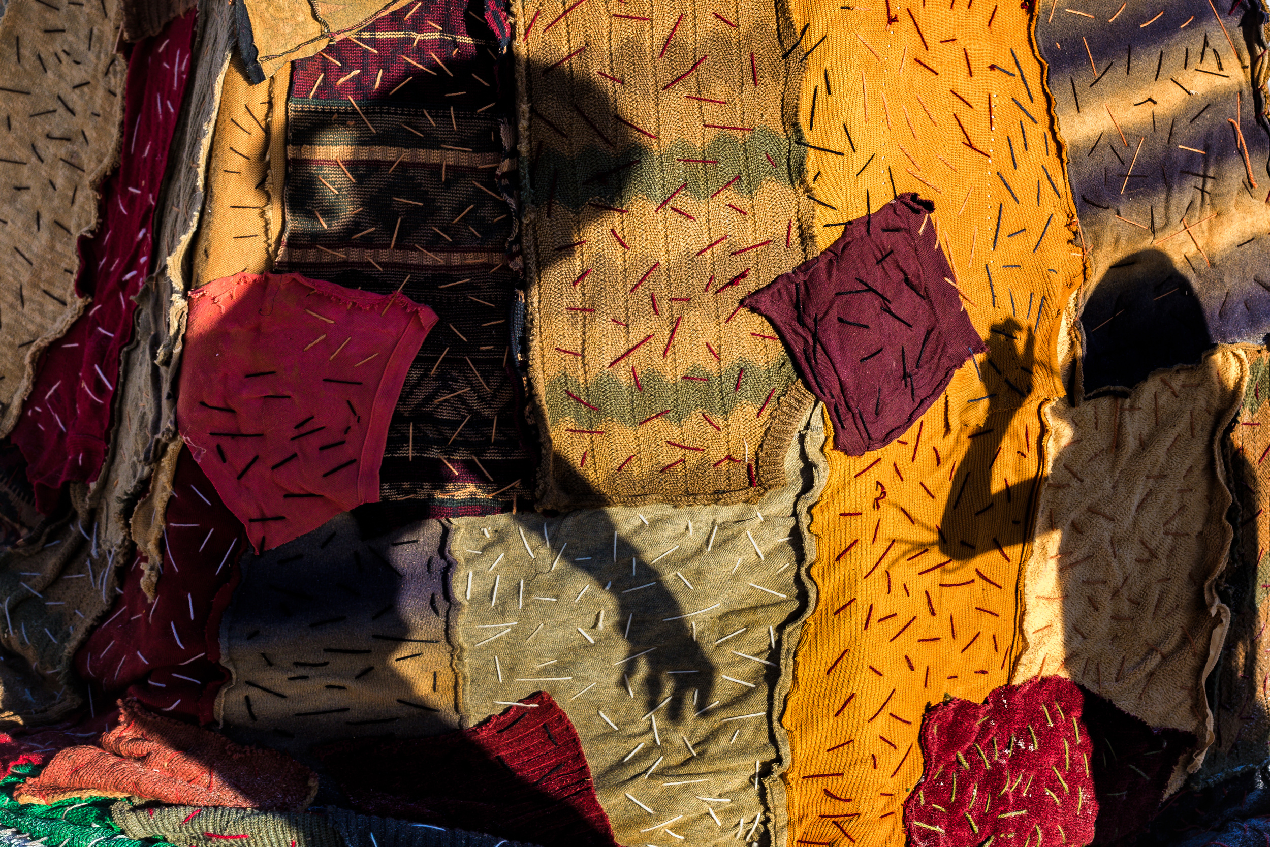
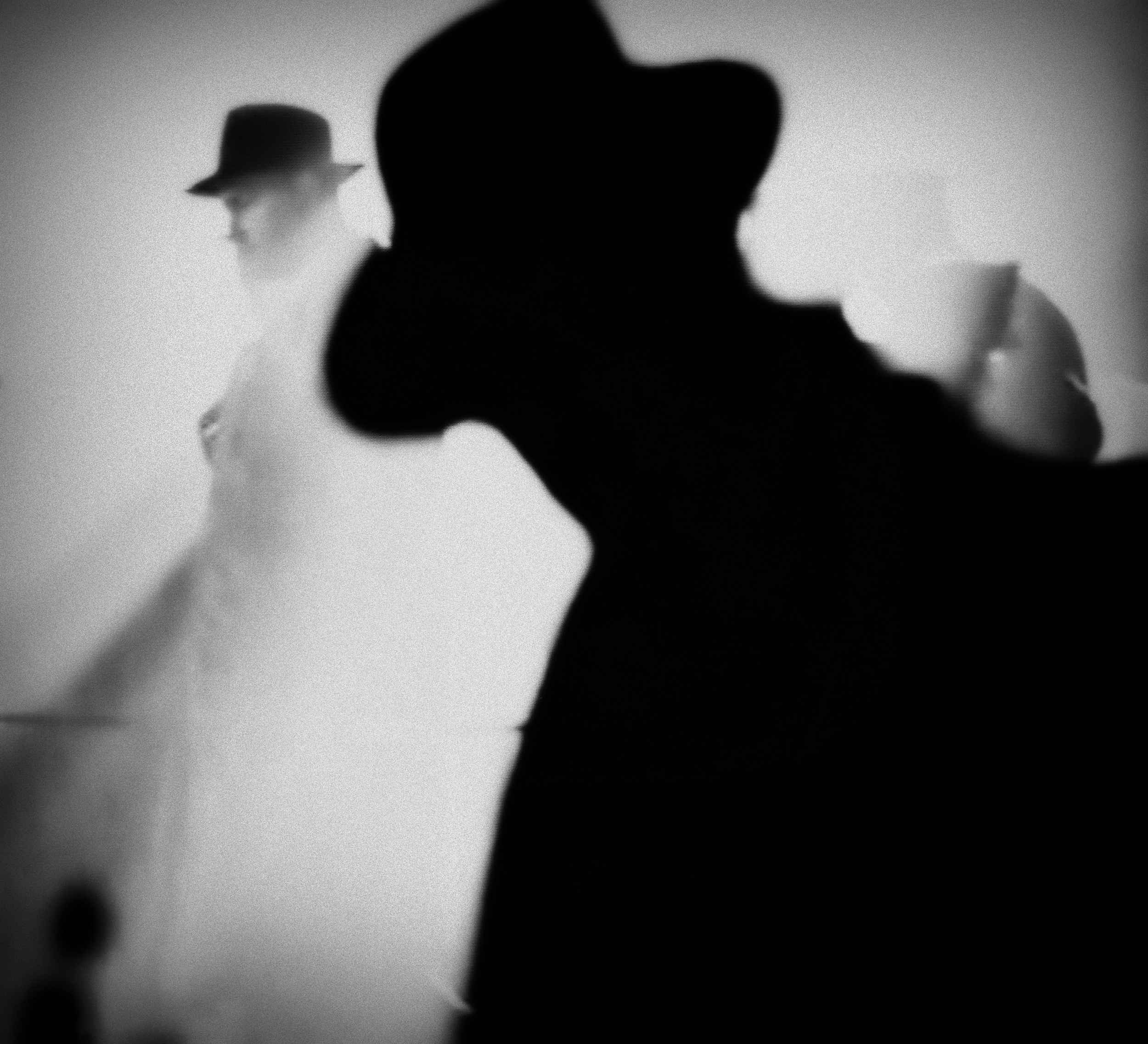
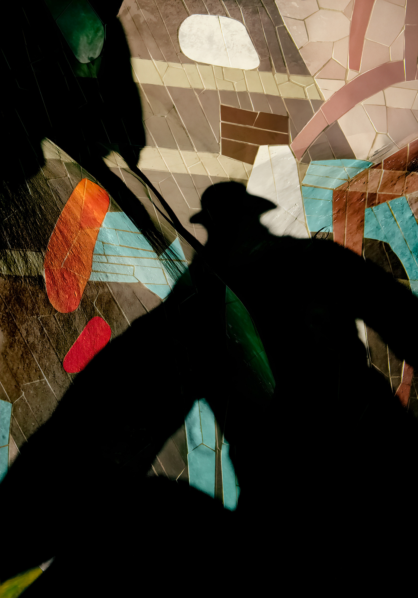
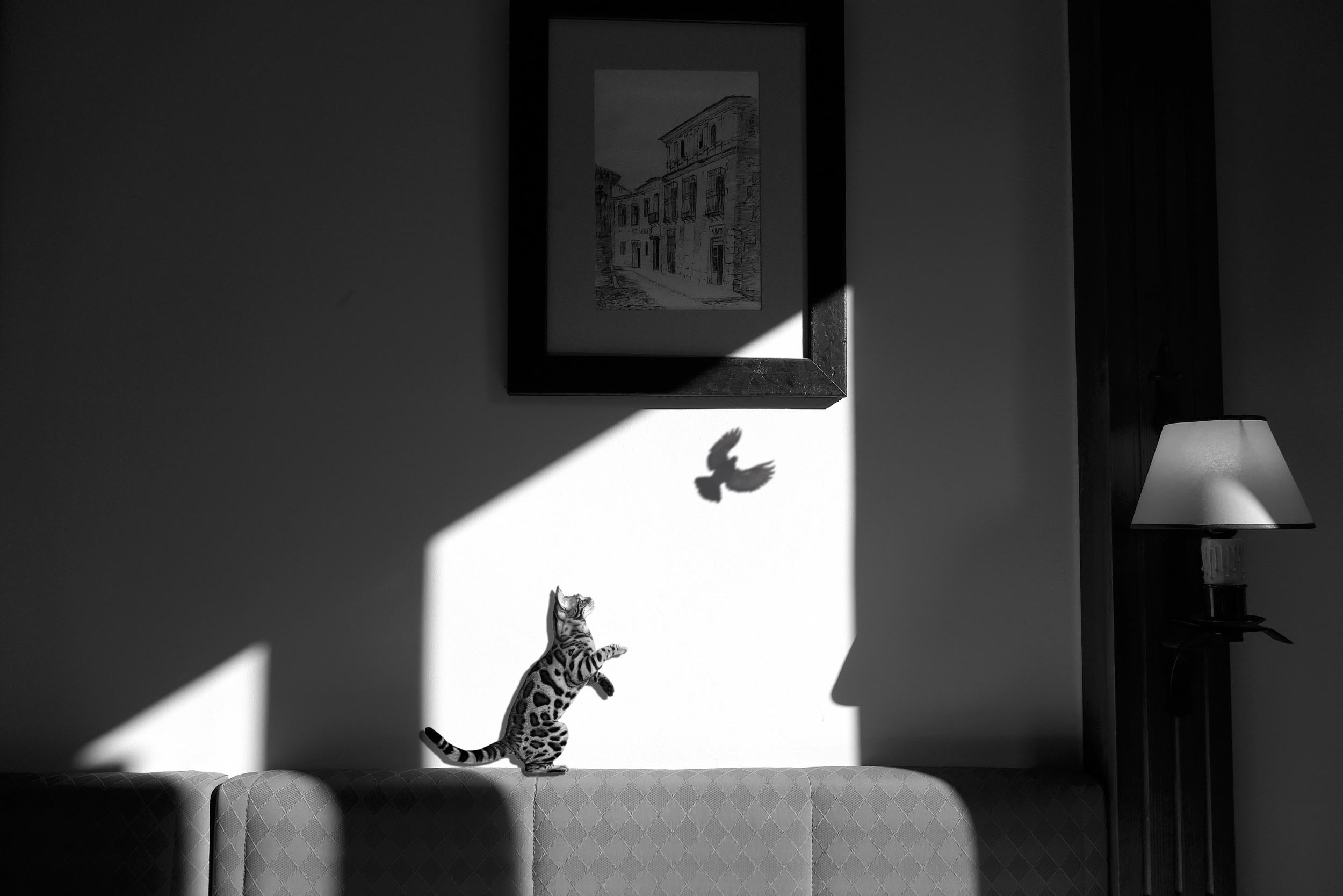
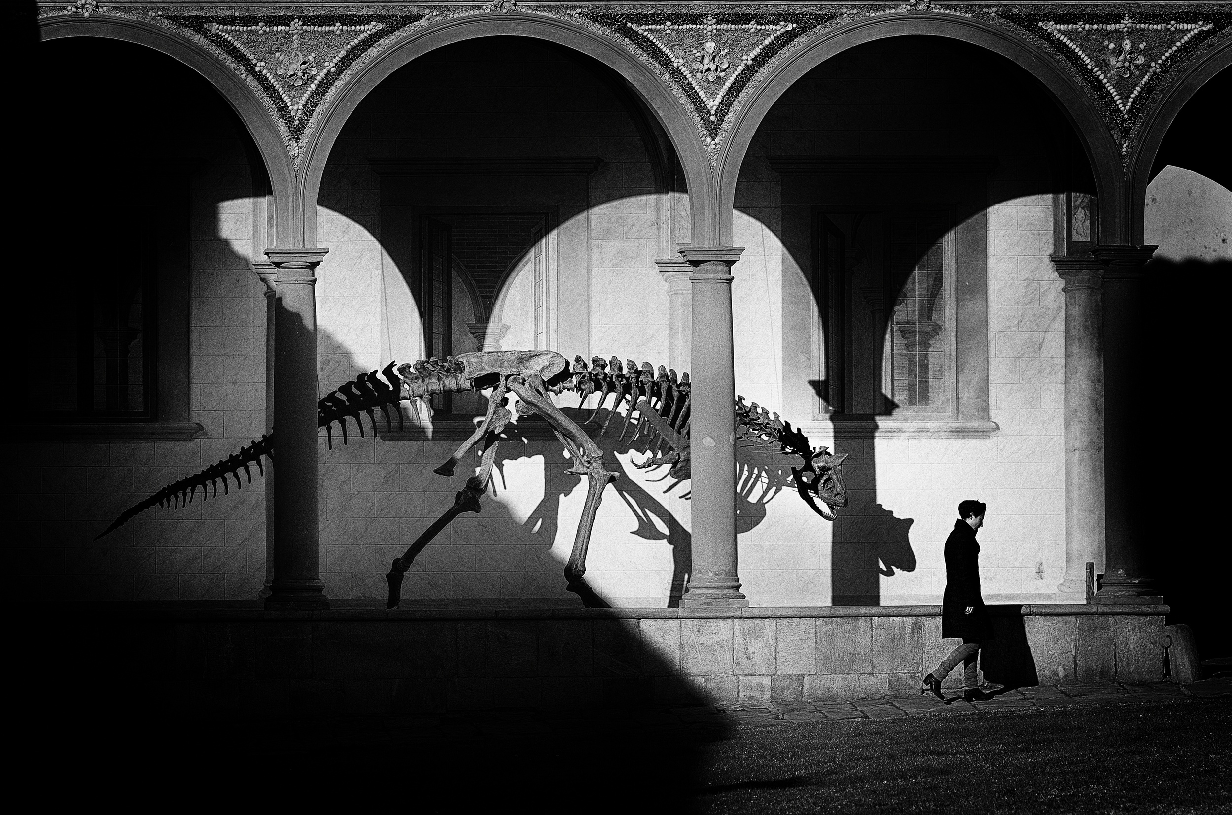
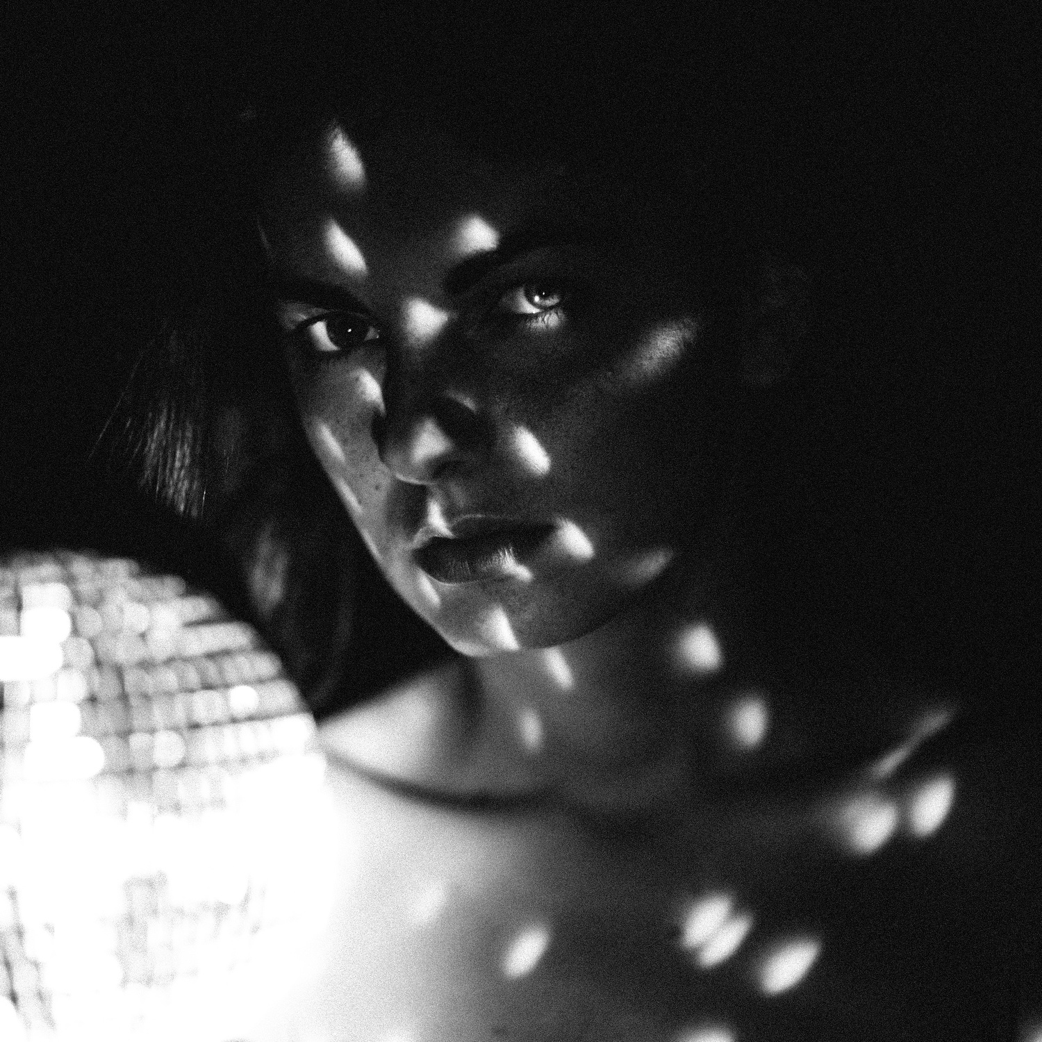
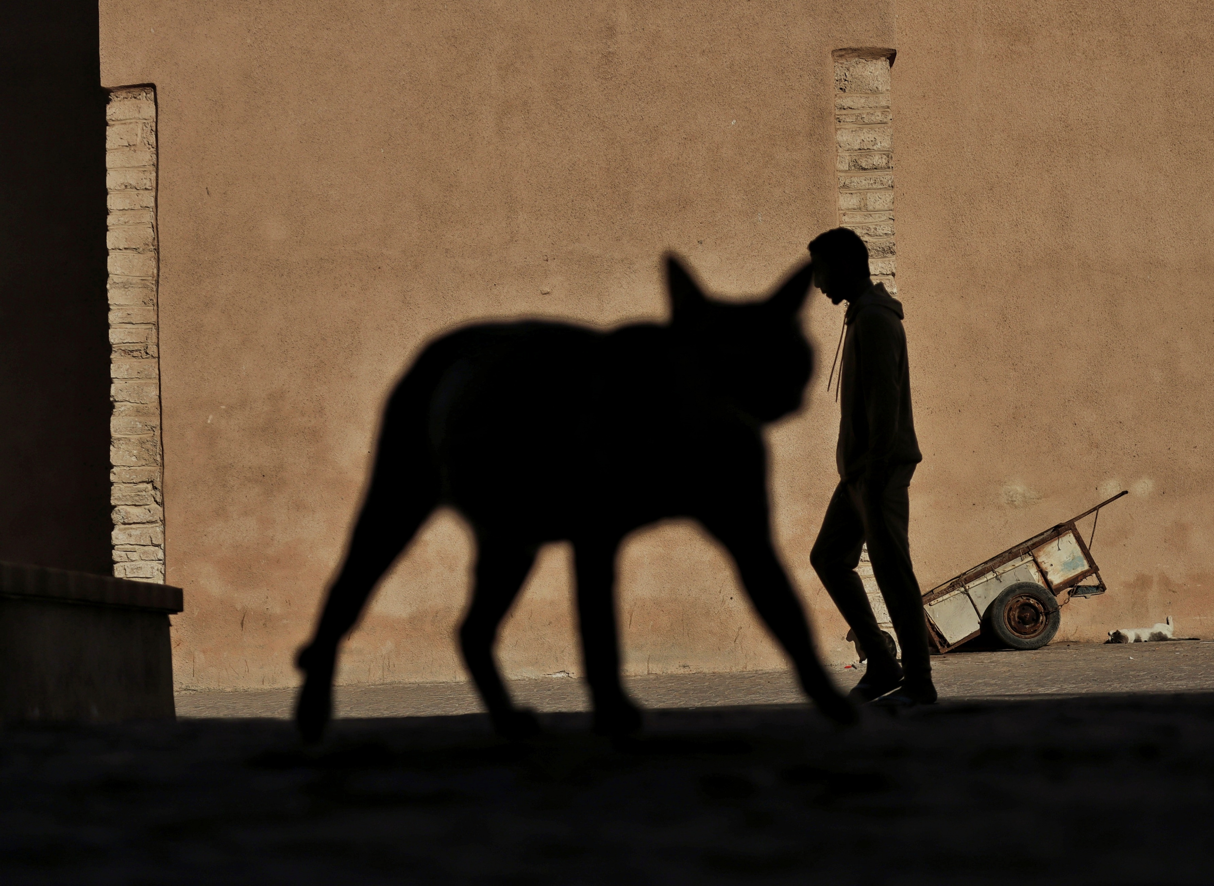
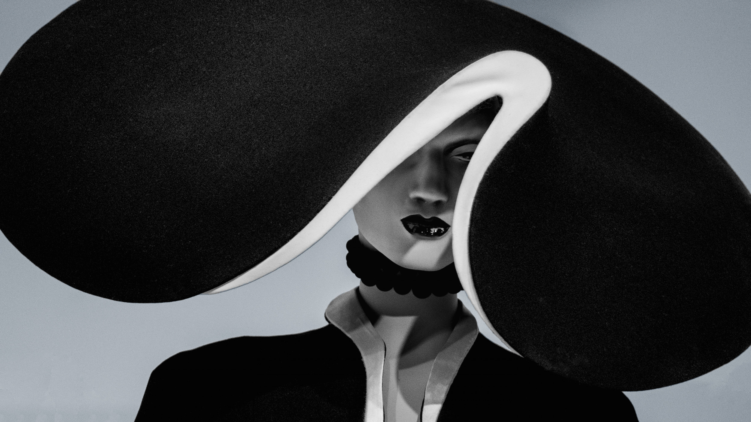
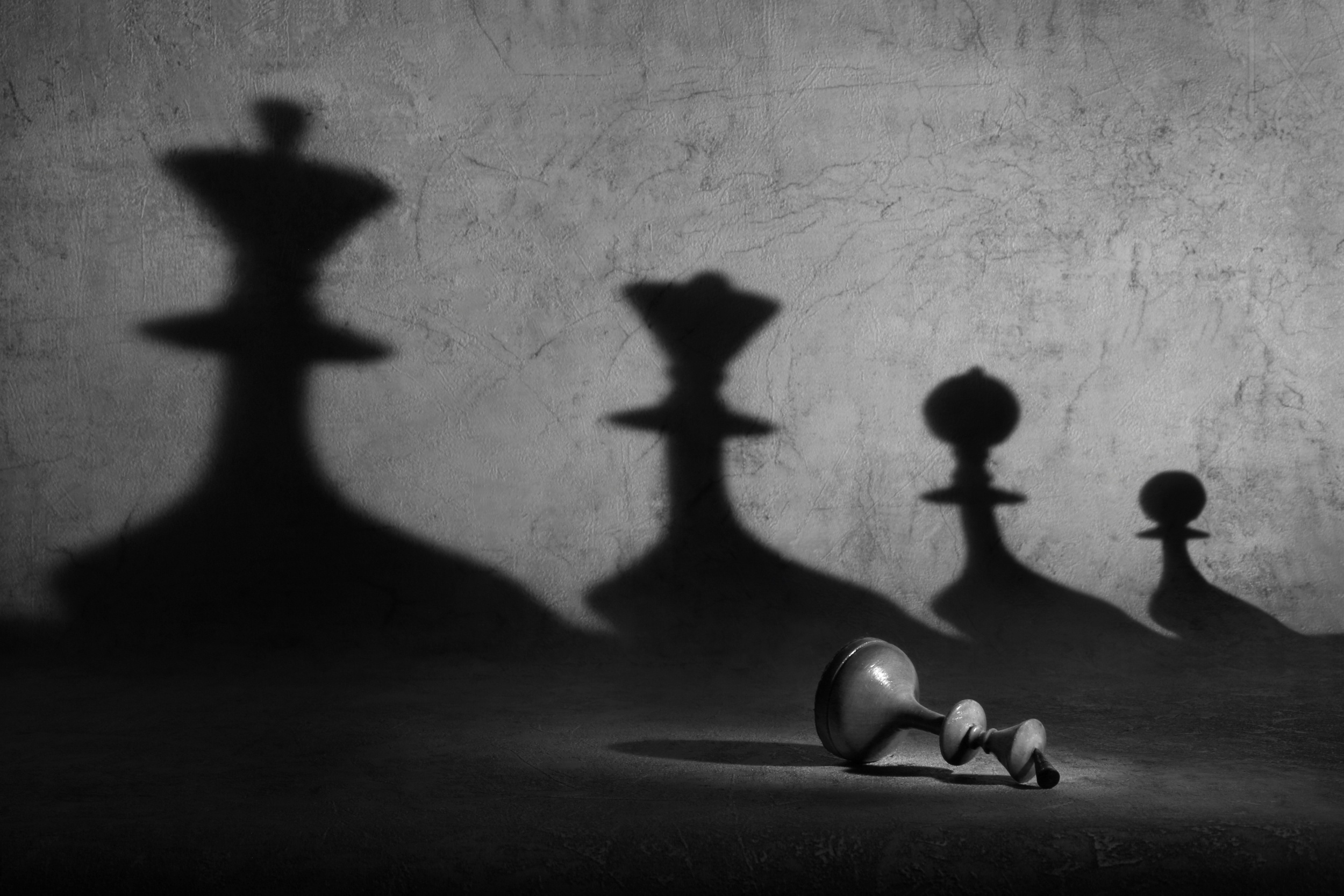
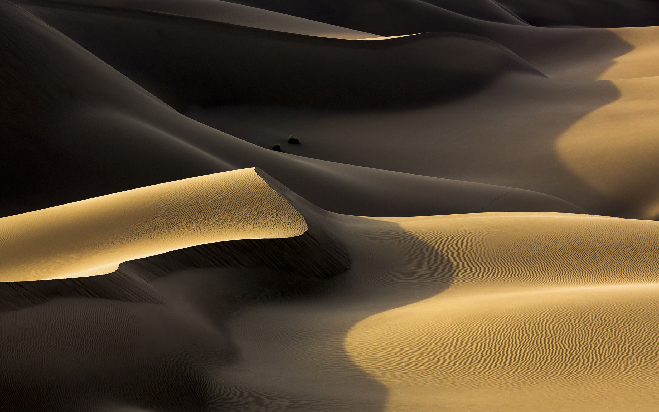
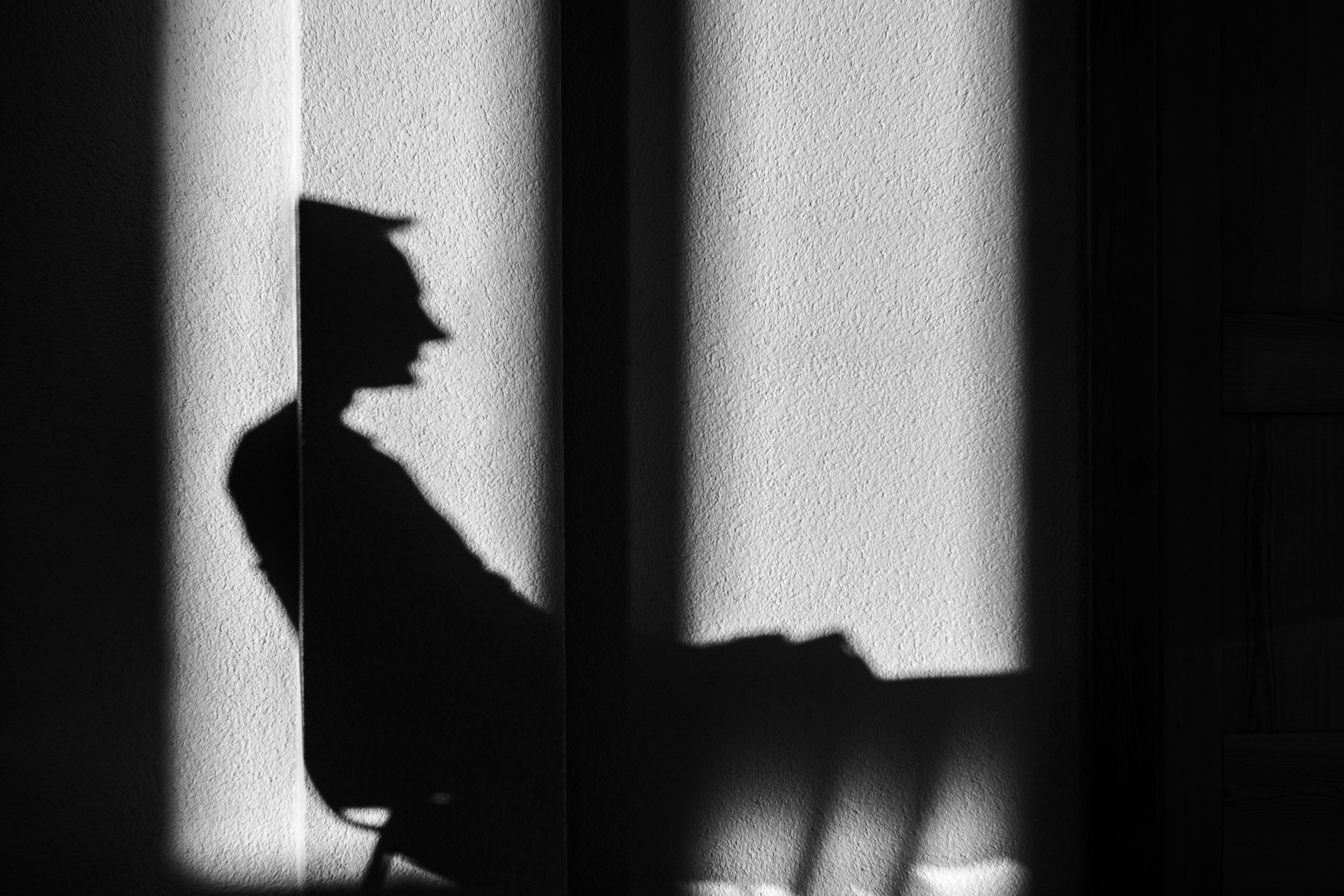
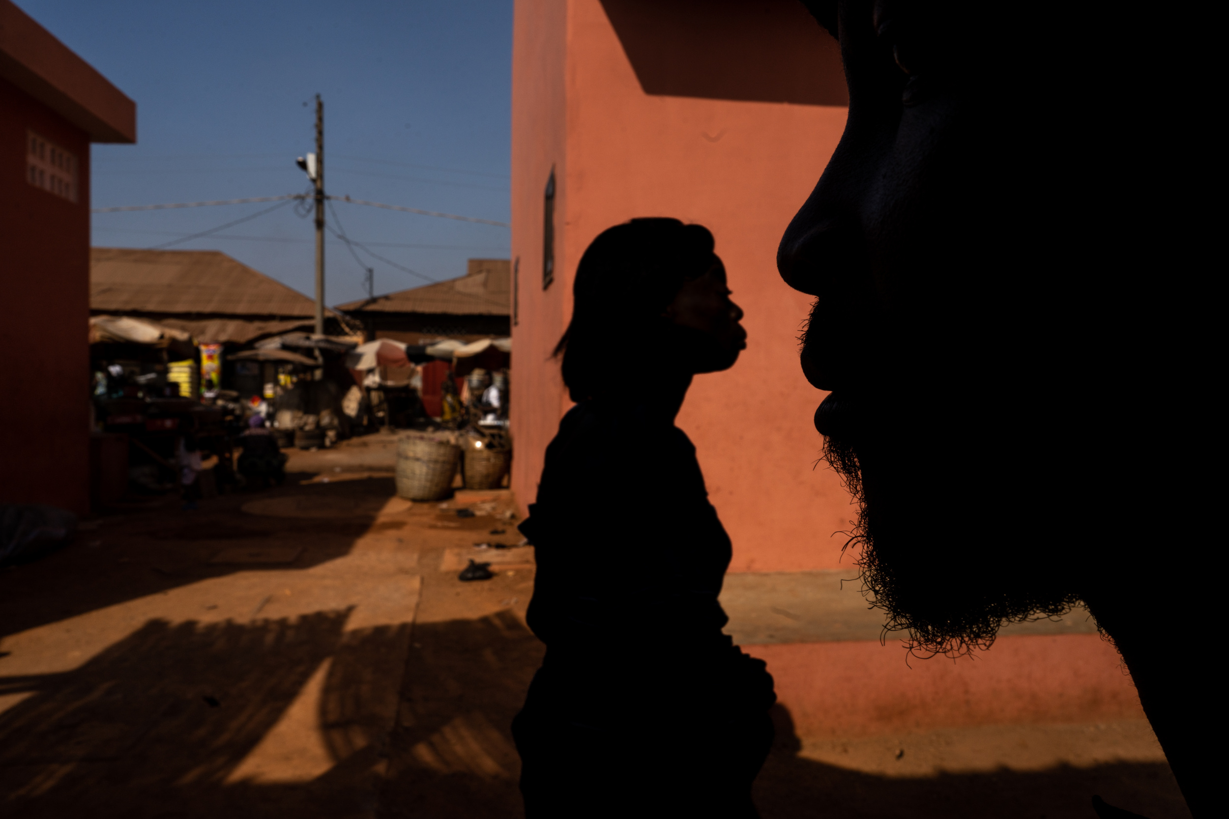
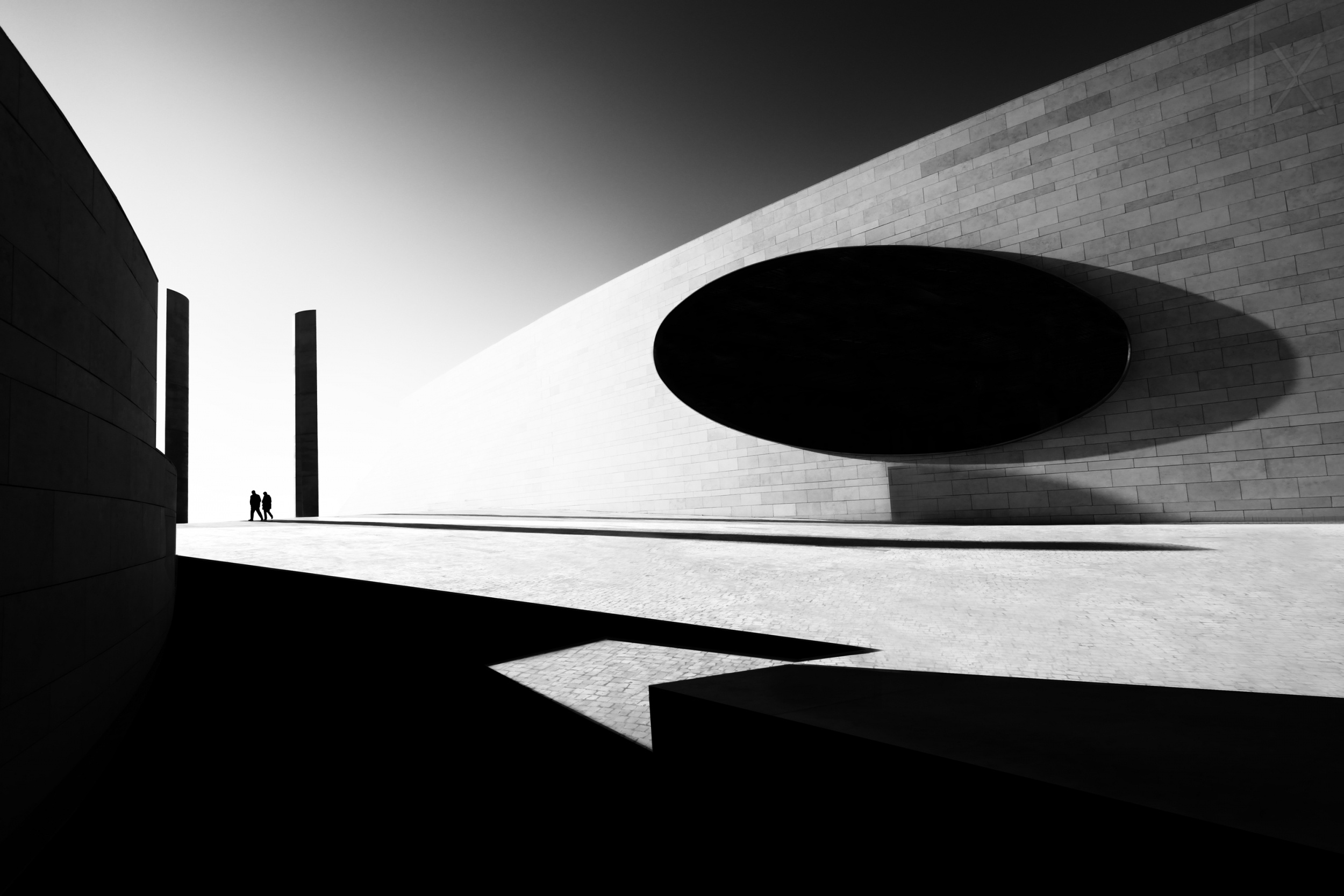
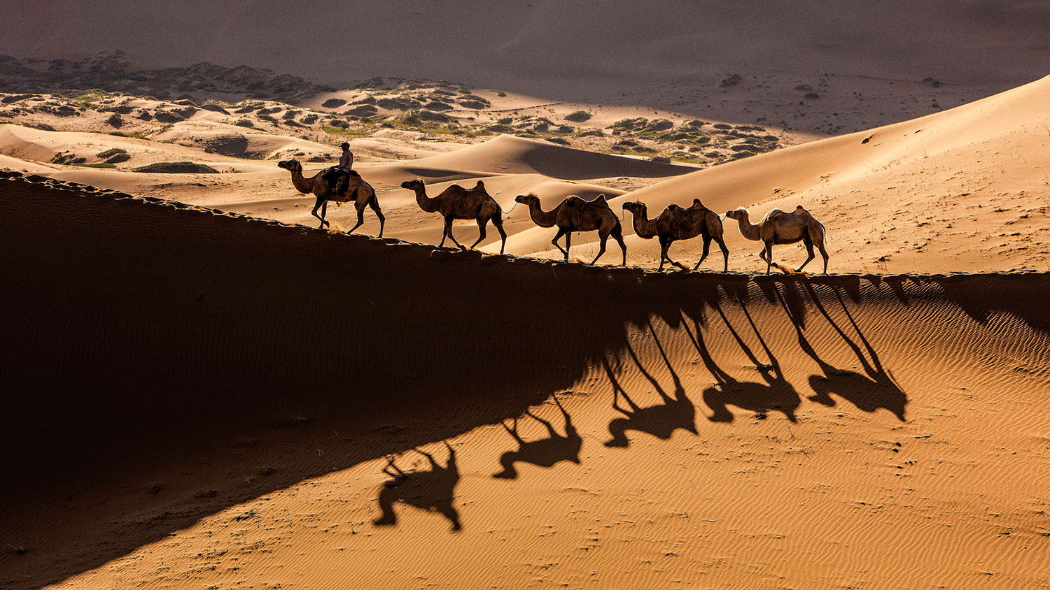
Although photography is often described as the art of light, shadows are no less important. They can shape form, suggest mystery and create rhythm. Sometimes, they can even become the true subject of an image.
Whether reflected within the same frame or the subject of another, shadows are a wonderful vehicle for highly creative and memorable photography. The shadows cast by different objects, as well as visual sleights of hand, often result in imaginative and compelling works.
“Carmen” by Eleanora Abbagnato by Flavio Bertazzi

“Facade” by Arnon Orbach
“Untitled” by Raceala Elena
“Untitled” by Gloria Salgado Gispert
“n.y.” by PeBe
“Shadow Game” by Shenzhen Dou
“Virtual capture” by Georgio Pizzocaro
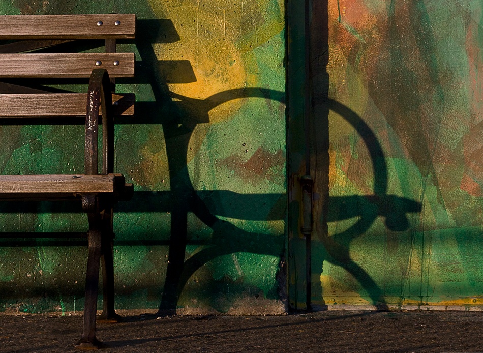
“Bench” by Patricia Sweeney
“a quiet day of fear” by Claudio Moretti
The 1x archives hold many treasures that demonstrate just how powerful shadows can be in creating original and memorable images.
They bring dimension, contrast, and emotion, transforming an ordinary scene into something dynamic while enriching and expanding the story being told.
 n/t by artem Vasilenko
“Follow Me” by Osher Partovi
“cat on street” by Silvia Dinca
“Glyph” by Patrick Compagnucci
“Game over” by Victoria Ivanova
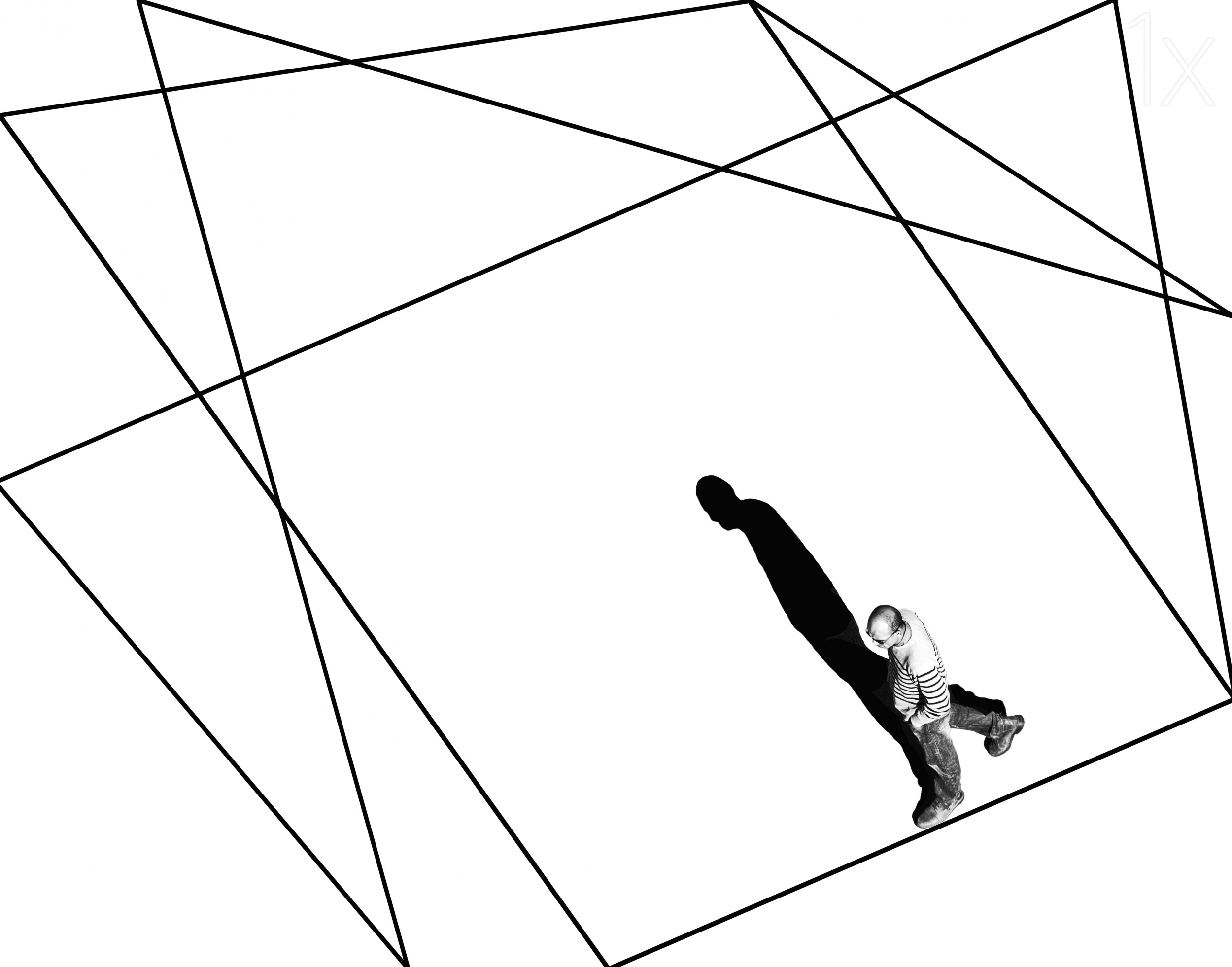
Light coming from the side creates long shadows that embrace the subject.
These shadows can trace an exact silhouette, defining shape and form, and producing beautiful outlines and graphic compositions.
High-contrast photographs with deep shadows can evoke mystery, drama and suspense. Softer shadows, created by diffused light sources such as overcast skies or studio soft boxes, create a gentler, more romantic and intimate atmosphere. Shadows can also serve as negative space, giving the viewer room to explore the frame and allowing an image to breathe.
“Life in Shadow” by Mohammadreza Momeni
“***” by Eduards
“Market in Benin” by Corinne Spector
“B&W Harmony” by Florentines Joseph
“Badain Jaran Desert-1” by Shin Woo Ryu
“Line and Shadow” by Natalia Baras
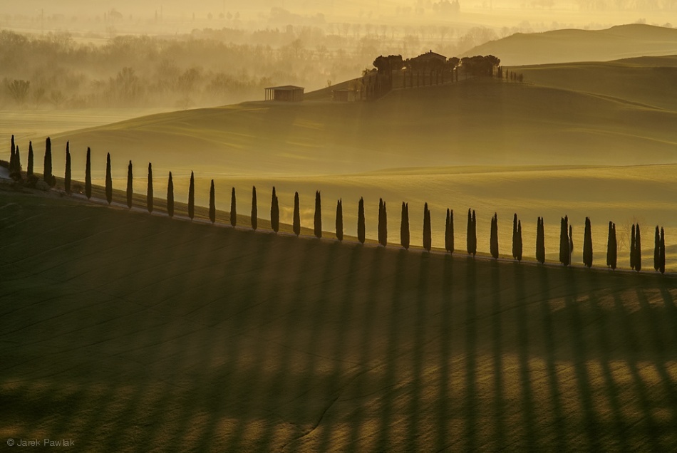
“Cypress shadows” by Jarek Pawiak
“On the Edge” by Itzik Einhorn
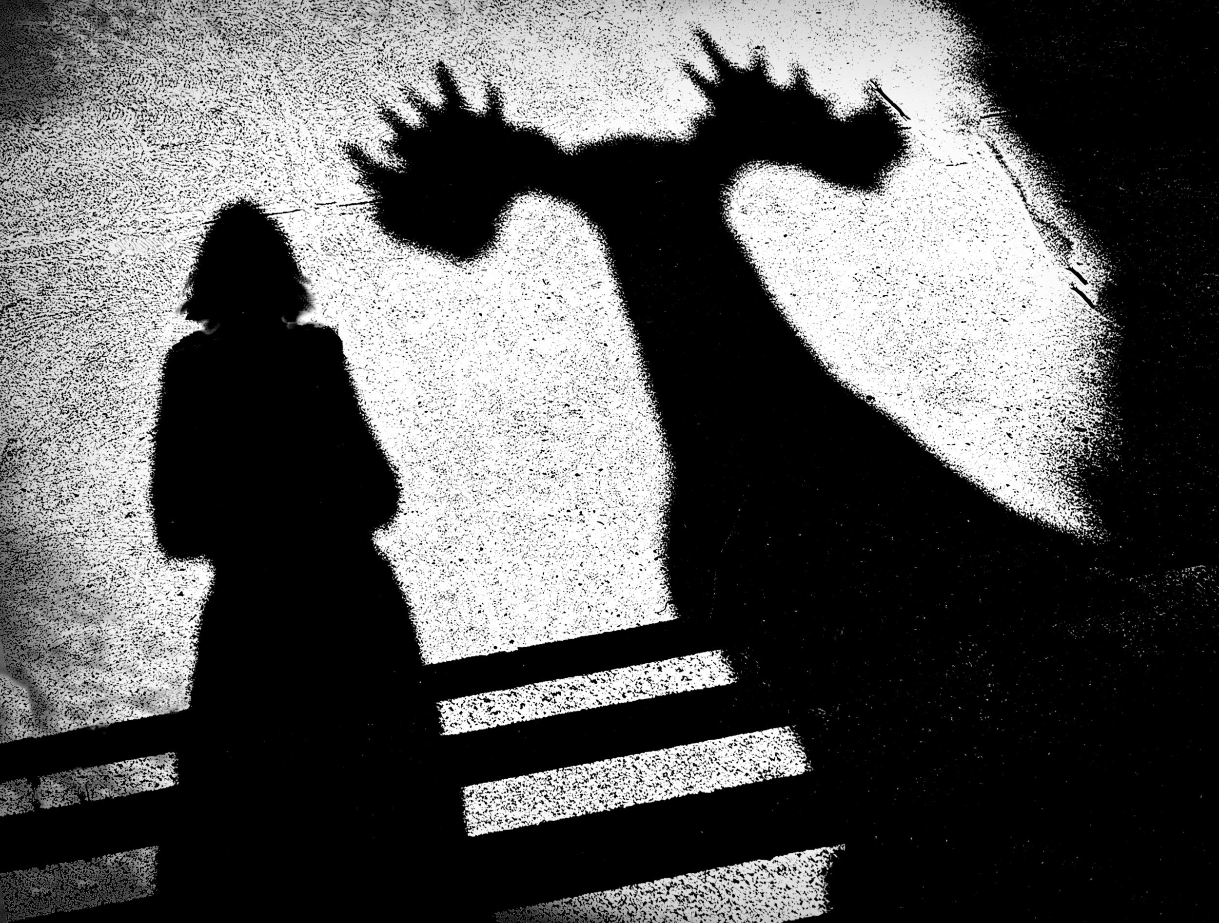
“Me and my Moose” by Jane Lyons
To capture shadows effectively, expose for the brightest highlights rather than the darkest areas.
Maintain deep, inky blacks by keeping the ISO low and using manual mode. Use a hard light source to create well-defined shapes, then frame them to produce abstract and interpretive images.
Here is an interesting video on creating shadows for portraits.
https://www.youtube.com/watch?v=krWQ3wwv97Y
|
| | very beautiful gallery and article !!! |
 | David Manusevich PRO Very beautiful gallery |
 | Subhajit Das PRO Great work. Very inspiring article. Congratulations! |
 | Arnon Orbach CREW Delighted to be featured in The Aesthetics of Shadows. This beautiful article and the inspiring gallery reminds us that shadows are not the absence of light—they are its perfect companion. Together they shape atmosphere, reveal emotion, and give photographs their timeless sense of wonder. Light and shadow are inseparable. Light reveals form, while shadows add mystery, balance, and emotion—creating images full of magic. Thanks so much to Jane and Yvette - a winning team - for their excellent work. much appreciated. |
 | Cicek Kiral CREW Very inspirational 👏👏👏 |
 | It's wonderful to see such inspiring and magnificent works of art on display here. Thanks to everyone who contributed! |
 | Stephan Rückert PRO Fantastic inspiration through brilliant images. Many thanks to Yvette and all the authors. |
 | Eiji Yamamoto PRO Dear Jane, thank you so much for the fascinating article with beautiful and wonderful photos! Dear Yvette, thank you so much as always! |
| | Miro Susta CREW The Lady Gaga proverb hit the main point of this interesting article, in other words there is no shadow without light. I like this interesting article topic very much, well done Jane for creating it and for selection of wonderful photos. And of course many thanks dear Yvette for editing and publishing it. |
 | Exquisite examples of the magic of shadows captured by amazingly skillful photographers. Lovely article. |
| | Sokol Priftaj PRO Inspiring work, thanks for sharing. |
 | Qinyuan Wu PRO Interesting & Inspiring! |
 | Itzik Einhorn PRO Shadows possess a kind of magical charm. A small object can grow immensely in the right light; a certain movement is captured differently within the two-dimensional space of the projected area. Sometimes, when immortalized in a photograph, it leaves you amazed by its elegance. And what is a silhouette, after all? A dark, colorless shape — and yet so captivating to the eye. That is truly magical.
Thank you for choosing one of my photographs to demonstrate this magic. |
| | Great examples of shadow work illustrated in your article. Also thanks to you and Yvette for including my image here. You made my day! |
 | Jo Chaney PRO Jane, I am so enjoying your articles. I love how you bring out the nuances of your subject material and how varied and creative all of the photos are. Kudos to the editors and the creators of these wonderful compositions. |
by Yvette Depaepe
Published the 8th of July 2026
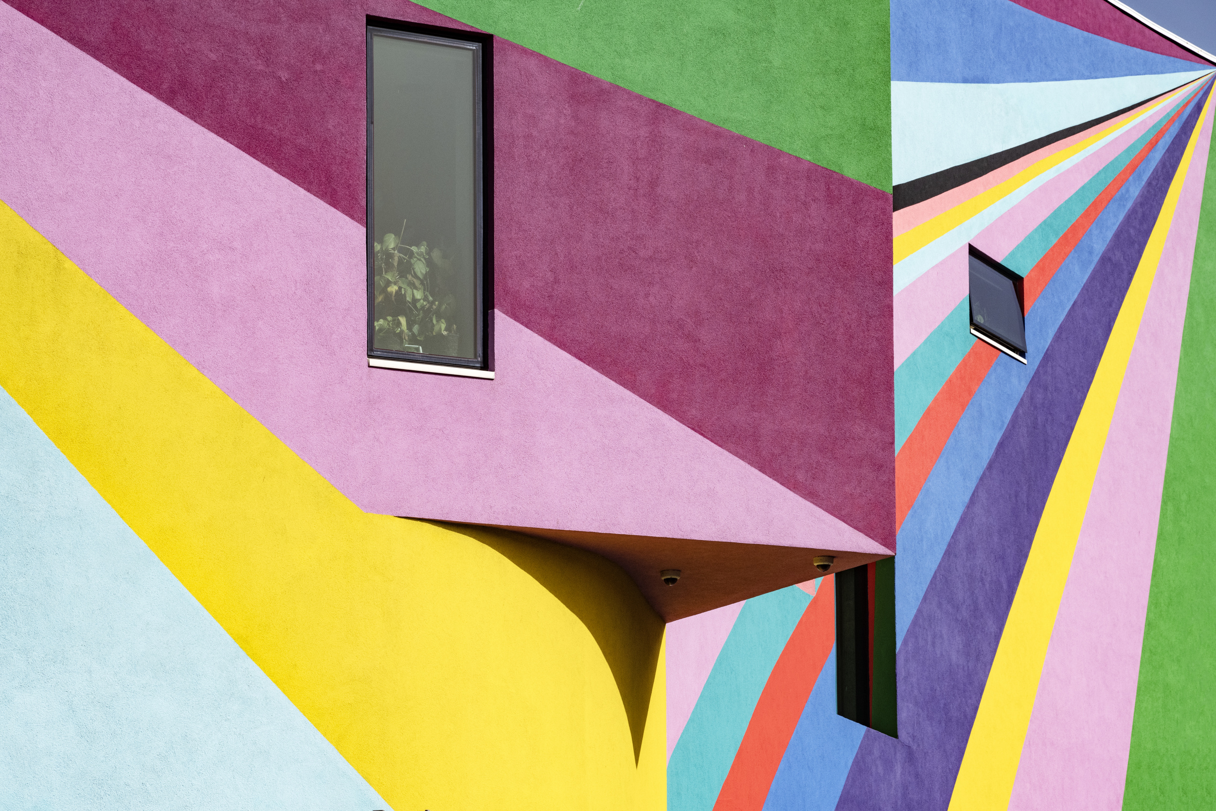
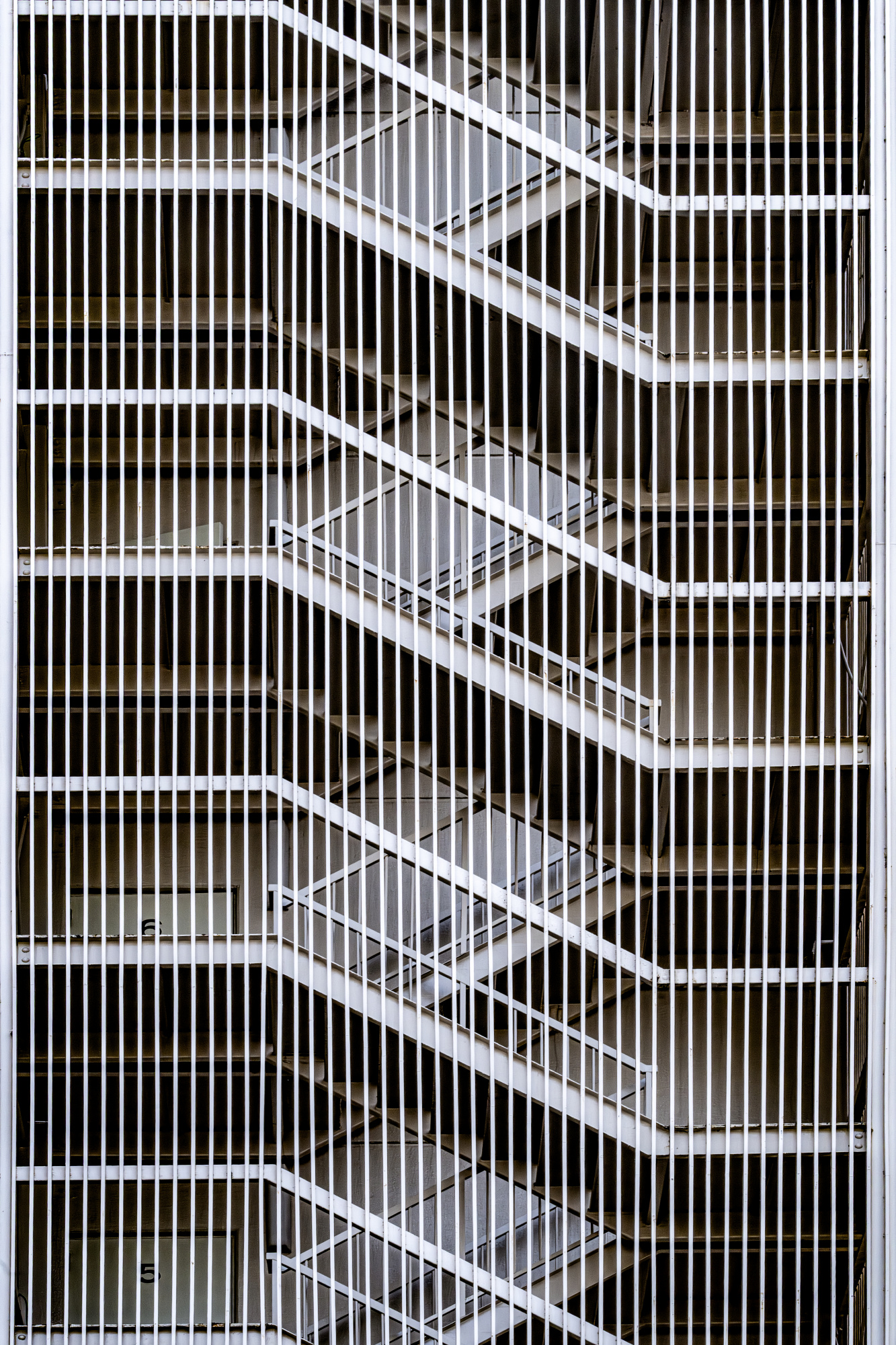
This months' featured exhibition is titled 'Archiometry' by Linda Wride
Linda introduces her outstanding exhibition to us as follows:
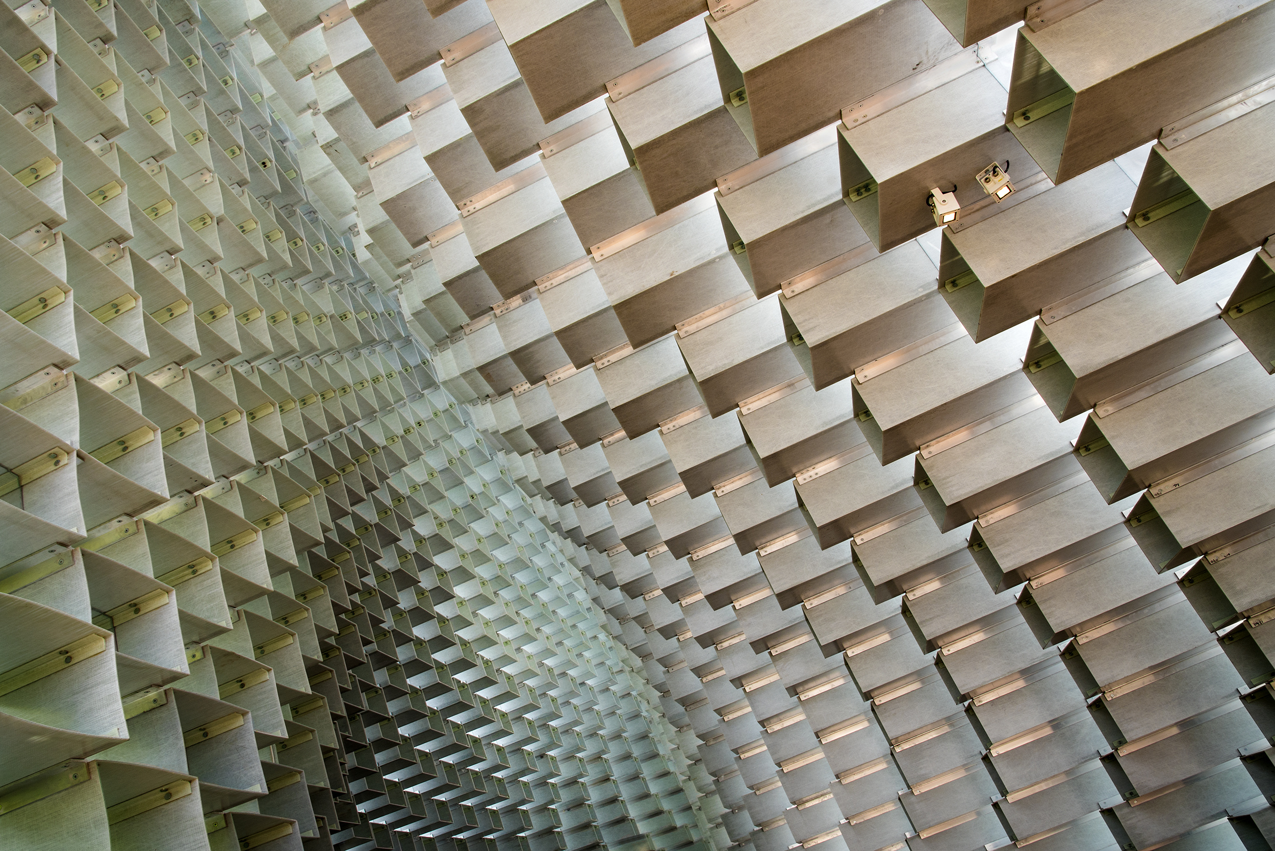
"As a photographer, I am fascinated by shape, form and pattern. As a city dweller, I often take photographs in the built environment. Unsurprisingly, my portfolio includes many architectural subjects. The geometry of architecture - the angles, lines and shape of buildings, their 3D form, facade design, and individual elements such as windows and stairs - has inspired many of my images, including those in this exhibition. "Archiometry" is a blend of architecture and geometry. I don't aim for verisimilitude. My images are often graphic in character, with compositions frequently using symmetry or repetition to draw attention to patterns which might otherwise be overlooked. I hope you enjoy!"
I invite you to explore the geometry of architecture for inspiration, just as Linda did.
This exhibition which will be exposed on our opening page / Gallery throughout July 2026.
Click here to see the entire exhibition: [228] Archiometry by Linda Wride
To trigger your curiosity, here is a short selection of images ...
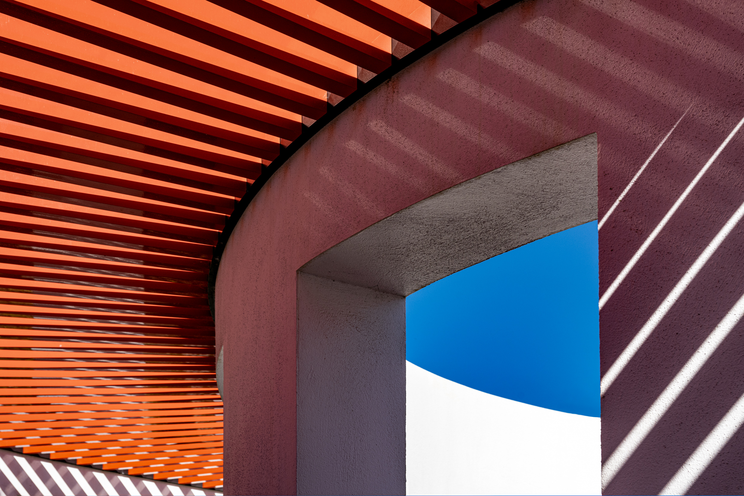
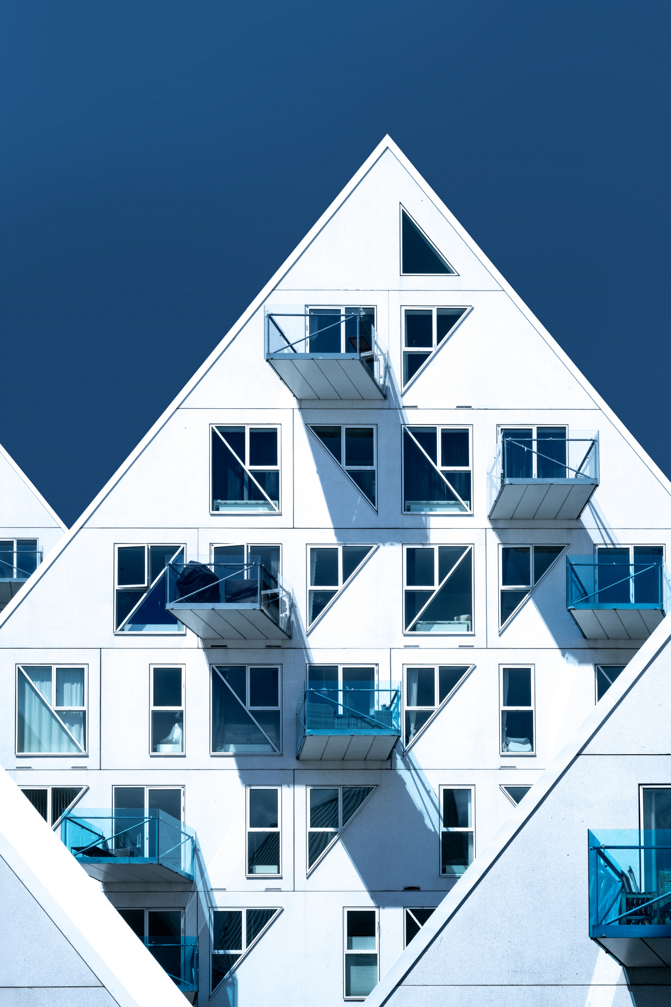
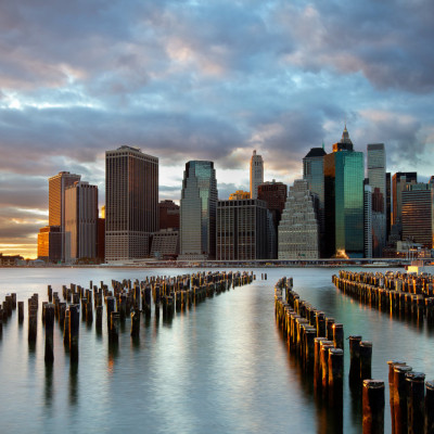
'Iceberg #5'
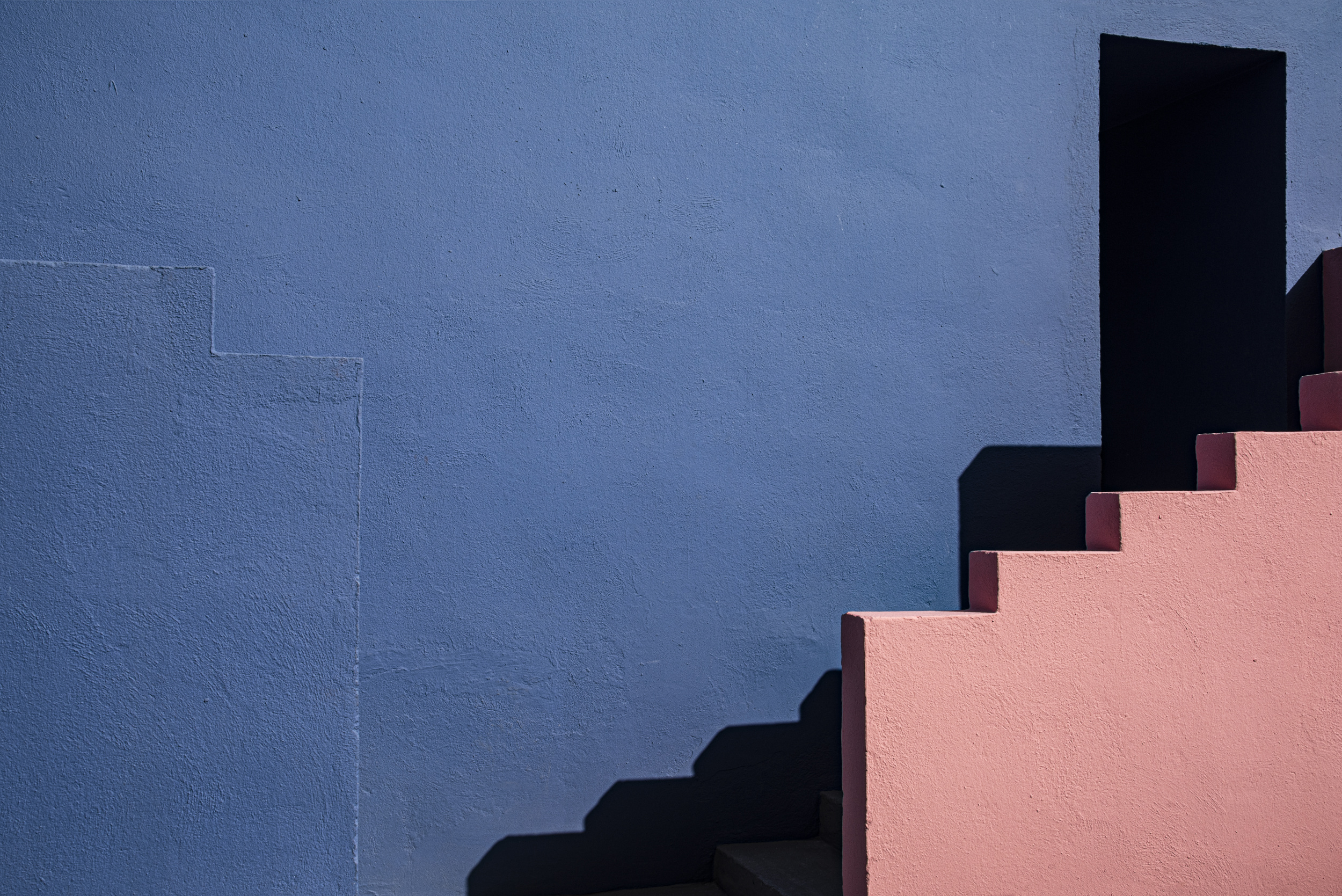
'Muralla Roja #3'
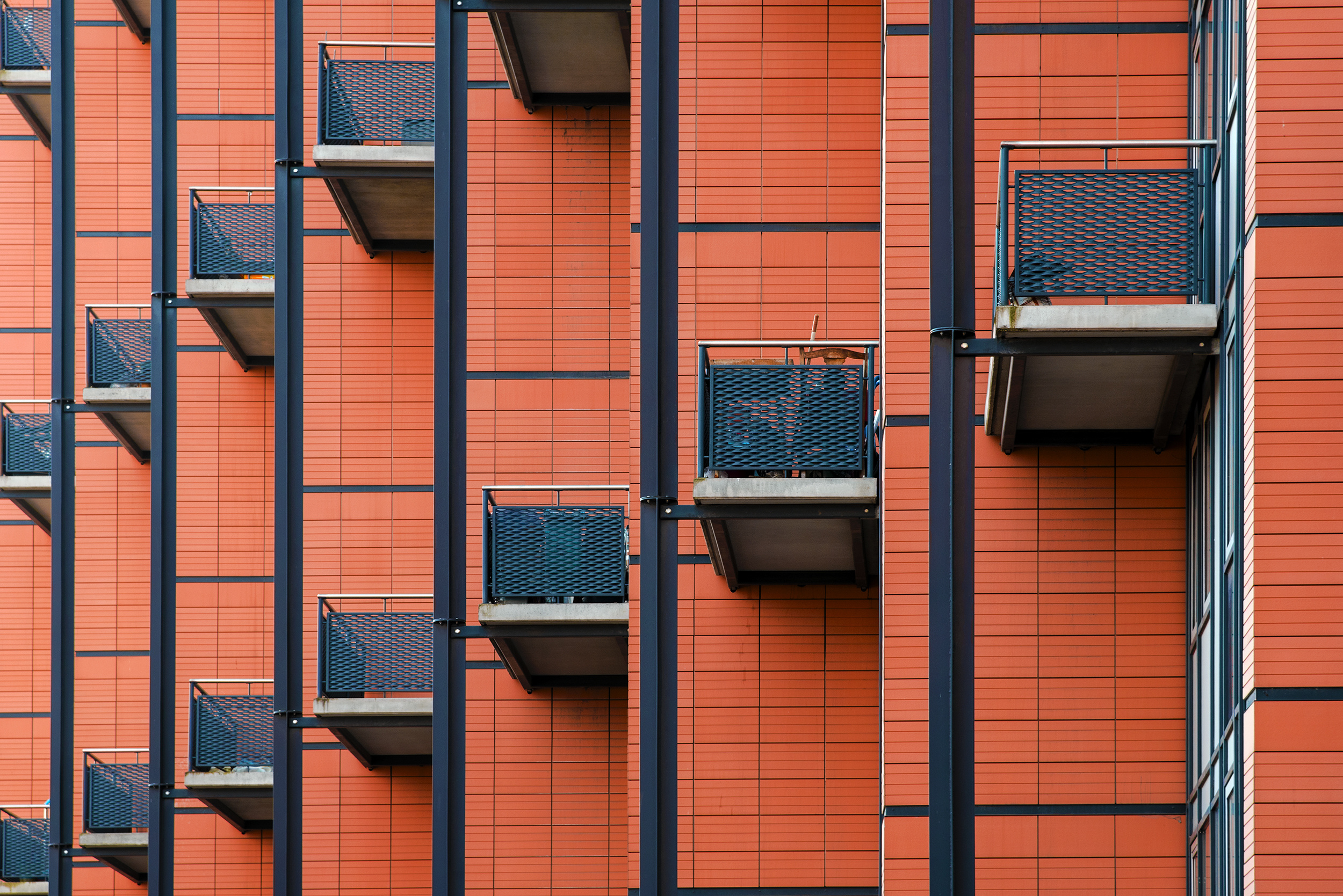
'A space of your own'
|
| | congrats, very impressive gallery !!! |
 | yein PRO There are so many different patterns in architectural structures. Congratulations, gallery! |
 | Wayne Pearson PRO An outstanding and dramatic portfolio of shapes, colours textures with an architectural abstract effect, congratulations Linda. We see the world around us in a very similar way. Thank you too Yvette, for your tireless effort in organising these editorial features. |
| | Wonderful work Linda, Many compliments! |
| | True frames, congrats for your work! |
 | Congratulations on the feature Linda, you’re exhibition of images shows what a classy photographer you are, beautiful architecture in everyone of them |
 | DonnaHom APA PRO Architecture is one of my favorite subject. Good collection of exhibition. Congratulations to author and editor. |
| | Miro Susta CREW Dear Linda you are a gifted photographer, your creative architectural photos are perfect, may I congratulate you on excellent photo work, and many thanks Yvette for introducing Linda in the way to us. |
 | Elizabeth Allen CREW Congratulations on your well-deserved feature, Linda. Your work is so inspiring and beautifully presented. Thanks as always to Yvette. |